Battle of the Concealers: Round 1, Matches 5 & 6

We’re back with the next two matches in the concealer tournament! If you missed the first four matches, I started with 16 concealers I’ve been testing, some for years and some much more recently. As always, I’m happy to do follow ups with anything I didn’t include here or anything that’s launched since that you’re super curious about! Important reference for concealers: I have dry 35+ year old skin that has fine lines. If you have oily skin, you might love the ones that lose specifically because they don’t work as well on my dry skin.
For the actual tests, I wore one concealer on each side of my face, both under my eyes, to spot conceal, and as foundation on different days. I kept the rest of my makeup the same. I also switched sides just in case. I’ve also been posting (way too) close up pictures in my Substack chat and having everyone vote on which side looks better without telling them what they’re looking at.

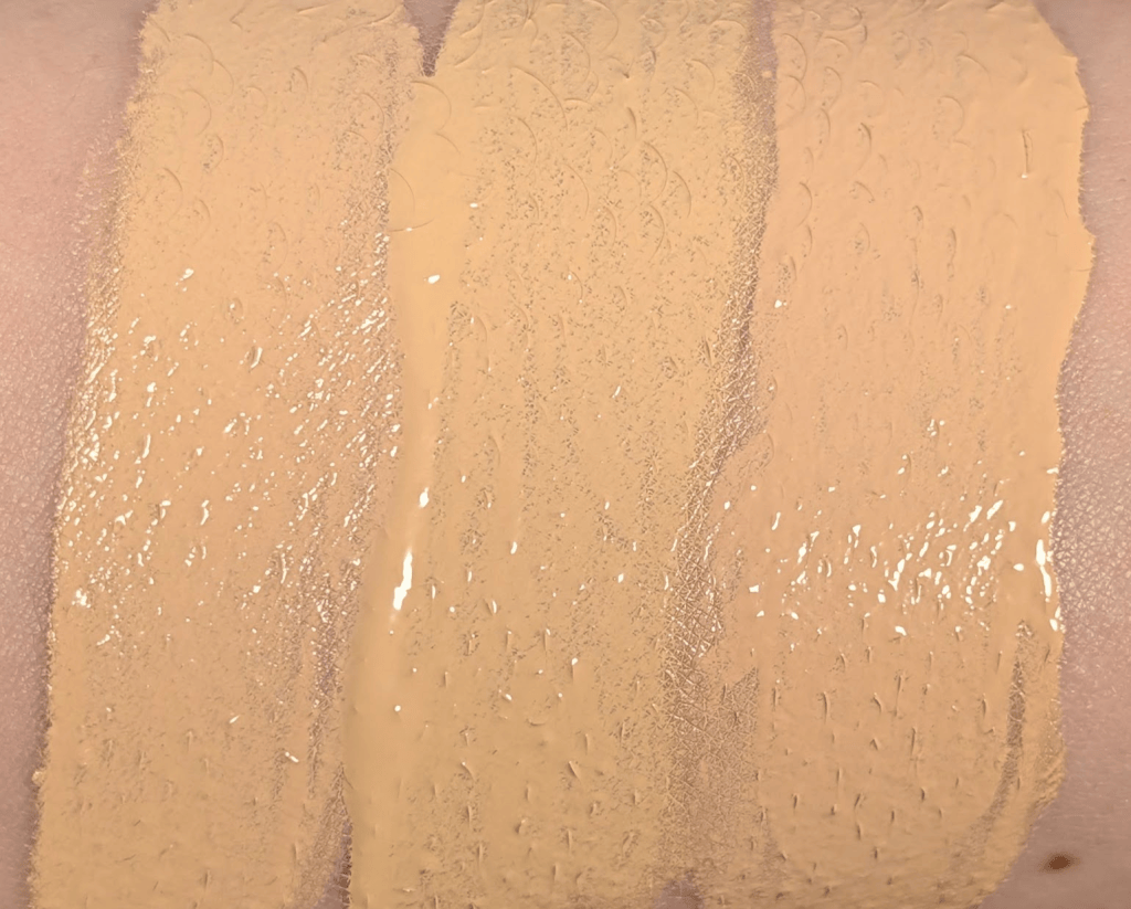
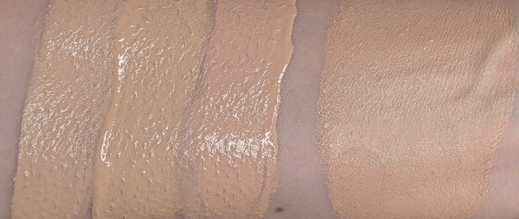
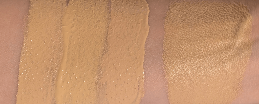
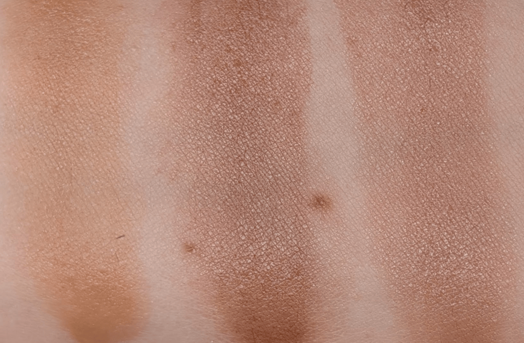
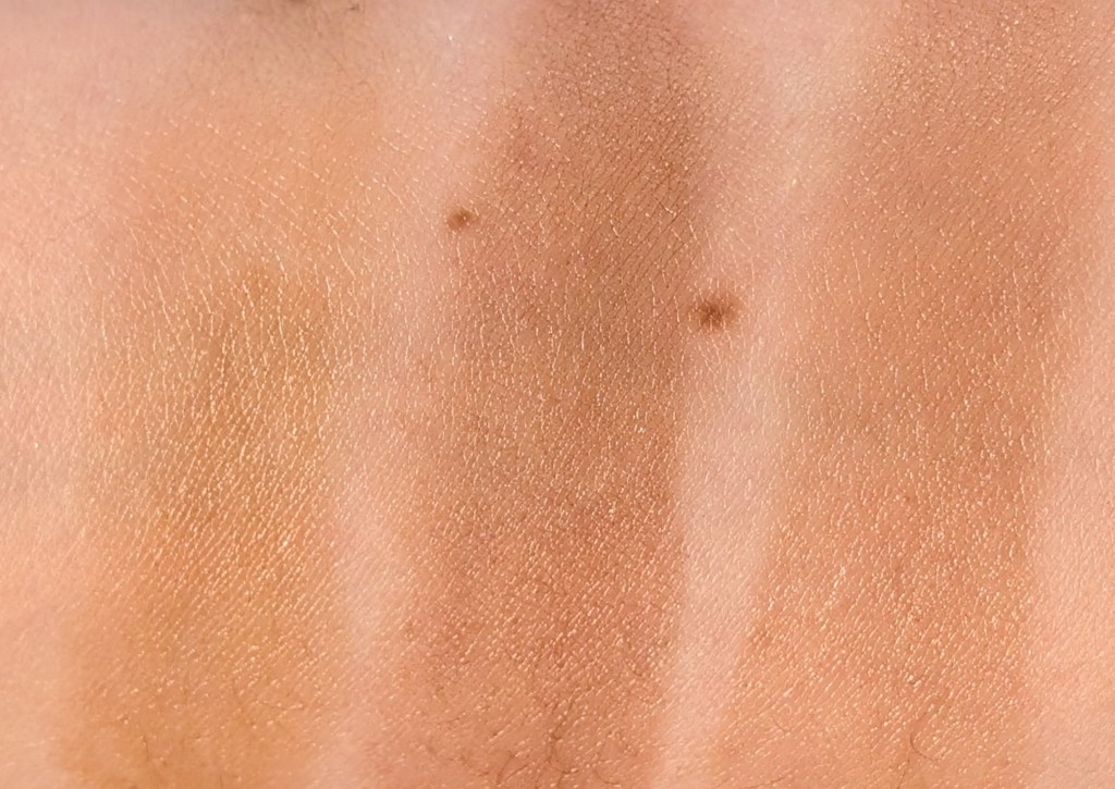
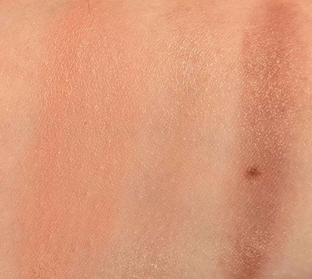
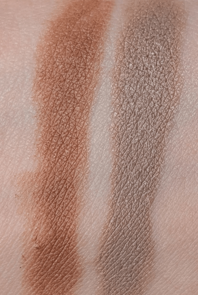
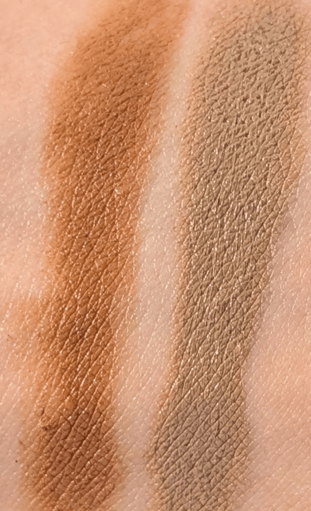
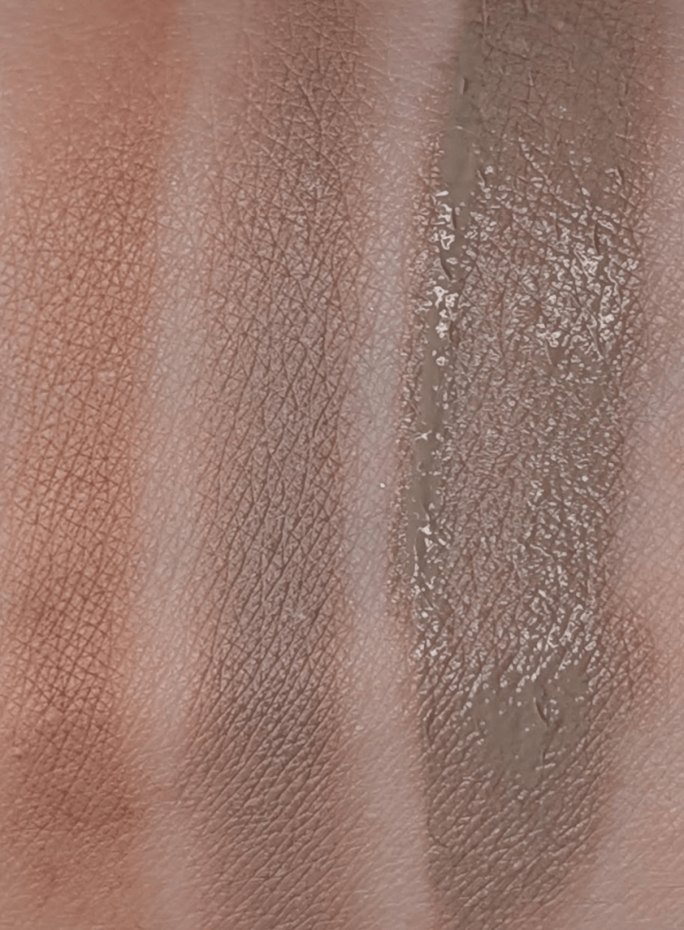
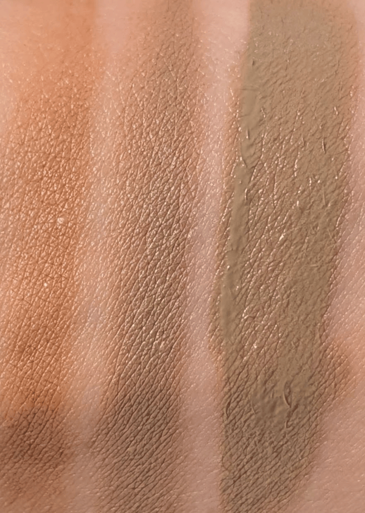
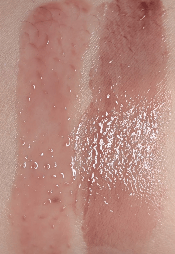
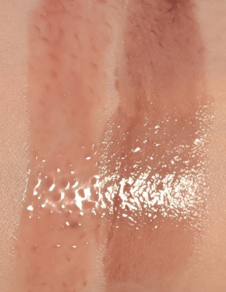
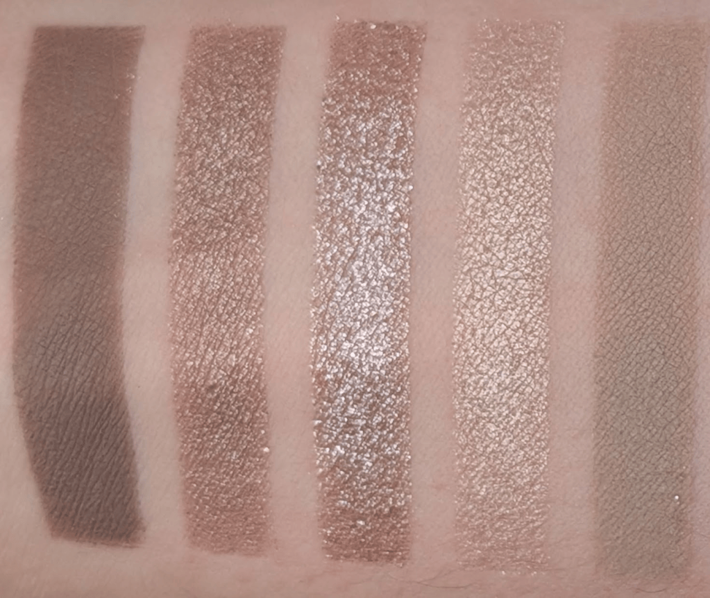
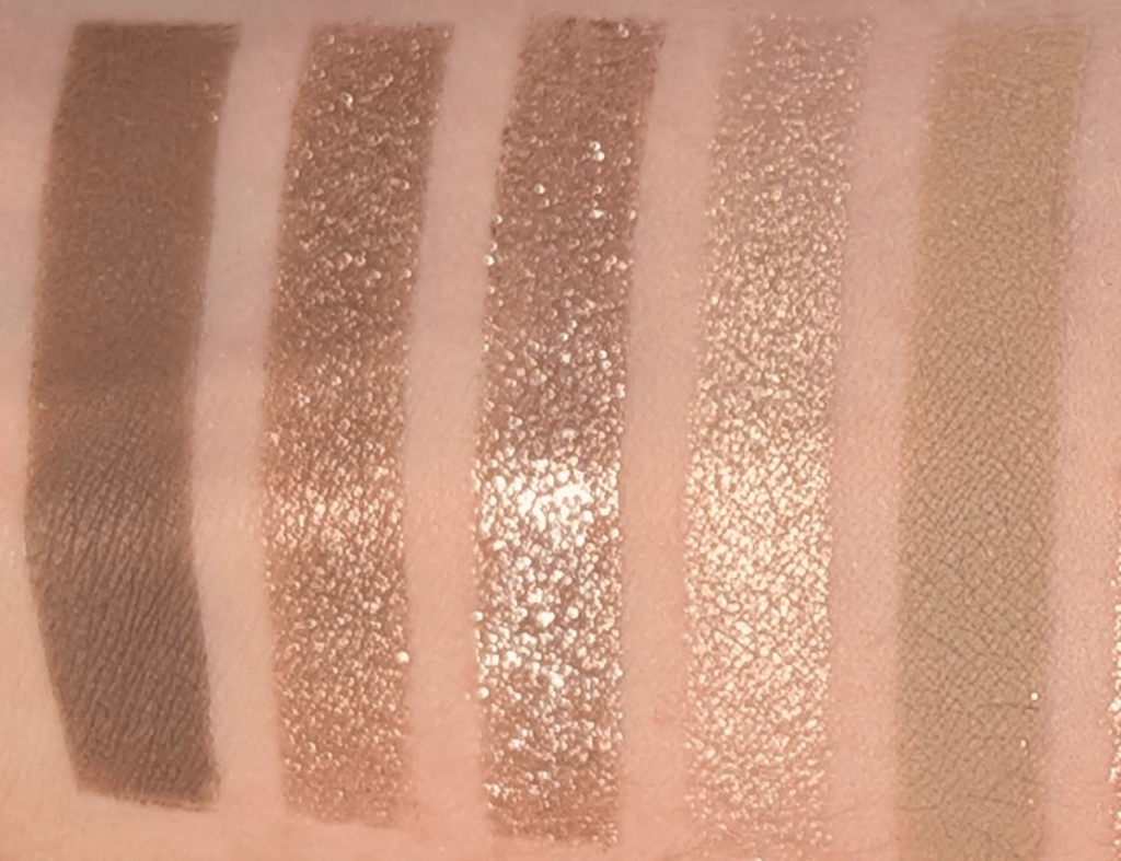
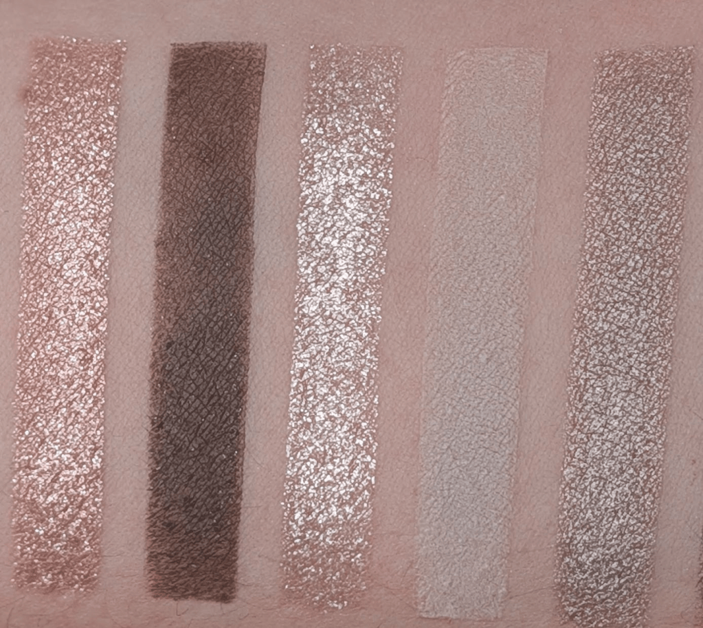
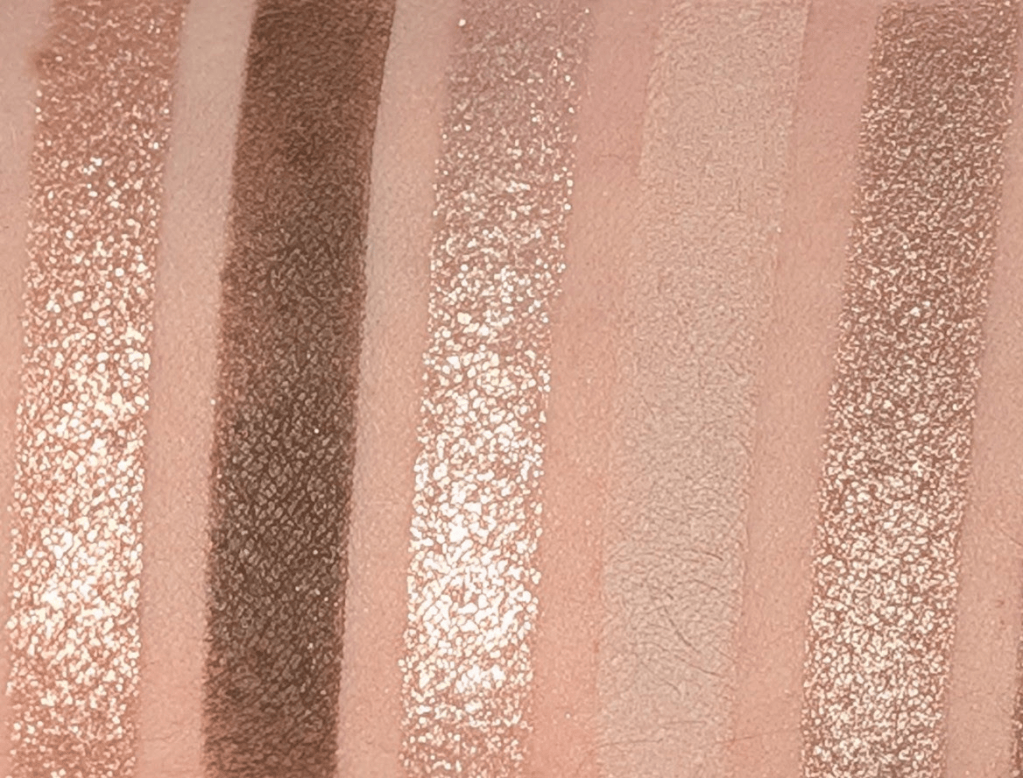
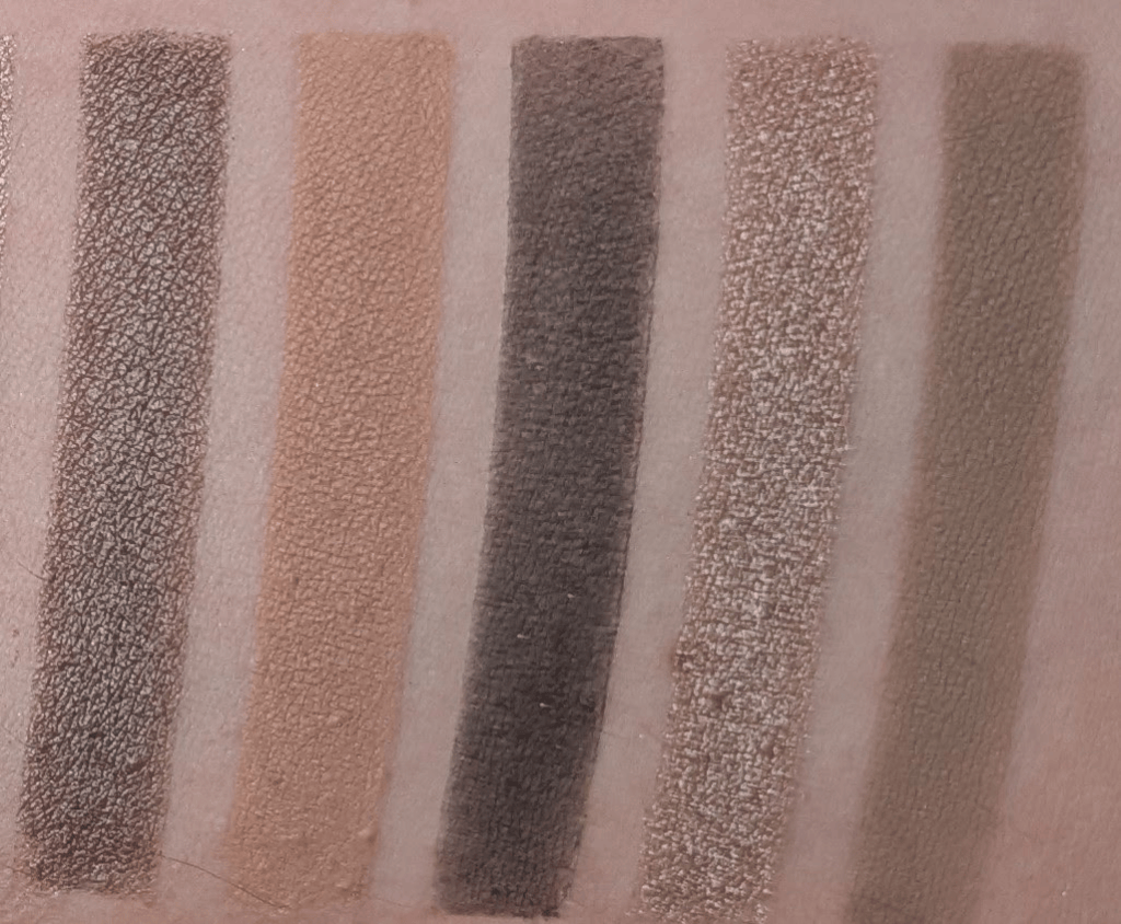
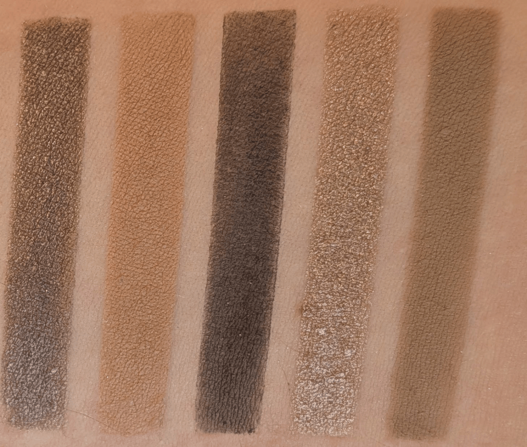
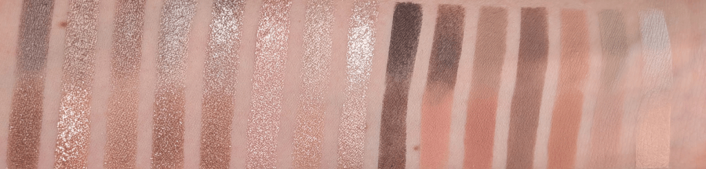
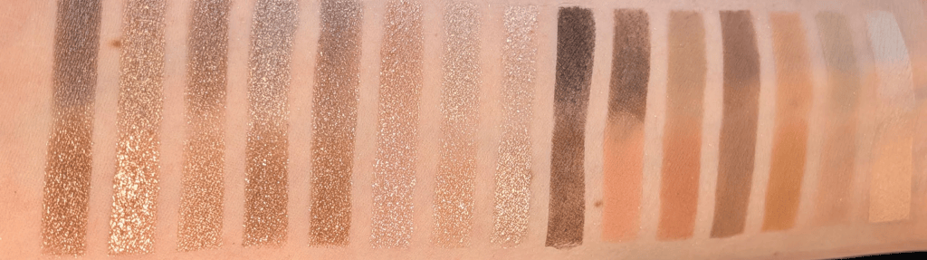
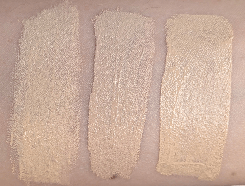
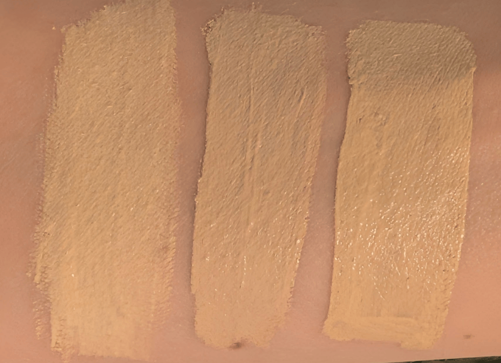
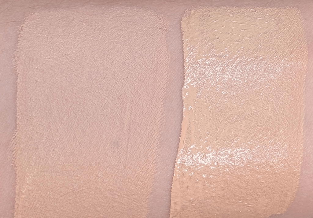
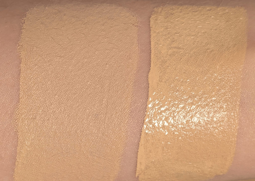
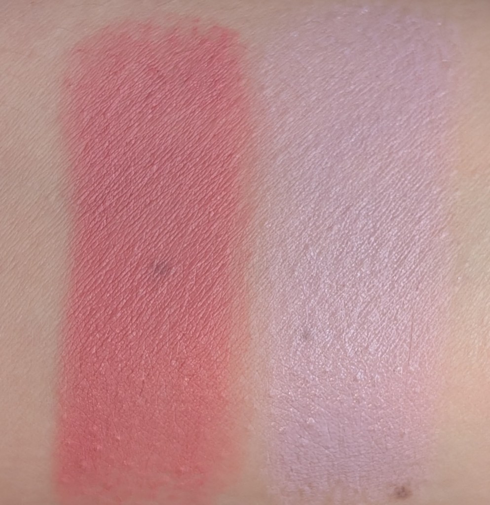
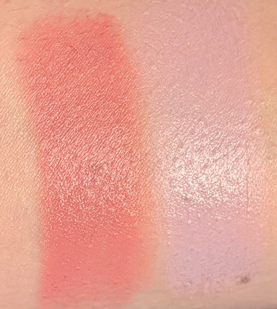
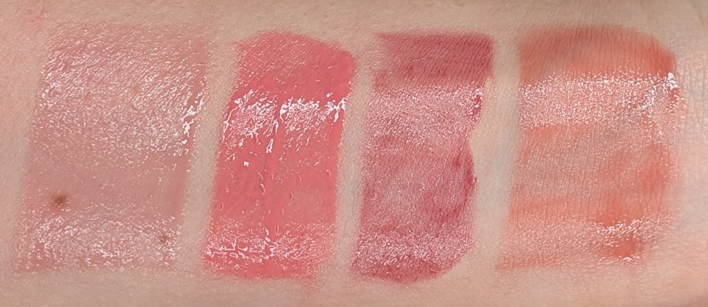
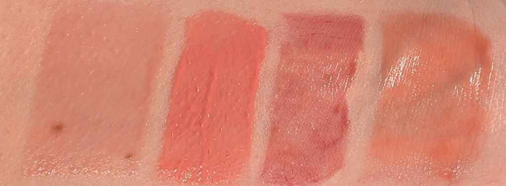
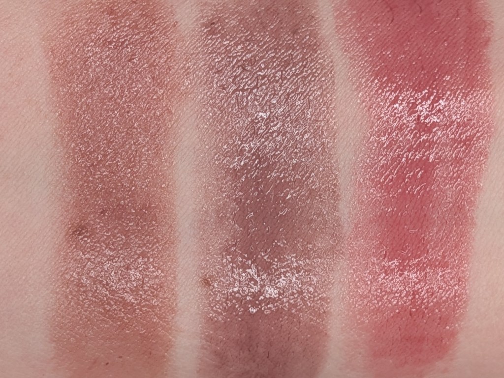
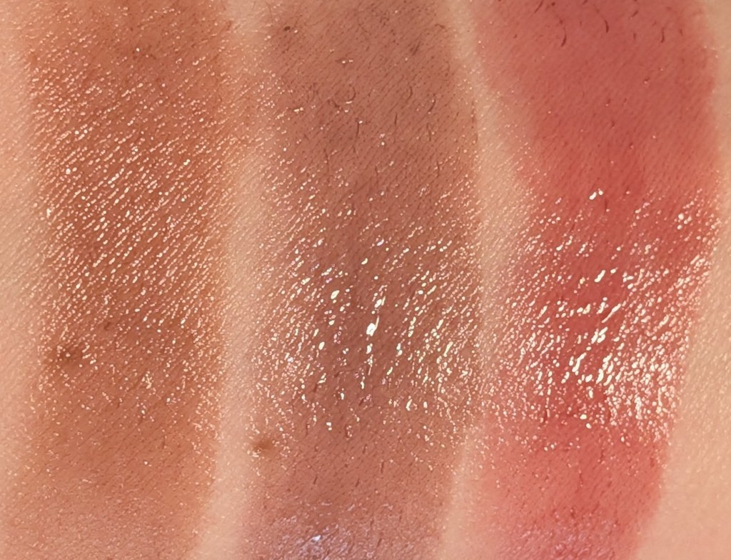
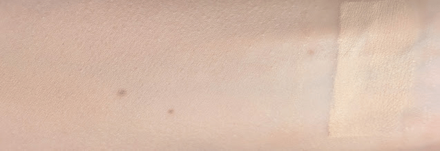
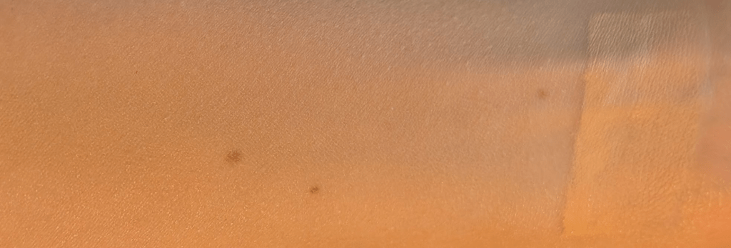
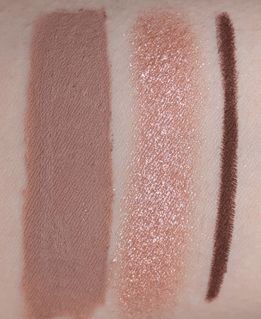
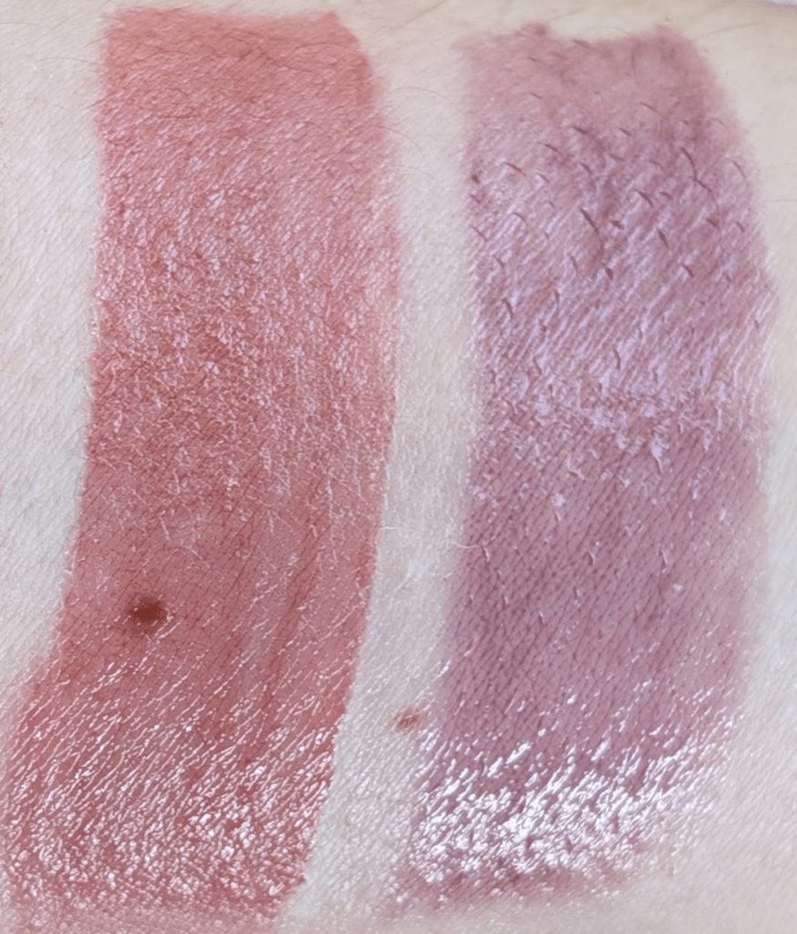
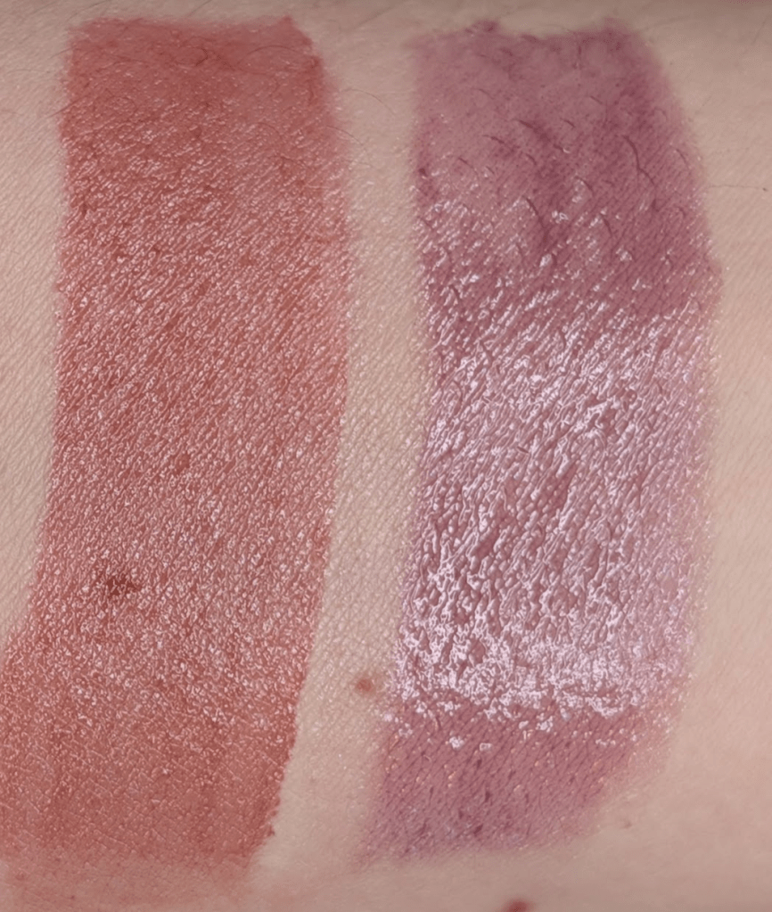
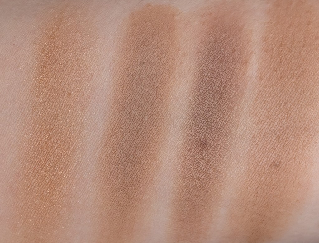
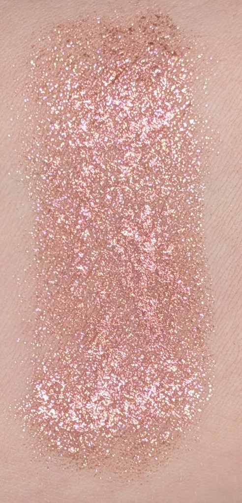
In this post, all links are affiliate links (thank you for your support!), but all opinions are my own and I bought all these products myself. Swatches are under a ring light to show true to color (photo #1) and then standard lighting to show the formula a little better (#2) for all the products.

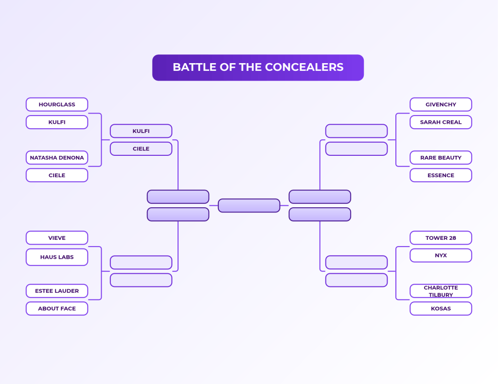
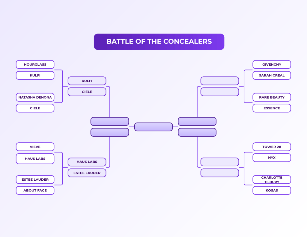
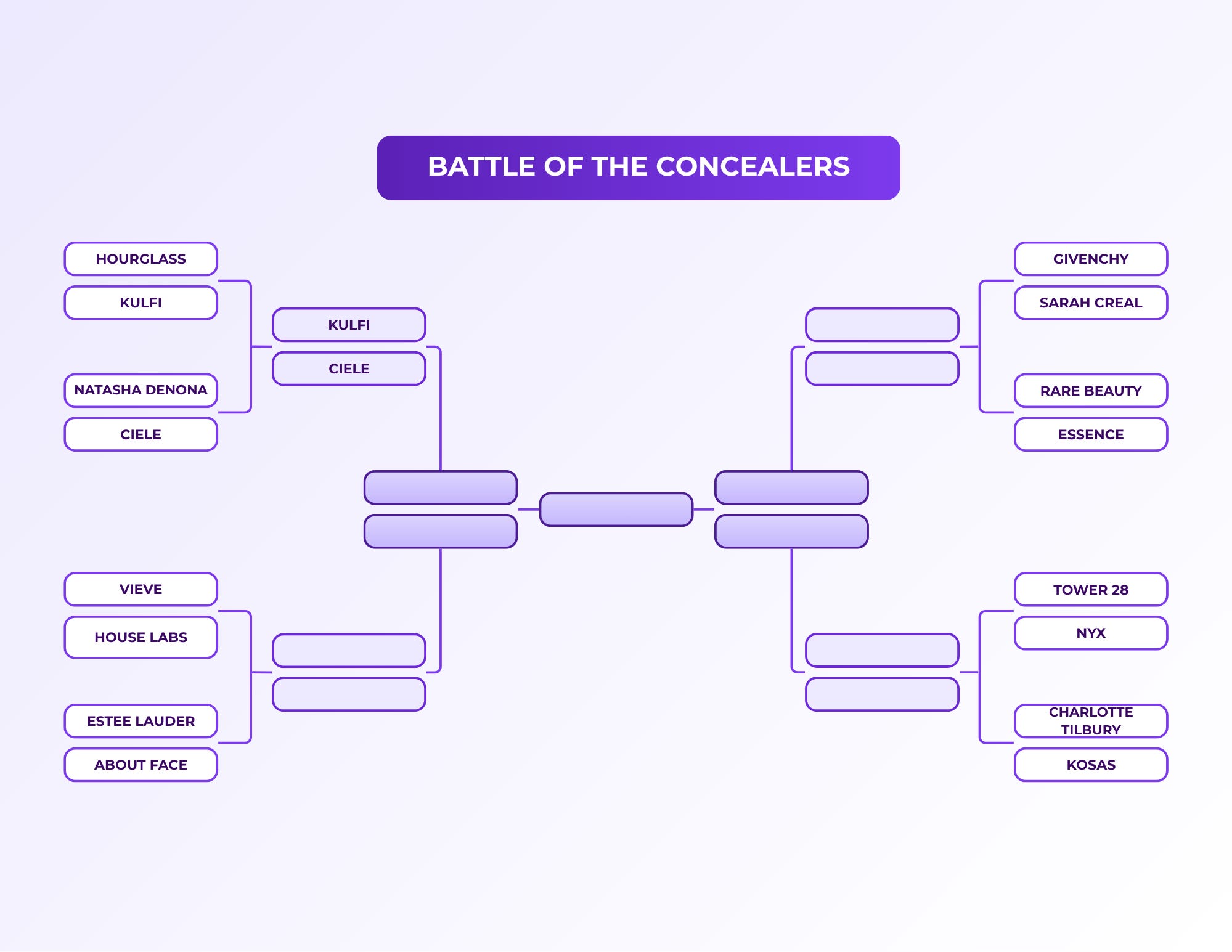
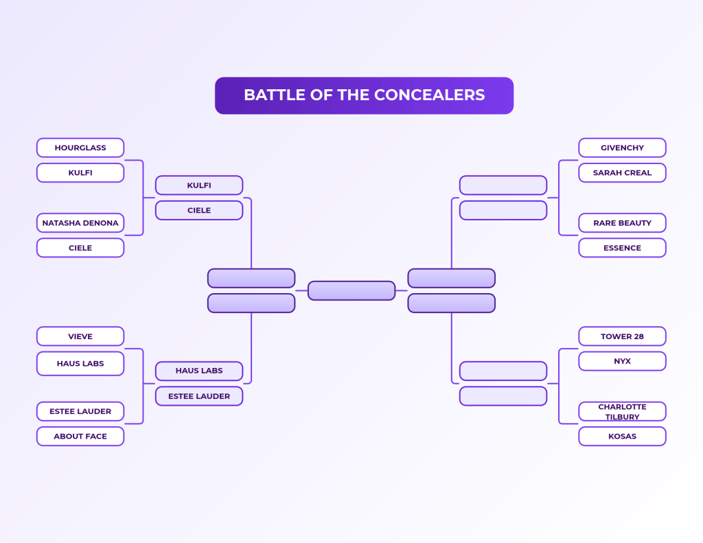
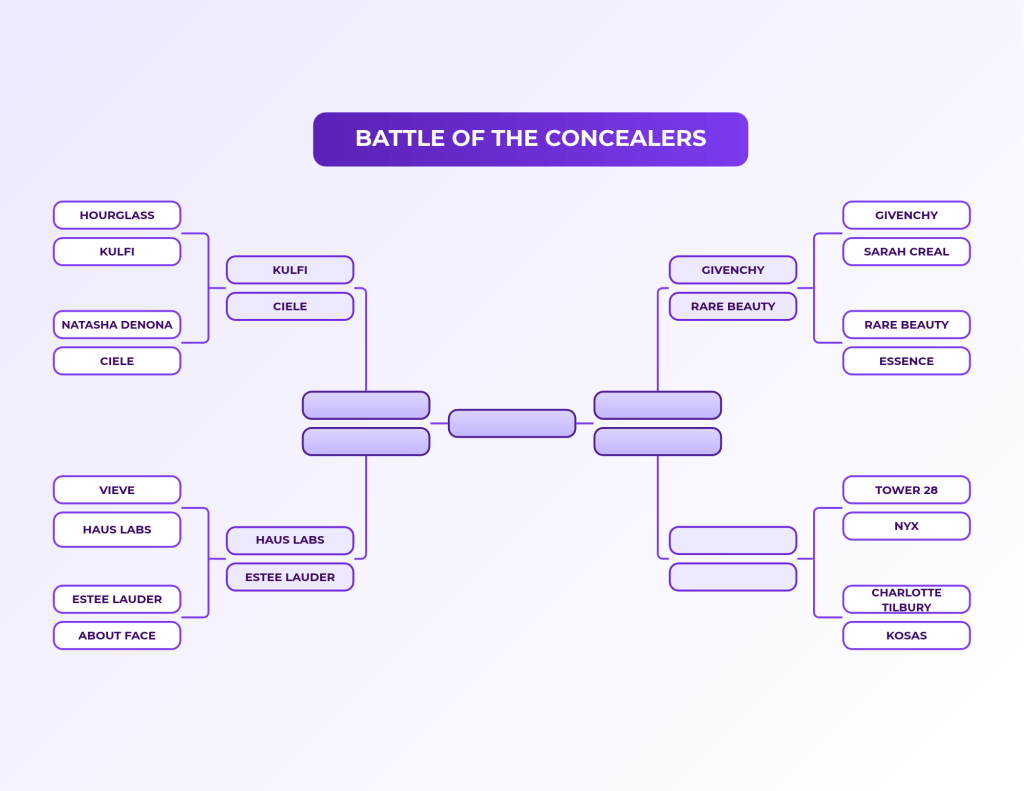
And here’s where we are in the bracket:
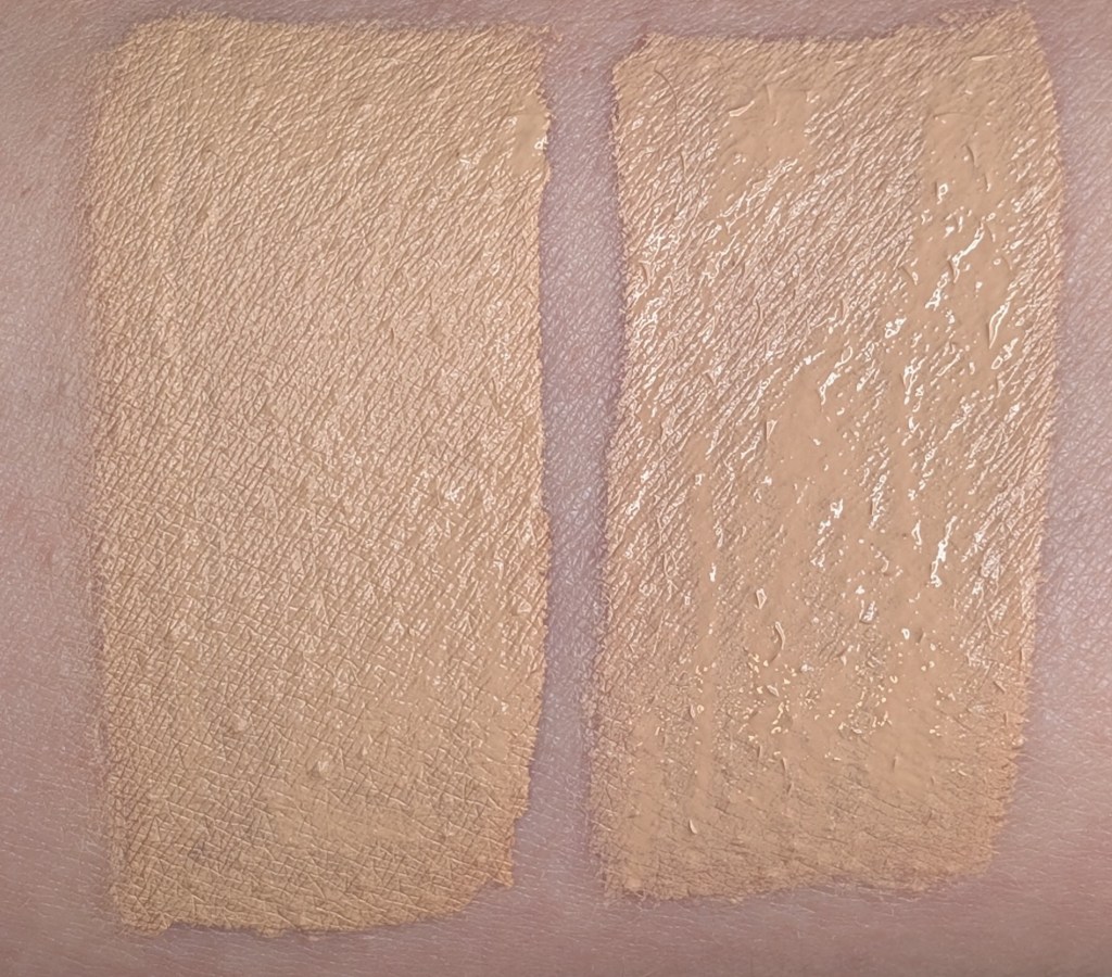
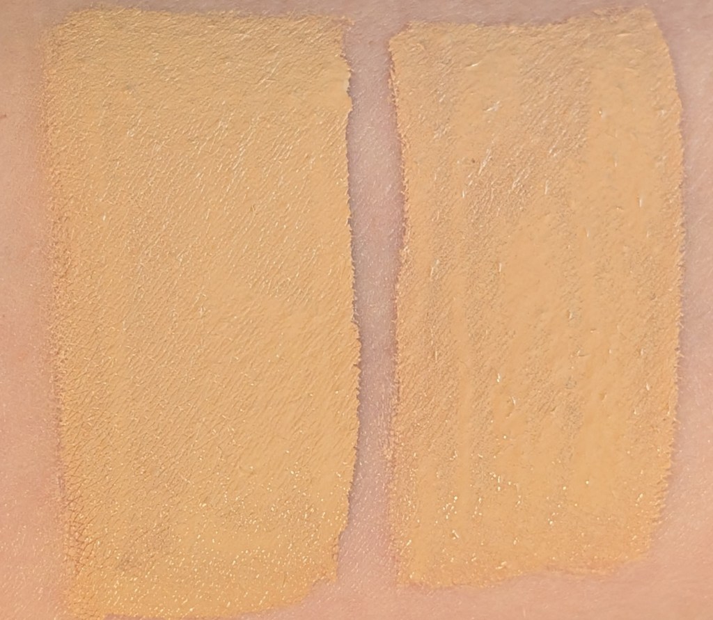
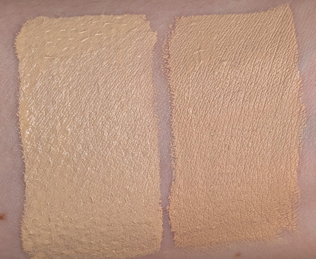
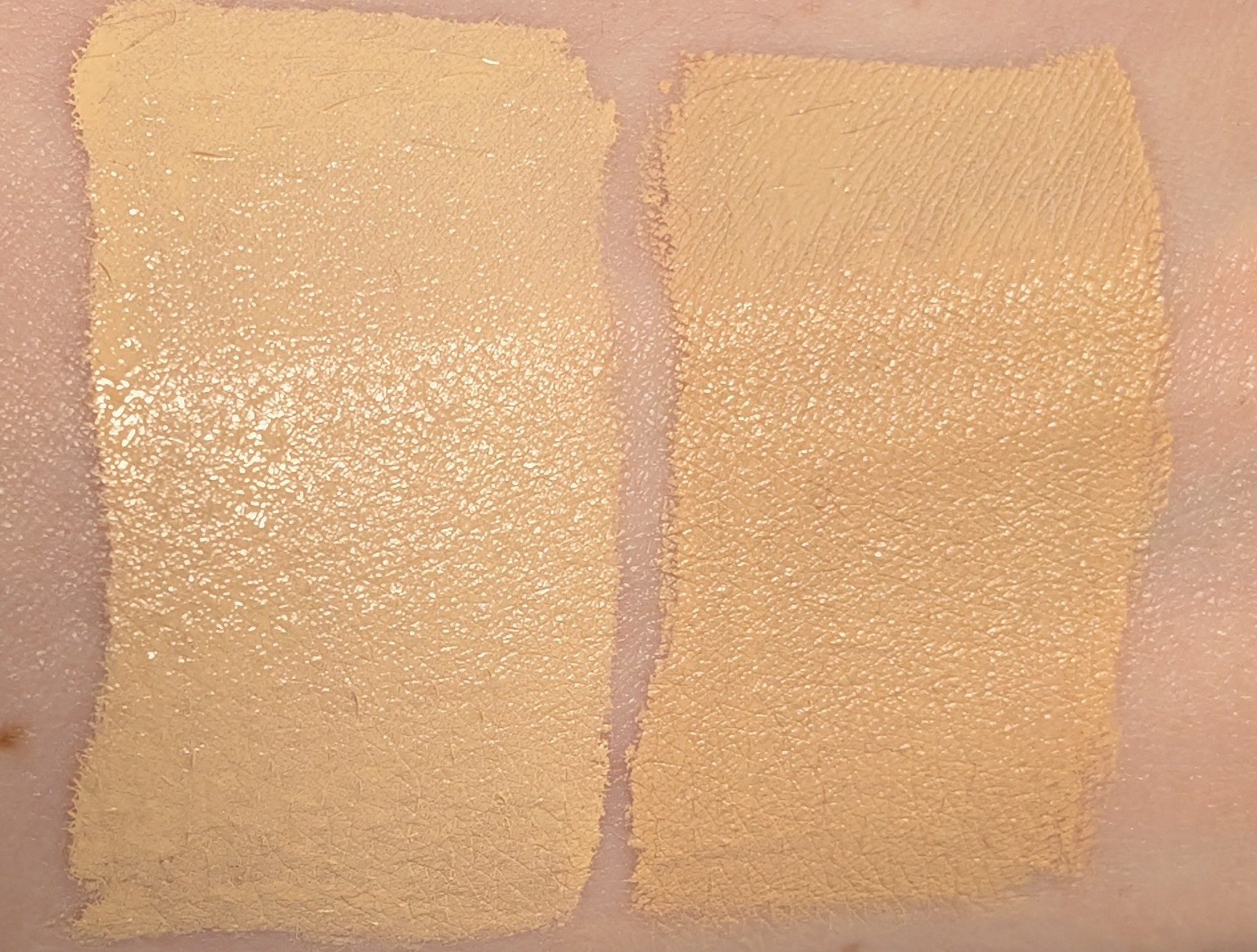
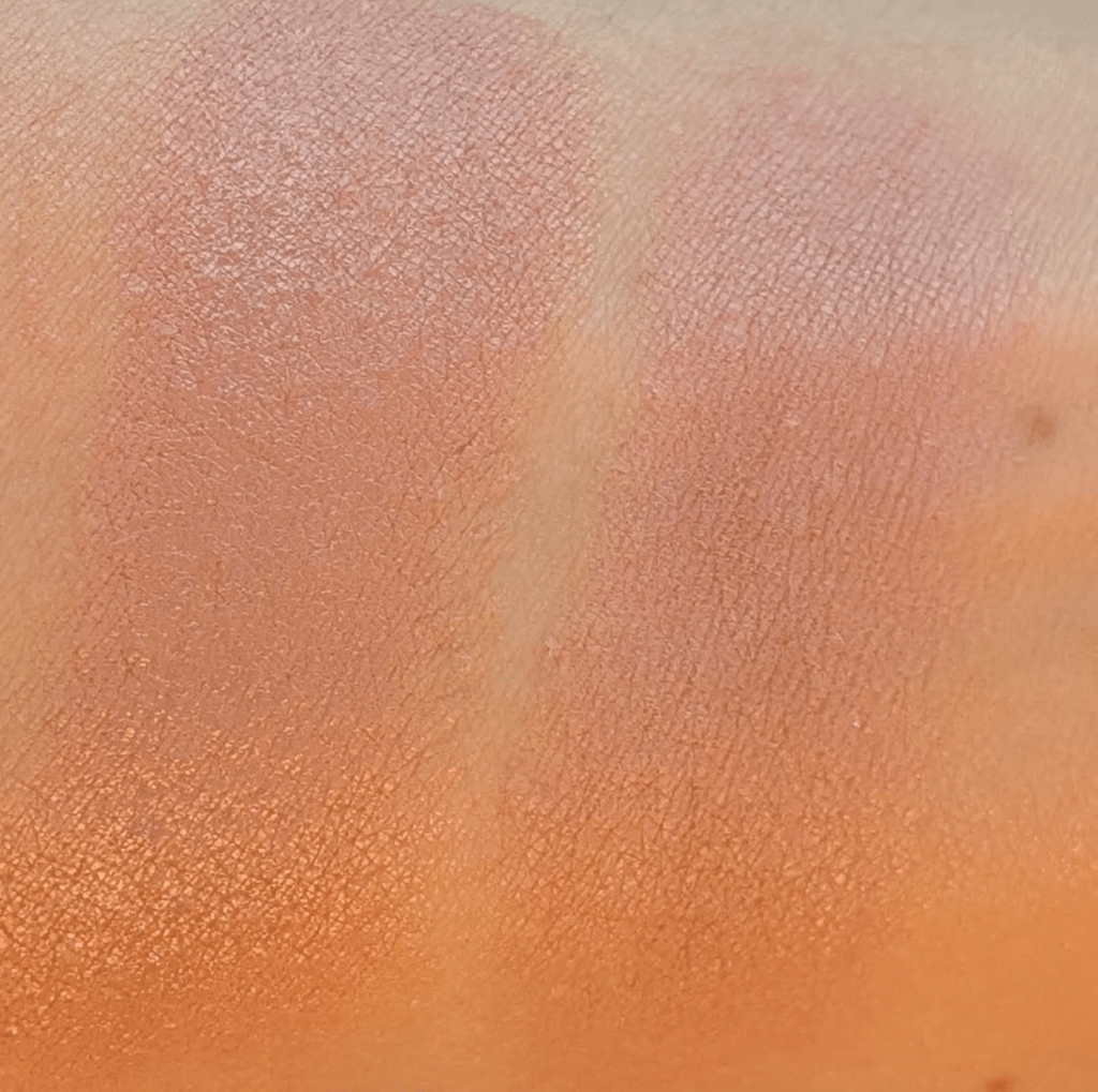
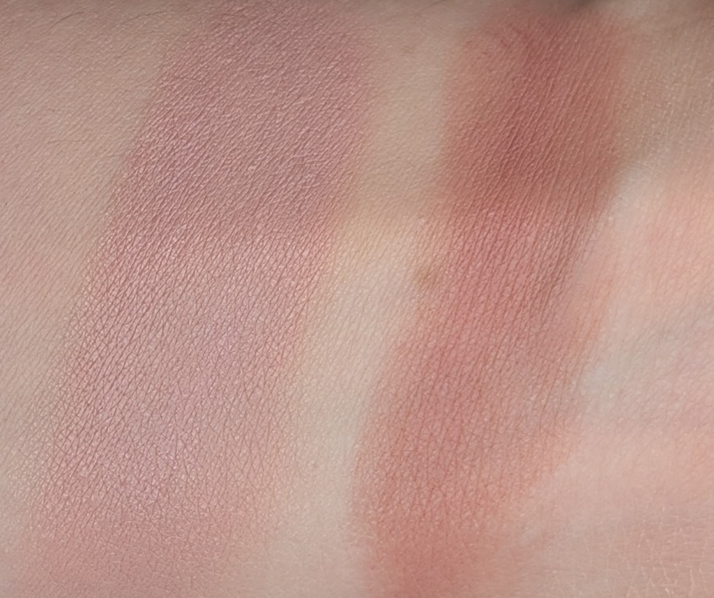
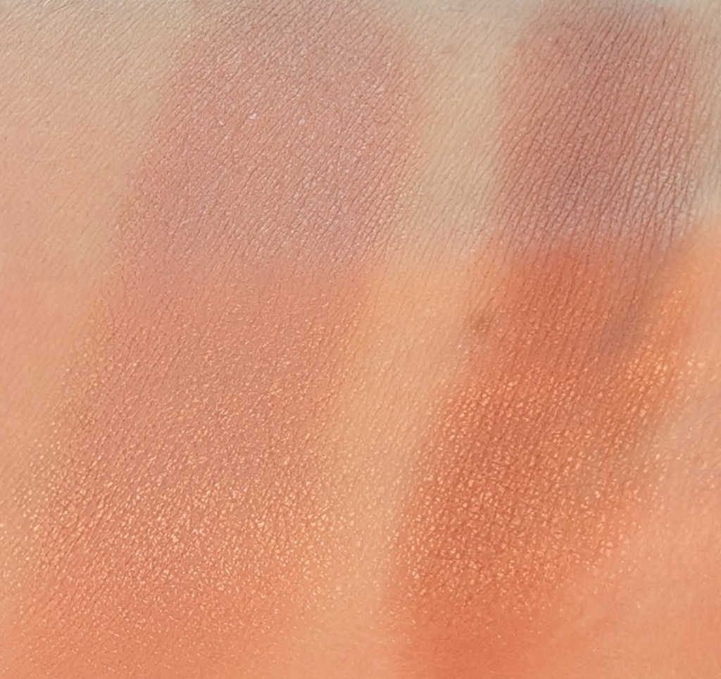
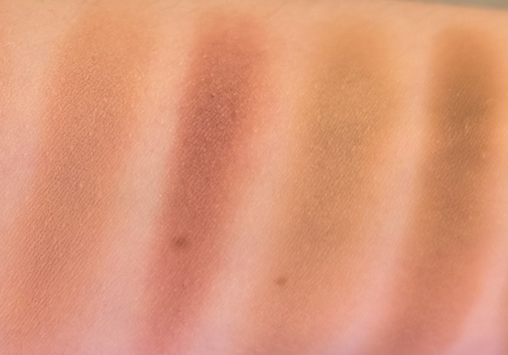
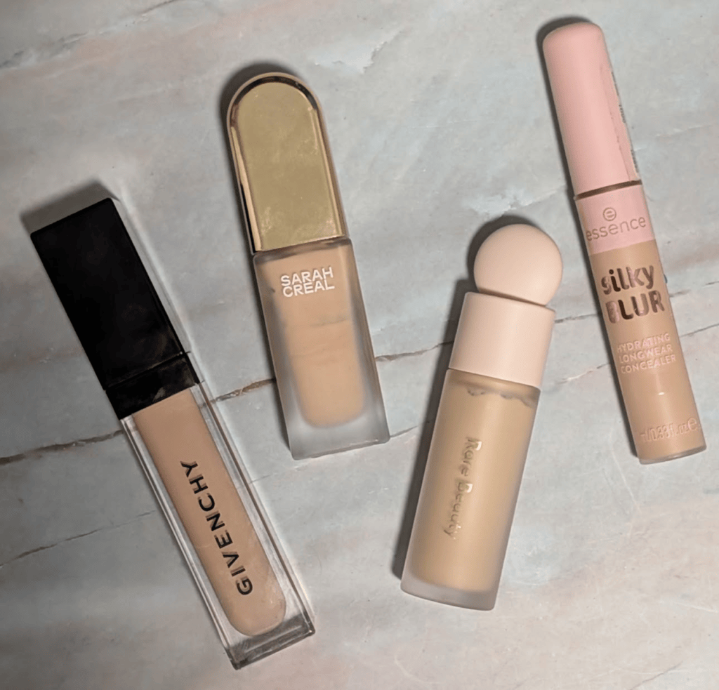
Round 1, Match 5: Givenchy Prisme Libre Skin-Caring Concealer in N95 vs. Sarah Creal Face Flex Concealer & Complexion Enhancer in 2 – I actually love both of these and don’t remember why I paired them together (I’m assuming that’s just the way the votes worked out but honestly I’m upset at past me for sticking to my own rules). I’ve used almost half of my Sarah Creal at this point and this is my second bottle of the Givenchy, despite neither being a great shade match for me. The Givenchy is slightly lighter and peachier than the Sarah Creal, which is a bit more yellow. Neither is particularly olive, although they also don’t claim to be olive shades.
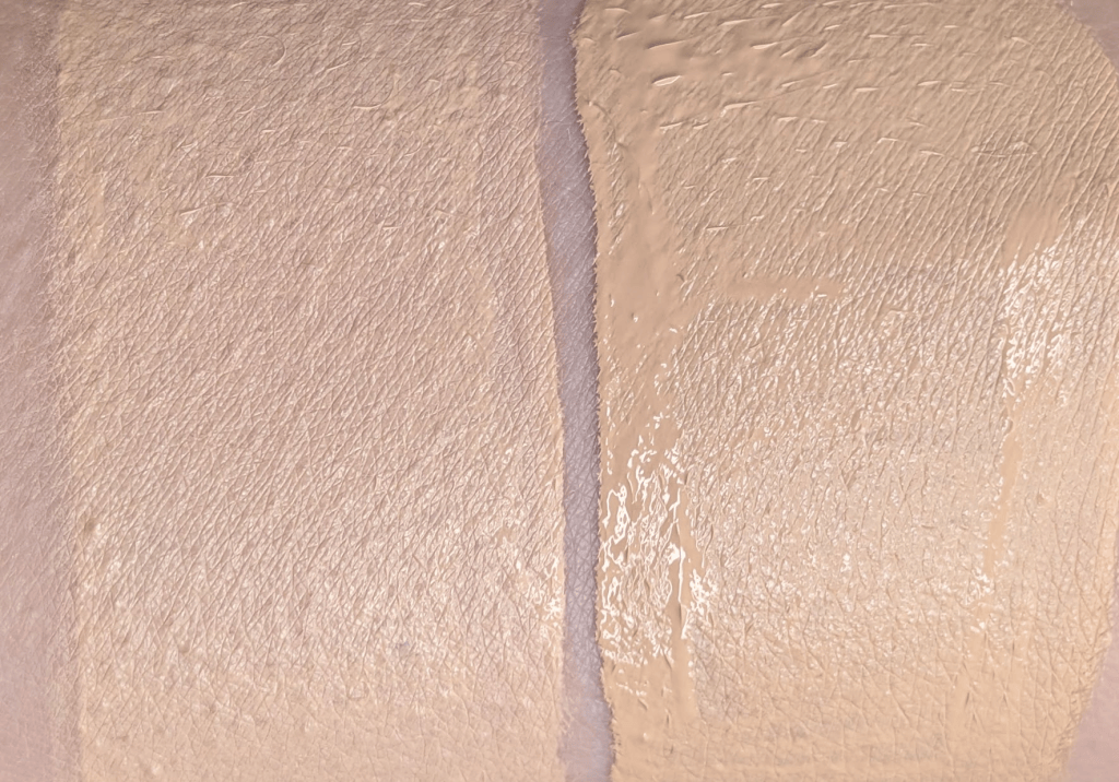
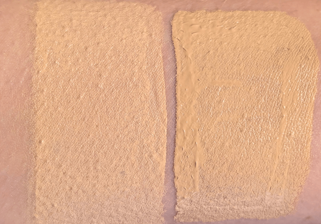
The Givenchy blends out really easily and seamlessly. It’s one of those concealers I can use under my eyes or just keep blending across my face as foundation. The Sarah Creal doesn’t spread quite as much, but it stays where I put it better and keeps its coverage. The Givenchy almost wants to sheer out into a skin tint level of coverage, which is really pretty, but much less of what you want an actual concealer to do (or so I thought). 

Under my eyes, the Givenchy looked smoother and settled into my fine lines less vs. the Sarah Creal, and everyone in my chat picked the Givenchy side in the blind comparison even after I switched sides. I also made my neighbor vote (hi! thank you for reading and voting in person!!) without telling her which was which, and she picked Givenchy too. She thought it looked more seamless and less dry. I had my husband vote, and he actually picked the Sarah Creal, so this definitely wasn’t a totally unanimous vote. Even though I, and almost everyone else except my husband, consistently preferred how the Givenchy looked on my skin, I still really like Face Flex. I  will absolutely keep using mine until I run out (although I now have more than 20 concealers so I may not actually be able to finish any of them). 

The Givenchy also has a surprisingly generous amount of product for a concealer, so while it’s obviously not inexpensive, the price per ounce is better than the initial price tag makes it seem. If this somehow ends up winning the whole tournament, I might actually buy it in another shade because N95 is definitely not the shade I would choose again. So, Givenchy moves on!

Round 1, Match 6: Rare Beauty Liquid Touch Concealer in 170W vs. Essence Silky Blur Hydrating Concealer in 50 – Rare Beauty started off strong with one of the best shade matches of the tournament. I actually bought it because it was one of the few fair/light shades labeled as olive, and it’s also one of the only olive shades that is actually olive. It blends into my skin so well and I wish I could have this shade in formulas I like more (yes, that’s a spoiler). Essence in the shade 50 is much lighter and pinker than I’d like. Even though I bought 50, 70, and 120 after watching a bunch of swatch videos to make sure I got at least one good shade, this is still the best of the three. Luckily it’s inexpensive enough that buying three shades wasn’t the end of the world, but I wouldn’t say I found the olive one or that there even is a shade that would work.
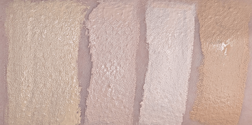
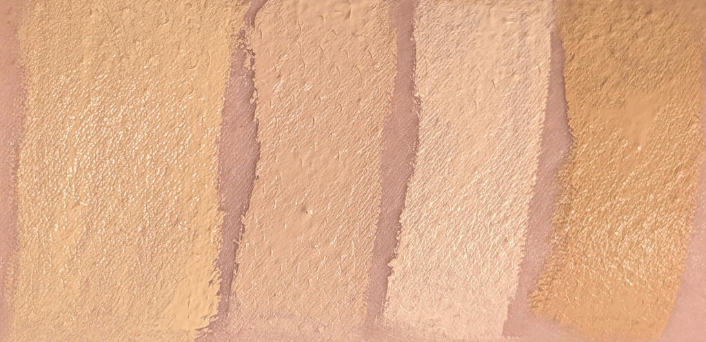
Both of these concealers are super creamy and easy to blend. They have good coverage and look smooth when I first apply them. I honestly thought it was going to be a great concealer day every time I put these on because they both looked so nice. Every time, I was wrong. Within about 30 minutes, I had fading coverage, creasing, and texture on both sides. They started to look dry and cakey, which is so bonkers considering how nice they looked in the beginning. Setting them didn’t help either, and if anything made the dryness and texture more obvious.

And by the end of the day, neither of them looked good. Those problems just got worse and worse, and this happened every time I tried these, even when I switched sides. When I did the vote in my Substack chat, a lot of people picked neither. I got messages saying this was the worst matchup so far. When I switched sides, more people picked the Rare Beauty concealer, but it wasn’t unanimous, and there was still a general vibe of “eh, I’d rather not pick.”

Even though neither was great on me, the Essence definitely lost more coverage and became more visibly dry than the Rare Beauty. I just felt like I could see way more texture, and it broke apart much faster. I know people are obsessed with the Essence concealer, and I was so excited to test it. I review plenty of drugstore/under $20/under $10 products here because I really do think there are so many amazing products in that price range now. But that also means that Essence isn’t going to get any extra points just for being $5 when there are so many amazing drugstore products to choose from. It’s also possible that my skin just doesn’t like it, but I’d honestly rather put that $15 toward one really great concealer than spend it trying three shades of one that doesn’t work for me.

Even though it did get much drier than I would want and it creased a ton, the Rare Beauty did better on the rest of my face than under my eyes. Because the shade is so good, it works better as an all-over concealer/foundation situation than a lot of these other concealers. I suspect it’ll be better for my skin in the summer when my skin is less dry, but it’s still not something I’d say you need to run out and buy. That all said, Rare Beauty moves on for this round!
I also did get the Marc Jacobs concealer and the Lisa Eldridge concealer, each in two shades, because I know y’all want to know (and honestly I also want to know). I’ve already started testing them both, which is why the tournament is getting a little more spread out timewise. I will figure out a way to get them into the tournament, and let me know if you have requests and/or suggestions!
September Reader Requests: This, That, or Neither?

I normally try to stick to 5 products for these monthly reader request posts but you all requested too many products this month for me to review. I decided to do 5 sets of products instead, which was actually a lot more to test and review and also why this September post is landing in October. Don’t worry though – I will still do October reader requests; make sure to leave your requests in the comments or join the Your Green Friend Substack chat!  

In this post, all links are affiliate links (thank you for your support!), but all opinions are my own. Swatches are under a ring light to show true to color (photo #1) and then standard lighting to show the formula a little better (#2) for all the products.

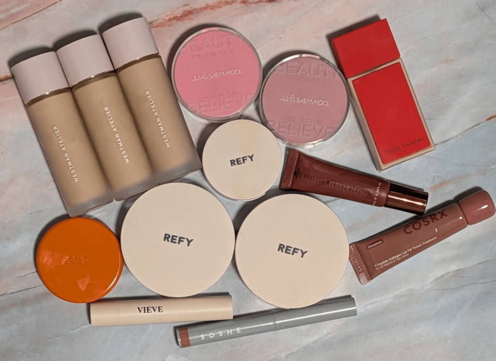
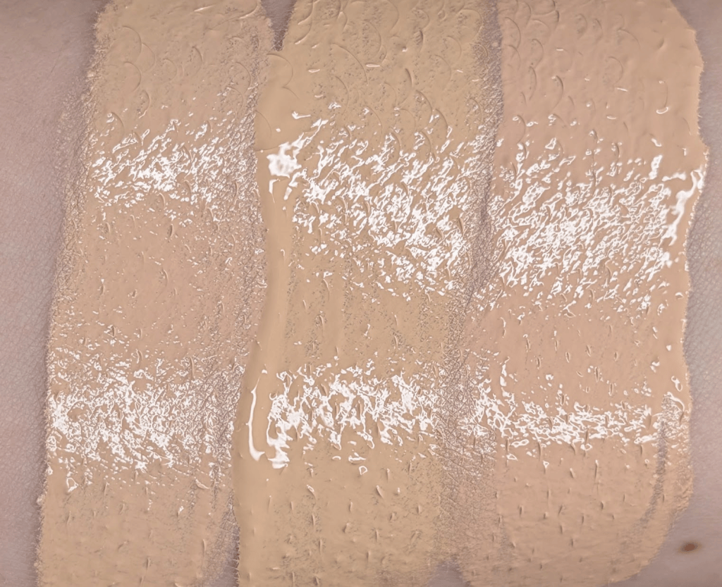
Westman Atelier Suprême Bio-Complex Liquid Foundation With Exosomes + Peptides in F4, F5, and L1 and Hung Vanngo Red Carpet Skin Luminous Longwear Serum Foundation in 5 – I started this journey by buying F5 because y’all wanted to know what I thought about this foundation. I honestly have been wearing it all the time, and if you’ve seen me in person lately, there’s a 90% chance I was wearing this. I honestly love the formula and how it looks on my skin (except for the shade – more on that in a bit). It actually looks better over the course of the day, which is really rare for me since most foundations tend to break up or just look worn off by the time I wash my face. I’ve tested this one through full workdays, including going to the office in person, and have been really impressed with the wear time. I like to apply it with my fingers, but a brush works too, and it’s buildable to full coverage even though it starts off more medium. If there was a shade that matched me, I’d be so happy with this. 

However, even though F5 is definitely the most olive shade of the 3 I have, it’s a very saturated yellow olive. If you’re a cooler olive or teal, be warned how yellow this is. F4 pulls pinker on me and L1 is straight up peach. All the shades feel like they just have a lot of color/pigment in them, even though they don’t look dramatically more saturated than my other foundations in swatches. It’s just when I blend out the foundation on my actual skin, the pigment just stays really present even though it’s not technically full coverage. I wouldn’t even say it’s more pigment = more coverage, it just really seems to stand out against my skin. Because of this, I’ve mostly been mixing F5 with Lisa Eldridge Skin Tint 1.5 to get my “best” shade and most natural look out of this. Otherwise, I mix in some blue to get F5 closer to my actual skin tone but it’s still not quite right. I’m definitely fixing the shade and not the formula, though I still haven’t found something that doesn’t do well with some Lisa Eldridge 1.5 added. 

I also tested Westman directly against Prada LW5 since it feels the most similar to me in my collection. Prada was a little smoother and more blurring and just looked slightly nicer. In side by side comparisons I showed to my friends, everyone voted for the Prada side. If I were buying a foundation of this style again, especially at this price, I’d buy the Prada even though I do really like the Westman foundation. 

And the opposite happened with the Hung Vanngo foundation in shade 5. It’s definitely the best shade match of this group even though it’s still slightly peachy. But even though the shade is pretty okay, I can’t get this to look good. I have tested this so many different times and so many different ways. I’ve tried different application methods, different prep, side by sides with other foundations to see if I’m just seeing things. No matter what I do, I get so much texture and it breaks up on my face so fast. It just looks like it doesn’t want to be on my face.

I’m testing a bonkers number of complexion products right now between this and the concealer tournament, which is why I haven’t reviewed this yet even though it launched in July. And of all the ones I’m testing, this is one of the only ones I’m annoyed I didn’t return so I could review something else for y’all. I know that other people love this foundation (and it’s entirely possible it looks great on them!), but if you tend to like the same base products I do, you might have the same experience I did with this where it just doesn’t want to be a foundation. 

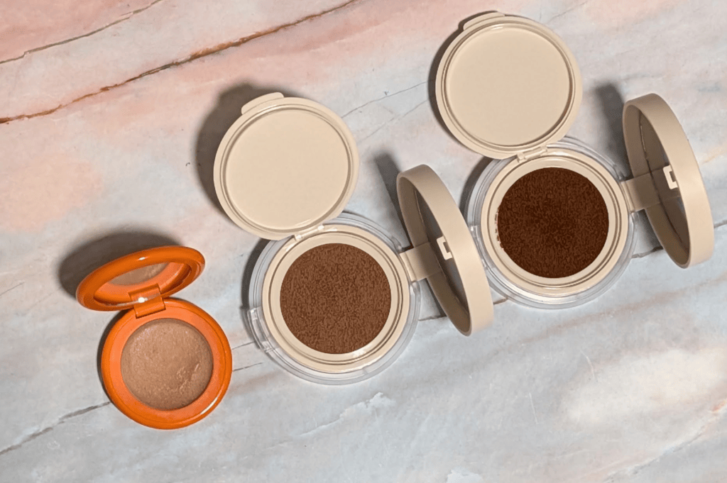
Sarah Creal Just Like Paradise Sculpting Cream Bronzer in 1 and Refy Water Bronzer Liquid Cushion in Cove and Sol – I’ve had the Sarah Creal Just Like Paradise Bronzer in shade 1 for a really long time, and I’ve been putting off reviewing it even though it’s been on my requests list for what feels like forever. Now seemed like the perfect opportunity because it shows the shades of the Refy so well in comparison, and I can finally cross this one off my list. I genuinely love the formula of the Sarah Creal bronzer. It reminds me so much of the Makeup by Mario Soft Sculpt Transforming Skin Enhancer because it has that same lightweight gel texture that sheers out super easily and stays a little dewy. 

Alas, shade 1 is orange on me, and it’s that very specific kind of “oh no, why did this turn orange?” type of orange when it gets onto my face. Even though I know how to work with warmer tones so much easier now, this is honestly just not bronzy on me. It looks like Sarah Creal has added shades to the line since I bought this one, and I’m betting one of those is better, but if you’re wondering if this shade goes orange, it does. 

Editing Rebecca coming back later – I legitimately forgot this was $50 until I was going through adding links. Why is this $50? Unless you absolutely love the packaging (valid!) or the colors are perfect specifically for you, get the Makeup by Mario bronzer if you want this kind of formula.

The Refy Water Bronzer in Cove and Sol are both definitely bronzy but they don’t turn orange like the Sarah Creal does. Cove is more neutral and a little rosy whereas Sol is a bit richer and closer to a more standard bronzer shade – something like Marc Jacobs Light 20. No one needs both, but I actually have used each of them in different looks and been really happy I had both shades. 

I absolutely love the cushion format for a product like this. It’s so much easier than dealing with a traditional liquid bronzer since I can just tap a brush in the cushion and blend it out on my face. This formula is super blendable and easy to work with. It sets down to a skinlike finish that isn’t too matte or dewy. I have basically stopped reaching for my regular liquid bronzers since getting these. Make sure you actually close them because cushions can dry out; other than that, I highly recommend these. 

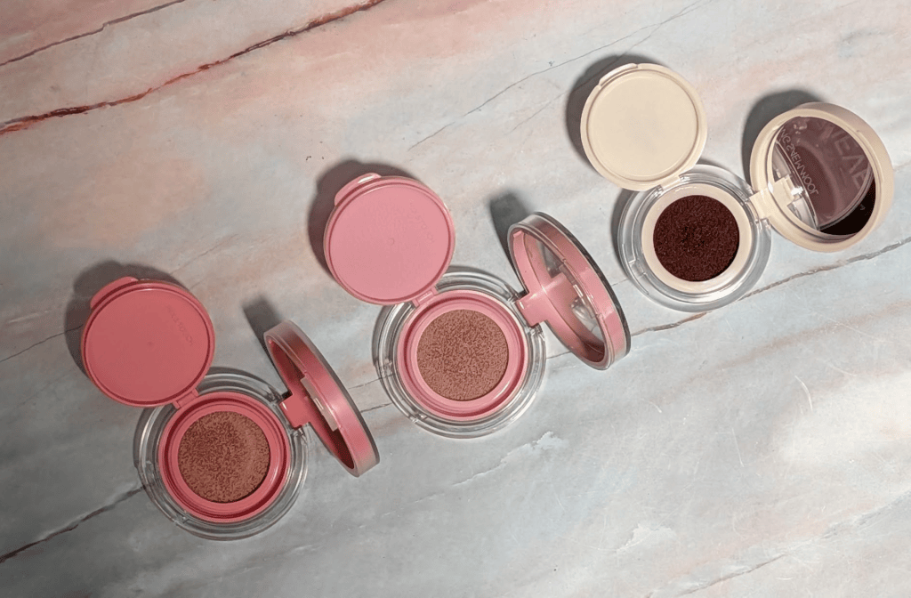
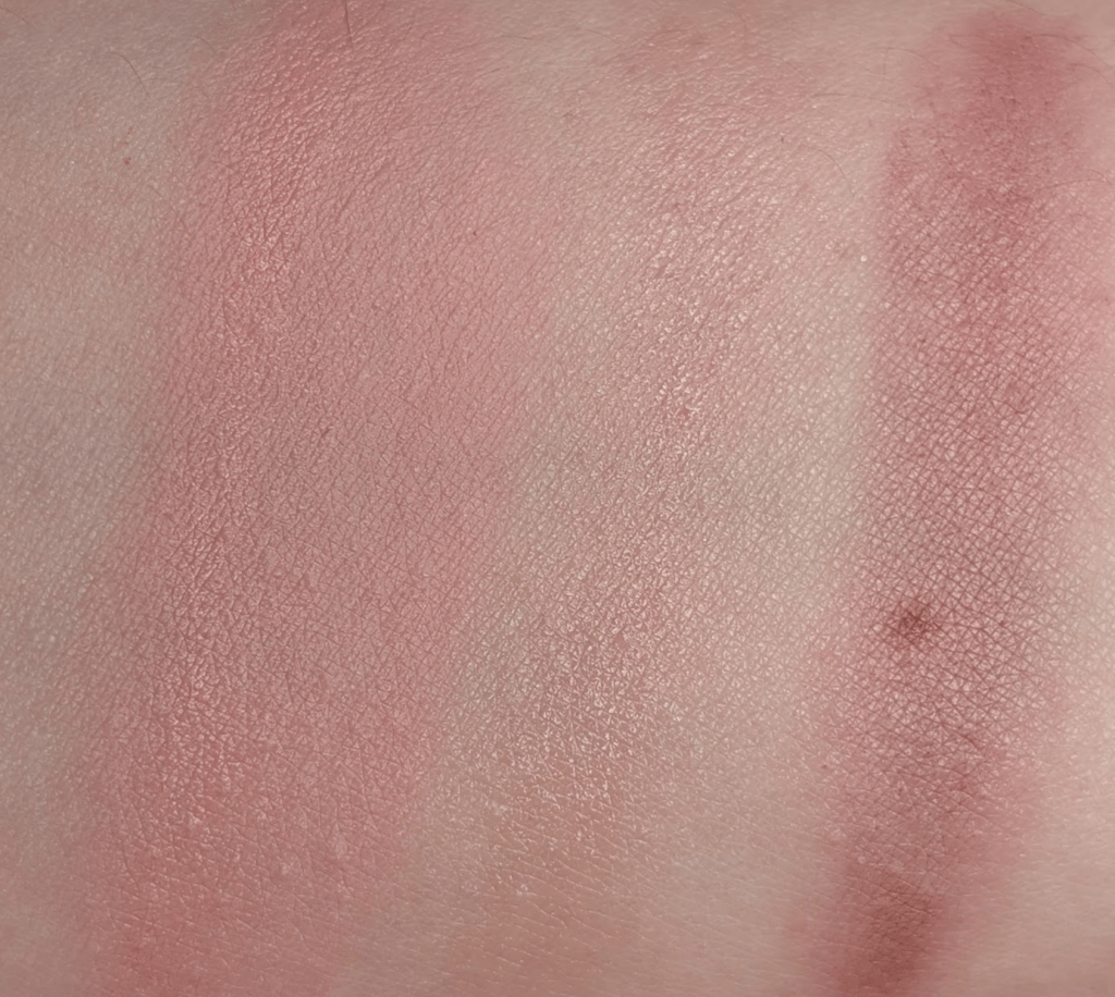
Jung Saem Mool Artist Cushion Blush Blur in Rosy Petal, Artist Cushion Blush in Odd Mauve, and Refy Water Blush Liquid Cushion in Acai – I actually got two formulas of the Jung Saem Mool – the Cushion Blush Blur and the Cushion Blush. I was hoping to try these because the brand launched at Sephora, but I might have actually gotten shades that are exclusive to Yesstyle. Either way, I prefer the Cushion Blush Blur because it has much better pigmentation (though that could just be the shade I got), and I like the blurring and matte but not too matte finish. Like all the cushions, it’s super easy to tap a brush in or use the included cushion and blend the blush on to my skin. Rosy Petal is brighter and more coral on me than I expected, and it’s just not my favorite pink. I probably should’ve gotten Fuzzy Lavender, but I think that one might have been too light. 

The Cushion Blush is so sheer. I love this color in theory, but I just can’t see it. I love mauve shades because they almost always are super natural looking beigey pink on me, but this is just so sheer it’s barely anything at all. If you’re looking for something barely there and impossible to overdo, you might actually love this. I personally want this shade but more pigmented, which luckily I already found in a cushion formula I love that’s less than $5. 

I was surprised but the Refy Water blush is actually my favorite of these. Acai is a beautiful berry brown that doesn’t go orange, and it’s exactly the kind of shade I’m looking for in the fall and winter. It has enough pigment to show up without being impossible to use/blend. The formula, like the rest, is so easy to use. All three wear about the same on me throughout the day, and so it’s more down to the sheerness and shade. Acai wins by a landslide between these for me. I really hope that Refy comes out with more shades. 

Soshe Precision Sculpting Stick in Drift and Vieve Silhouette Stick in Light – Hopefully you can see by the swatches what’s happening here. Soshe is on the left, Vieve is on the right. I chose the shade Drift in the Soshe because it’s the light to medium shade, and I’m normally around there or what ends up being shade 2, at least for my correct depth across bronzer and contour type products. The depth here is probably right, but it’s so orange. Not only do I not understand how this could be a contour, I couldn’t even use it as a bronzer. I love Soshe – you’ve read about them here a ton, and their blushes and bronzers are some of my favorites. So I was fully expecting to love this, and yet, it’s one of the most Cheetoing Cheeto products I’ve tried in a while. 

Transparently, I haven’t tested the formula that much because honestly how am I supposed to use this as a contour. Even adding a little bit of blue, it’s nowhere near a believable contour shade. So, the formula might actually be incredible, and I’d just have no idea. Leave me a comment if one of the other shades is actually great because I am always happy to test something again, but otherwise, the shade made it so I couldn’t really tell you if it’s a great formula or not.  

The Vieve Silhouette Stick in Light is a much better color that’s cool enough to function as contour. It has a little bit of that purple nuance that I love to have in a contour so it can be cool without being too grey. But it can also warm up enough when I blend it out that it’s more of a brontour than a contour. The formula is super easy to throw on and blend without it sheering out to nothing. The stick format is really convenient, and it’s emollient in a good way. I’m happy I bought it, and for most people, I think this could be a great contour shade. I just know I make things go very orange so I’m pulling out all the warmth it has. 

As a comparison, I swatched these next to my favorite contour which is the Judydoll Liquid Contour in 02. You can see that it’s green grey enough that it’s literally a shadow on my skin. Formula wise, I think the Vieve is easier to use and blend because it’s such an easy cream to work with, but the Judydoll color is so good. The only one I really don’t recommend is the Soshe. 

COSRX Peptide Collagen Lip Film Tinted Treatment in Cinnamon and Danessa Myricks GlossWork 4D in Honey Coco – These were actually some of the most requested things this month because apparently y’all need more lip balm reviews. And don’t worry – there’s even more lip balm reviews coming.  I think I would’ve really liked the COSRX in a vacuum. It’s super comfortable, it’s not sticky, and Cinnamon is a really pretty pink. It’s objectively nice, and I’m 0% surprised there’s a bunch of hype around it. It’s just that compared to the Danessa Myricks, it doesn’t feel as unique or special. 

Honey Coco is a much more interesting color on me. It’s such a nice nuanced rosy brown that’s the color I’m usually looking for but have trouble finding. This shade looks especially nice with the Refy Acai blush. More importantly, the formula feels more nourishing and longer lasting than the COSRX. It just feels like it’s more substantial and I’m getting more out of it by using it. The plumping part is super mild and not uncomfortable, but my lips definitely look nice when I’m wearing it. 

The COSRX is super nice, but just feels like a very good lip balm like all my other very good lip balms. When I put it on, I was like “yes, this is a great lip balm.” When I put on the Danessa Myricks, I was like “wow, I really want to try this in more colors.” And I probably will. If you want to know whether I’d recommend the Danessa or Eadem or Ole Henriksen, I refuse to choose, you can’t make me, and I will be using all three. I promise I will maintain a top three from here on out though so I will kick one of these out if something fantastic comes along. 

Don’t forget to let me know if you have requests for October!  As always, some links may be affiliate links that support the blog and some products may have been gifted, but all reviews/opinions are completely my own and unsponsored. 

Natasha Denona I Need a Cool Is the Neutral Palette I’ve Been Looking For

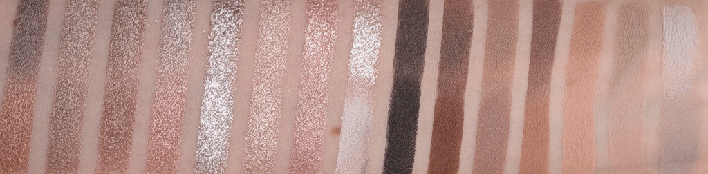
I have a problem with neutral eyeshadow palettes where I look at them and think “oh look, a normal brown”, and then I put them on my face and everything is orange. As an example, I Need a Nude is much peachier on me than I thought it was going to be and I Need a Tan is extremely warm (as expected, I know, I shouldn’t have bought it). Unsurprisingly, I Need a Gold also has plenty of shades that go orange. I was really hoping I Need A Cool would be the neutral palette for me from Natasha Denona, and it turns out that it is. Since I won’t come back around to this, saying upfront that the Xenon palette is my all time favorite cool-toned Natasha palette, but it’s a very different kind of palette than I Need a Cool. 

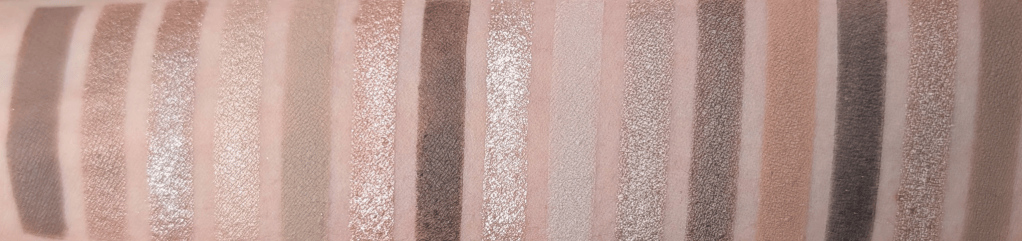
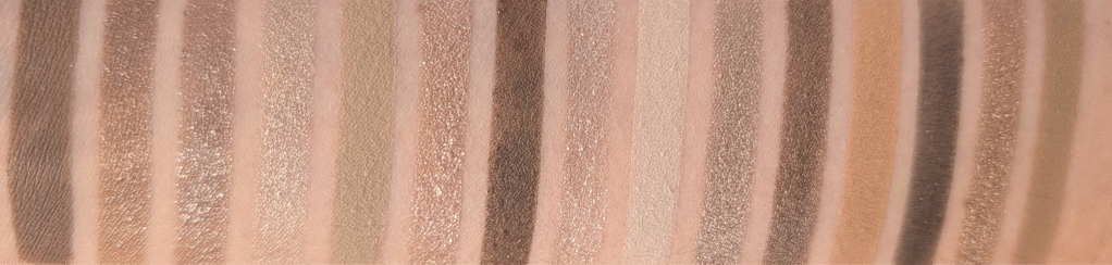
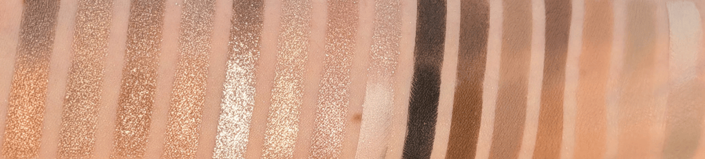
In this post, all links are affiliate links (thank you for your support!), but all opinions are my own and I bought all these products myself. Swatches are under a ring light to show true to color (photo #1) and then standard lighting to show the formula a little better (#2) for all the products.

I Need a Cool vs I Need a Tan

I’ve seen other people say this palette is too gray or ashy, and after actually wearing it, I completely understand what they mean. I think I’m pulling basically every ounce of warmth out of these shades and they’re still landing somewhere around neutral-to-cool on me. If you don’t normally make everything turn orange, I can absolutely see this looking much grayer on you than it does in my swatches so I wanted to warn everyone up front that this is, in fact, a (mostly) cool palette. 

I personally tend to veer towards pink, purple, berry, and navy types of shades when I go for a cool toned look. This palette is very specifically a gray, mushroom, silver, taupe version of cool, and I honestly  don’t own that many palettes that have these kinds of shades. I’ve really liked the looks I’ve been wearing with this palette even though it’s weirdly a bit out of my comfort zone. I’m already excited to wear this with berry blush when it gets colder, and it turns out these shades look great with a bright pink blush just like warmer shades do. 

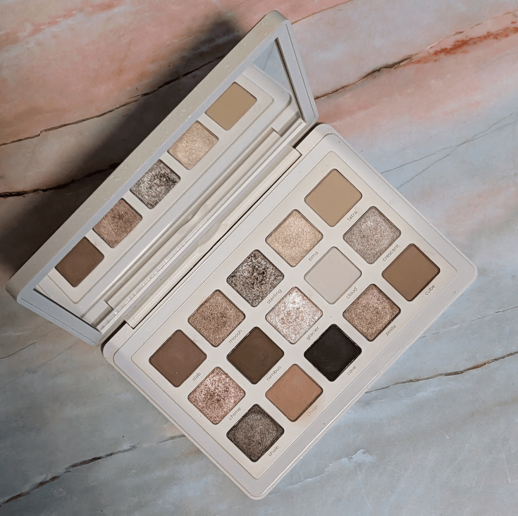
Natasha Denona I Need A Cool

Formula-wise, I’m still not the biggest Natasha Denona matte person. I know people LOVE these mattes, but they have a stick-to-it-ness that isn’t really my preference. Once I put them down, they want to stay exactly where I put them, and I prefer a silkier matte that I can move around more easily, like the mattes in the YSL quads. They’re still good mattes, but I think they really benefit from a natural hair brush and being used to working with this type of formula. 

The super sparkly shimmers and metallics, as usual, are stunning. They have a lot of dimension and just look blingy, for lack of a better word. They’re easy to use with a finger or a brush, and they wear really well on me. The smoother shimmers are exactly what you want for a sophisticated (meaning I had 30 seconds to get ready for this 7am meeting, and I don’t want it to look like I’m covered in glitter) type of look. 

A short detour to look at each of the shades individually:

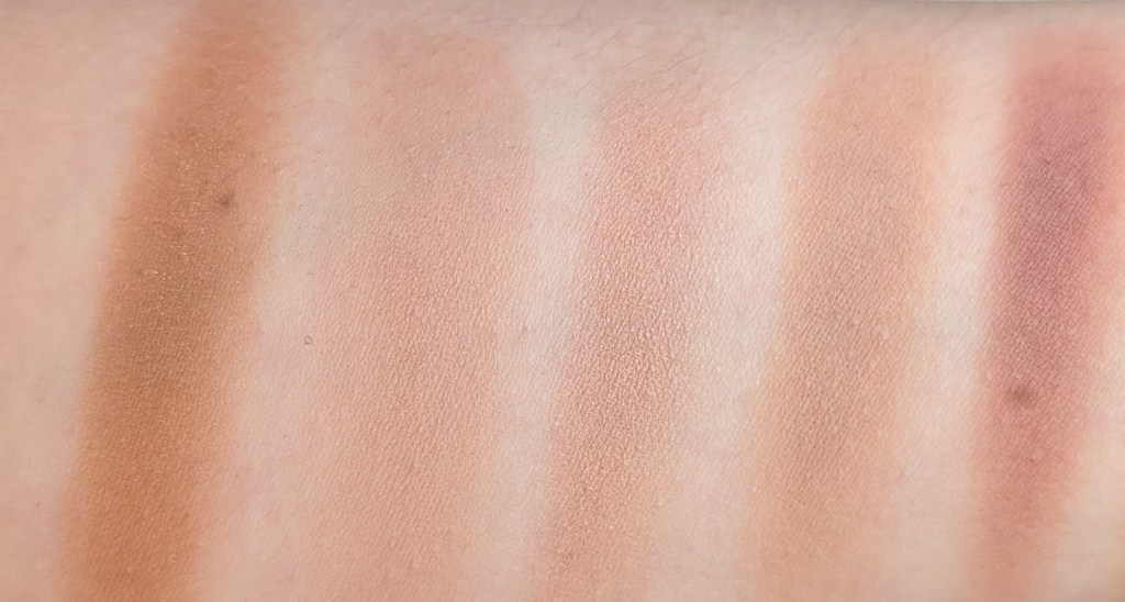
Slab, Moosh, Sterling, Zima, Tatra

Slab – This is my perfect midtone brown matte that doesn’t go even a little orange. It has a little gray-green thing going on if you look really closely, and it just works so well with my skin. I can wear this as a one and done matte look so easily. I wouldn’t say buy this palette for this shade, but I wouldn’t be mad if I could buy this as a single. 

Moosh – This is a smooth taupe shimmer that’s less sparkly, but easy to wear alone. It’s one of those neutral browns that always turns orange on me, except this one doesn’t.

Sterling – This is one of my favorites in the palette. It’s a taupey brown with a chunky silvery metallic reflect that I just want to pile on my eyes (and I have many times). Another one that I’d totally buy as a single. 

Zima – This is somehow the least special shade in here even though it’s not a matte. It’s a champagne shimmer that pulls a little gold on me, and I feel like I already own this shade 400 times. Spoilers – it’s also the only shade I found an actual dupe for in the Stone Cold Fox palette. 

Tatra – This is one of my favorite mattes in the palette. It’s a muted stone/khaki/beige transition shade that does what I always want a camel brown to do because Tatra doesn’t turn orange.  

Chime, Nimbus, Glacier, Cloud, Crescent

Chime – I love this one. There’s a little pink in it, but it’s almost silver when I get it on my eyes. It’s mostly just really shiny and sparkly, and the silver reflect keeps it from going too peachy. 

Nimbus – This is the darkest brown matte in the palette, and it honestly swatches pretty badly. It works much better when I’m actually working with it, and I really like using this as a subtle liner because it doesn’t show up too strongly and I have room to build it up. 

Glacier – This is a very pale and icy sparkly shade. I like this much more as a topper or brightening shade than using it alone. This is also the shade that I get the most fallout with, so I have to be a little more careful. 

Cloud – This is a super pale mushroomy off-white matte. I thought I would use this a lot to blend things out, especially because it’s almost a little green, but I just really haven’t. This is also one of the shades that can make a look go from neutral to “wait why is this so gray?” pretty quickly.

Crescent – This is a really nice taupe brown metallic that doesn’t go orange. It’s pretty and the formula is very nice. 

Shale, Chisel, Cove, Zelda, Cube

Shale – Similar general territory to Crescent but much deeper and browner, and I like Shale so much better, I really haven’t used Crescent. 

Chisel – This is the actually warm shade in the palette especially relative to everything else. I don’t even know that I would call it particularly warm if it were sitting somewhere else, but next to everything here it definitely is. I like having it for when I’ve accidentally gone too gray and want to pull things back a little without going too orange, but it still feels a little out of place. 

Cove – This is the deepest shade. It’s more of an almost black than an actual inky black, which is nice if you’re afraid of using a super pigmented black shadow. If you’re used to that though, this might be a little disappointing.

Zelda – A smooth taupe-brown shimmer (yes, another one!). It’s pretty, and I would happily wear by itself.

Cube – Another mid-tone taupe/brown. It’s deeper and browner than Tatra, but they’re close enough in what they do for me that if I were making this palette, I probably would have put something else here.

Most of the looks I’ve made are some variation of taupey brown with sparkle. Sometimes they’re more pink, sometimes more gray, sometimes a little khaki, sometimes very silver, but they’re all the same vibe. That doesn’t bother me when it’s so obvious that’s what you’re getting with this kind of palette. If you want to wear that kind of look every day, you’re gonna love this palette. 

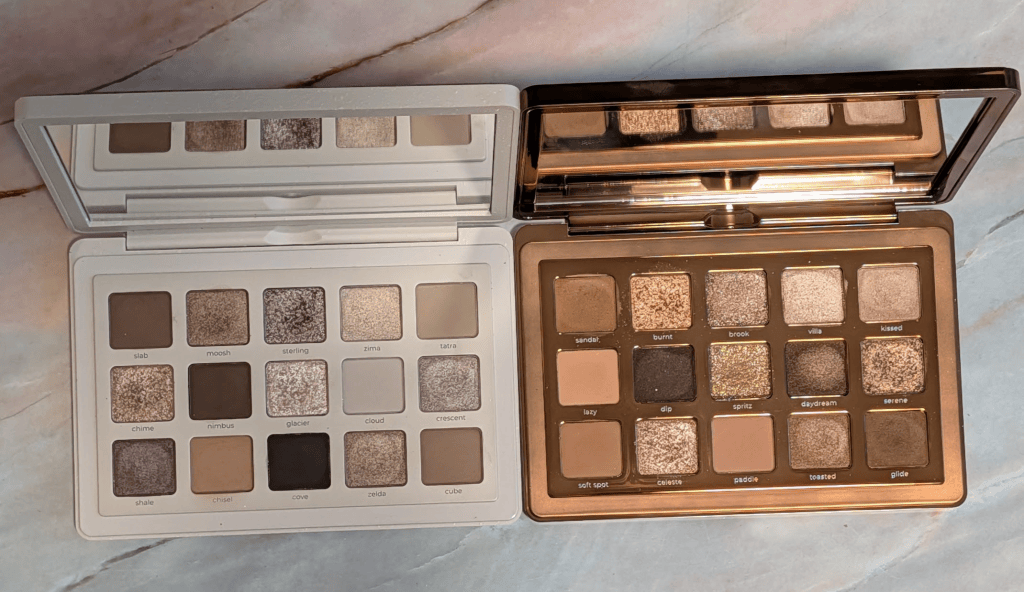
And now, the real reason you’re here, comparison swatches! 
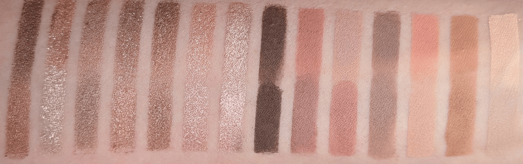
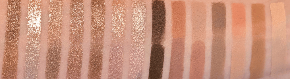
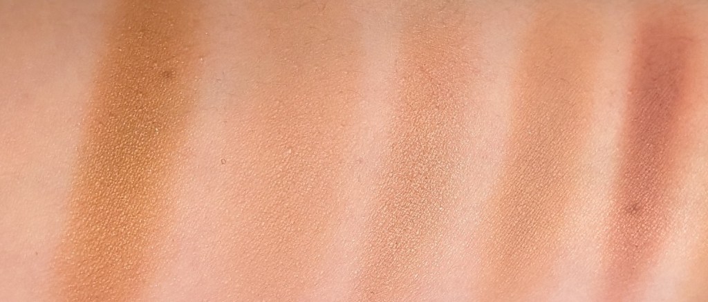
The Natasha comparison that makes the most sense to me is I Need a Nude, because I Need a Cool is basically what I wanted I Need a Nude to look like on me. I Need a Nude is really pretty, but so much of it ends up being really peachy on my skin. When I swatched all 15 shades next to each other, I Need a Nude was noticeably rosier and peachier vs the gray/taupe/mushroom tones in I Need a Cool.  

I Need a Cool on the top and I Need A Nude on the Bottom

If I Need a Nude already looks beautifully neutral on you, then I can absolutely see I Need A Cool being too grey for you. If I Need a Nude is orange on you, then I think I Need a Cool might be exactly what you’re looking for. 

And then obviously there is Colourpop Stone Cold Fox. I matched 15 shades from the two palettes and when I swatched them all together, the overall color stories looked much closer than I expected. There aren’t 15 actual dupes, but I truly think you can get pretty close to both I Need a Nude and I Need a Cool with the shades in Stone Cold Fox. Even though they’re not exactly the same, they’re very very similar. And by they’re, I do really mean both I Need a Cool + I Need a Nude = Stone Cold Fox. 

I Need a Cool on the top and Stone Cold Fox on the bottom
I Need a Nude on the Top and Stone Cold Fox on the bottom

I personally reach for I Need a Cool more than I Need a Nude and Stone Cold Fox, especially because I like the Natasha shimmers more and the I Need a Cool tones more. If I already had Stone Cold Fox and liked it, I definitely wouldn’t feel like I had to immediately buy I Need a Cool too. And if you’re looking at all of these gray-taupe-brown shades and have no idea whether this is something that could work for you, Stone Cold Fox is a much cheaper way to experiment. Especially because Stone Cold Fox is under $30 right now, and each Natasha Denona Palette is $72.

I used Ulta points to get I Need a Cool and I would happily use my points on it again. Actually, if I could go back in time, I just wouldn’t buy I Need a Tan and buy this instead. I knew I Need a Tan was probably going to be too warm when I bought it, but I wanted to review it anyway, and now I feel guilty every time I see it because I just don’t want to use it enough to even finish the review (I did post swatches in my Substack chat, please comment if you want me to find them!). With I Need a Cool, I keep wanting to use it and have to force myself to use other things I’m also testing. But of course, if you already have your perfect silvery taupes, mushroom browns and neutral mattes that never go orange, you may truly not need this. 

Ultimately, I do think this one is worth getting if you have also spent years wondering why every “neutral” brown palette looks orange on you. If my toddler hid this somewhere in my house and I couldn’t find it again (he would never, but hypothetically), I would buy another one. A lot of my other palettes, I wouldn’t miss. 

The Pink Blushes That Let Me Wear Warm Eyeshadow Without Turning My Whole Face Orange

I’ve been wearing way more warm eyeshadow lately (I know, who is she?). This started because Rose did a look with MAC Venom as a welcome to fall type look, and she looked incredible. My husband had actually just picked out Venom for me to review, and I remember looking at it and thinking there was absolutely no way I was going to make that color work. But Rose paired the warm eye with a pink blush, and it looked so pretty that I decided I had to try my own version.

I loved the look so much that I was sending pictures of myself to basically everyone I know, and then started experimenting with pink blushes and gold, bronze, warm brown, and all the eyeshadow I normally think I can’t wear. I’ve been wearing some version of this almost every day, and these are the 5 blushes that I’ve found work the best for this look. These are blushes that still look pink on me, but are warm enough that they still feel like they go with a warmer eyeshadow. 

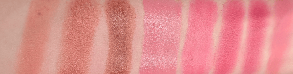
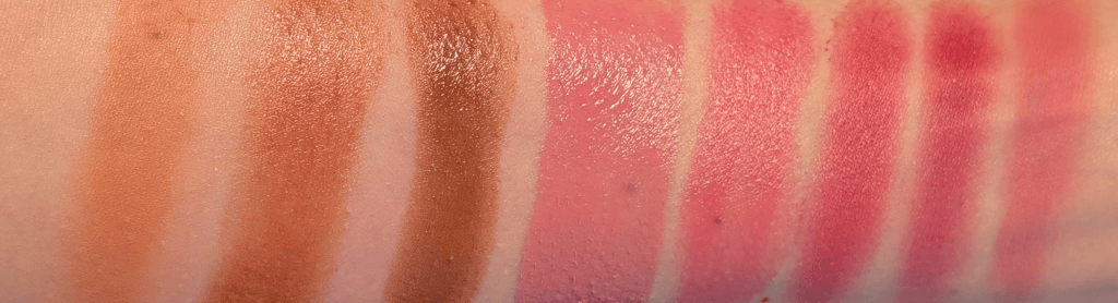
In this post, all links are affiliate links (thank you for your support!), but all opinions are my own and I bought all these products myself. Swatches are under a ring light to show true to color (photo #1) and then standard lighting to show the formula a little better (#2) for all the products.

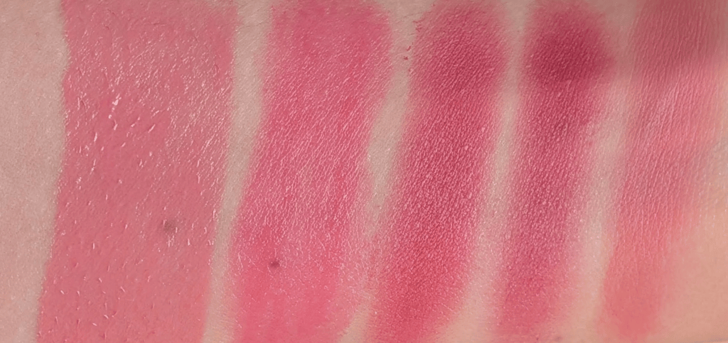
I swatched A’PIEU Juicy-Pang Jelly Blusher in BE02, Merit Flush Balm in Fox, and Haus Labs Color Fuse Glassy Blush Balm Stick in Glassy Cinnamon next to the five blushes I’m talking about today so you can see what I mean. The five blushes in this post definitely lean warm on me, but they’re still very pink and not orange. For fall, I actually do want to be a bit of a pumpkin, just not a Dorito. Warmth is good sometimes! But I know that I can’t go all the way to coral/orange/peach without it being A LOT warmer than I was planning on. 
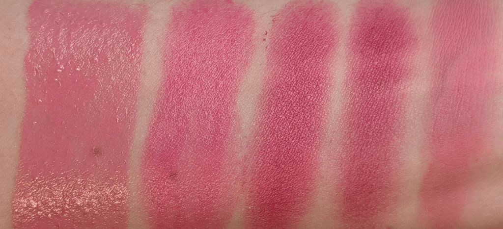
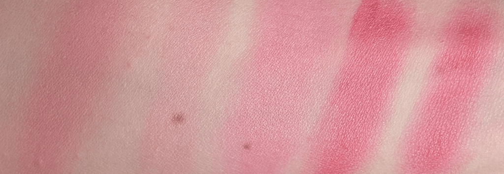
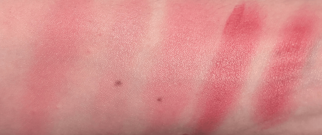
And a closer swatch of the five blushes in the order they’ll be reviewed below:

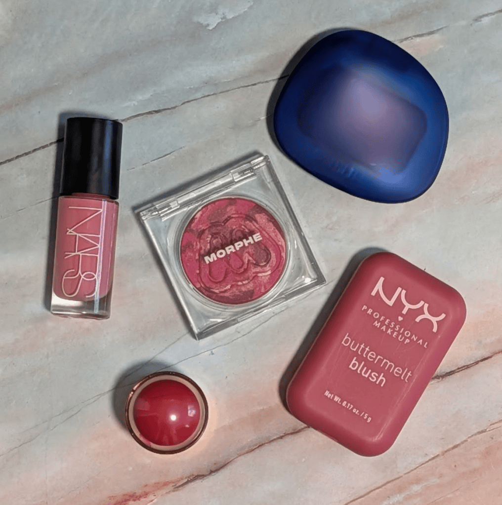
Nars Insatiable Longwearing Liquid Blush in Fast Ride – This is the one I’d recommend trying if you want to play with this look without putting on a very, very bright pink. It’s actually the one I used with Mac Venom and loved that kicked off this whole thing. Nars calls Fast Ride a cool pink, but on me, your very green friend, it really doesn’t look cool at all. 

As a comparison, Rare Beauty Daydream is described as a muted cool mauve, and on me that turns into what I would actually consider a cool pink. Something basically needs to start as a cool mauve or purple to actually end up cool pink on me. So, if it’s described as cool pink, it’ll probably just be regular pink like Fast Ride. And if the brand is already calling it warm pink, we are probably headed toward very orange. Since I started trying all these “cool pinks” that are actually just pink (or even a little warm) with warm eyeshadow, I’ve found a place for them all instead of just going “ugh they said this was cool and it’s not cool what now.”

The Nars liquid blush formula has that serum-y gel texture that’s really easy to work with. It blends out very easily and evenly, and I haven’t had any patchiness or other issues. It also doesn’t completely dry down like a matte liquid blush. It keeps a little bit of luminosity and has a really pretty skin finish. I’m not a huge liquid blush person, so I’ve been surprised by how much I’ve been reaching for this one.

Merit Flush Balm in Le Bonbon – This looks really bright when you swatch it, but the Merit formula sheers out so well that it doesn’t look anywhere near that bright on your face, as long as you don’t build it up. I love how this formula just sinks into my skin, and the color gives me a really pretty bright flush.

This is also the only regular cream blush in this group, so it’s the easiest one to just tap on and go. I love this formula and have the Flush Balm in a bunch of shades, but the more I use Le Bonbon, the more I realize how warm some of my other shades, like Fox, actually are. I really hope Merit comes out with more of these kinds of colors because I think the range otherwise leans pretty warm. Although now that I’m looking, it feels like I need Apres since it seems like the one other than Le Bonbon and Postmodern that might really look amazing on an olive undertone. 

NYX Buttermelt Blush in Butta With Time – Of these five blushes, this one is the most pigmented and I would say hardest to work with even though it’s not really hard to work with at all. It just happens to be a traditional powder blush (not my fave blush formula with my dry skin), and this one in particular is very pigmented. Especially with a color this bright, it’s really easy to go overboard if you don’t know what you’re getting into.

But! The formula is really smooth and really easy to work with as long as you go in prepared. I make sure to use a brush that isn’t super dense, and build up slowly rather than slapping a bunch on. I also like using this on top of other powder (e.g., setting my cream makeup first with a finishing powder and then going in with this). The color is also just so pretty – it’s a berry pink if you’re not olive, and if you’re me, it’s just such a pretty bright pink that goes really well with warmer eyeshadow. 

Morphe Cloudlight Soft Glow Diffused Blush in Whirl – If you normally avoid warm makeup because everything turns orange on you (One of us! One of us!) so you’re a little scared of this idea, this is the blush I’d recommend starting with from a color point of view (Nars is still my pick formula-wise). It’s the coolest and most berry-leaning of these five while still being in this pink family that isn’t purple leaning. 
The formula has a little bit of a satin glow to it, which makes it really easy to blend and gives it a really pretty finish that still manages to be a little blurring without it needing to be matte. It doesn’t have any sparkle or glitter either. I wish they had more shades of this, but so far this and Breeze seem to be the ones I can get to work. 

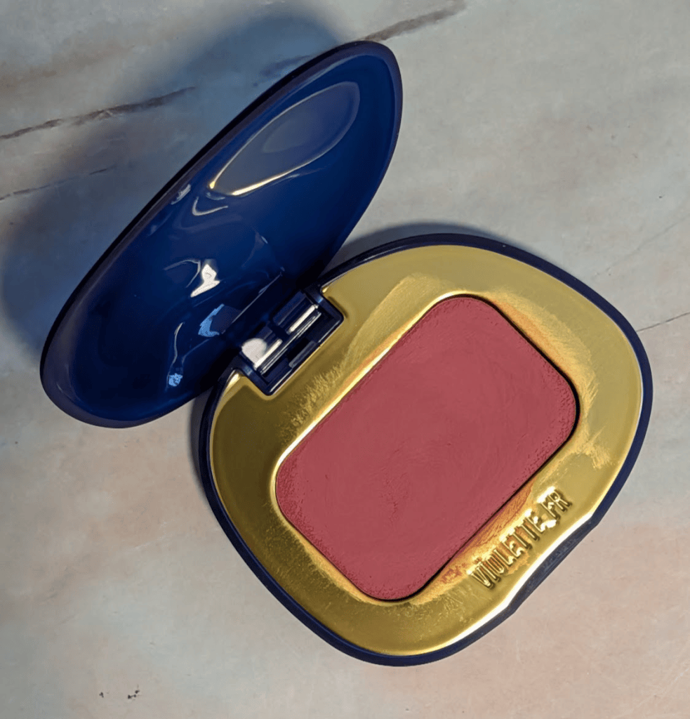
VIOLETTE_FR Plume Blush in Rose Fumé – I’m honestly shocked I haven’t talked about this blush before, especially because I’ve been using it so much and I love the formula. I have this in two other shades, and I’d totally buy more if they released more (but the current shade range is fairly limited. This kind of hybrid blurring cream to powder blush is one of my favorite formulas so I’m sure it’s no surprise how much I like this one.

Rose Fumé in particular gives me a softer version of this look without having to be careful with it. It’s more matte than the Nars or Merit, but it doesn’t look dry or flat at all. It’s so blurring and easy to blend – just make sure you’re using a denser brush than you would think you should use. Basically the opposite advice as the NYX blush. I also wanted to make sure y’all know that these have a vanilla scent, which doesn’t bother me, but if it’ll bother you, it’s worth looking for a different blush in the same type of formula, especially because there are so many now.

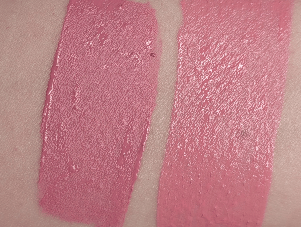
I blended all five out too (apologies for my arm basically turning pink because of all the swatching). I think this gives you a much better idea of how different they actually are once you put them on. The Violette_FR, Nars, and Merit are much easier to blend into a softer wash of pink. The NYX and Morphe stay a lot brighter and more saturated, so I think a lot of which one you’ll like if you decide to try this out comes down to how much pink you actually want and how bright you want it to be.

Battle of the Concealers: Round 1, Matches 3 & 4

We’re back with the next two matches in the concealer tournament! If you missed the first two matches, I started with 16 concealers I’ve been testing, some for years and some much more recently. As always, I’m happy to do follow ups with anything I didn’t include here or anything that’s launched since that you’re super curious about! Important reference for concealers – I have dry 35+ year old skin that has fine lines. If you have oily skin, you might love the ones that lose specifically because they don’t work as well on my dry skin.
For the actual tests, I wore one concealer on each side of my face, both under my eyes, to spot conceal, and as foundation on different days. I kept the rest of my makeup the same. I also switched sides just in case. I’ve also been posting (way too) close up pictures in my Substack chat and having everyone vote on which side looks better without telling them what they’re looking at.

In this post, all links are affiliate links (thank you for your support!), but all opinions are my own and I bought all these products myself. Swatches are under a ring light to show true to color (photo #1) and then standard lighting to show the formula a little better (#2) for all the products.

And here’s where we are in the bracket:

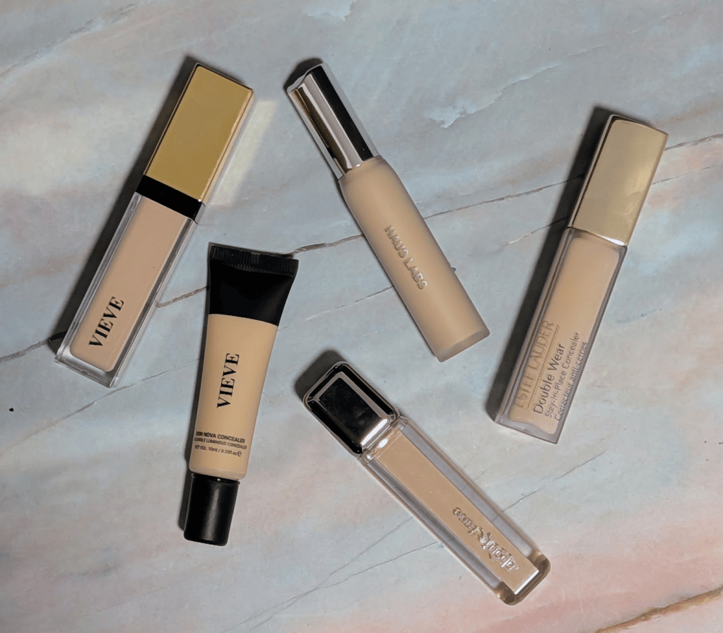
Round 1, Match 3: Vieve Modern Radiance Concealer in Light 1 vs. Haus Labs Triclone Skin Tech Concealer in 02 Fair Golden – I’ve liked the Vieve concealer since I tested it and the Haus Labs was new to me so I really thought the Vieve would sail right on through. Shade wise, the Haus Labs is lighter and brighter on me, while Vieve Light 1 is a little peachier. They both work when they’re blended out. The Haus Labs shade is labeled as being for olive undertones, but I’d say it’s just more golden (though better than a lot of other concealer shades). 

When I applied them, the thing that really stood out to me was that the Vieve stretches way more. It’s really easy to blend and looks a lot more skinlike, so if you like using your concealer all over as foundation (which I do!), it works really well for that. The Haus Labs doesn’t want to stretch nearly as much especially if you let it dry a little bit before blending. But that also means it has noticeably more coverage that really sticks around. 

At the end of the day, the Vieve wore away much more, and I was left with a lot less coverage than I would have liked. The Haus Labs still had noticeably more coverage and also creased less. My substack chat was pretty evenly split on this one both times I posted this match up, but my husband voted for Haus Labs every time I asked. 

A short detour before I call a winner of this match – the new Vieve Skin Nova Concealer in 125 Light Neutral Olive showed up a couple days ago, so obviously I immediately put that against Haus Labs too. I’m not putting it into the official bracket after a couple days of testing because that wouldn’t be fair to the very heavily tested concealers, but I needed to see what happened so here we are. 

First of all, 125 is a better shade match for me than the original Vieve concealer. It’s definitely the most olive of the three of these in person, although in the swatches you can see it’s pretty close to the Haus Labs. Putting them next to each other makes the old Vieve Light 1 look straight up pinky peach, which is kind of nuts given how much I’ve loved it. The new formula is a little thinner and stretchier than the old one, and it looks even more skinlike. It reminds me a lot of the Givenchy concealer in that you can almost use it like a lightweight skin tint with just a little bit of product. It also builds much better than I was expecting. I can get it to around medium coverage just adding one more layer, and it doesn’t look too heavy. 

I managed to test it against the Haus Labs two days (so I could switch sides once), and both times the Haus Labs managed to keep more coverage and wear better, just like with the original Vieve concealer. My husband also picked the Haus Labs every time once again.

I actually think the Skin Nova is prettier if what you want is something really thin and skinlike that you can just kind of throw all over your face, and between the two Vieve concealers, I’d absolutely pick the new one. But I’m confident that the Haus Labs should move on in the bracket!

Round 1, Match 4: Estee Lauder Double Wear Stay-in-Place Concealer in 1N vs. About Face The Illusionist Skin-Focused Concealer in L1 Warm Olive – This is another battle where it was a concealer I’ve liked for awhile (Estee Lauder) vs one I bought specifically to test because it was an olive shade (About Face). I really thought the About Face was going to pleasantly surprise me. But it turns out the About Face really stands out against my skin even though it’s for olives, and the Estee Lauder looks way more olive on me despite being labeled neutral. It was actually hard to show this in the swatches because the Estee Lauder blends into my skin and then my phone turns everything pink.

The Estee Lauder manages to both have great coverage and blend out really easily and far. It also sets down by itself but also does well with powder. The About Face has a super pretty finish but the thing that really stood out to me about it was that it loses quite a bit of coverage as you blend it out and it doesn’t build up that well. The first time I tested these against each other, my chat mostly picked About Face despite the less coverage. The Estee Lauder looked a little less skinlike at first (so I wasn’t surprised by the chat vote), but once they’d both been sitting on my face for a while, they looked much closer and the Estee Lauder kept much more coverage. When I switched sides, everyone, including my husband, picked Estee Lauder.

By the end of the day, Estee Lauder looked pretty great coverage-wise but also had creased less. The About Face doesn’t look bad by itself at all (and if it’s your favorite, keep on using it!), but every time I compared them side by side, I preferred the Estee Lauder, so Estee Lauder moves on!

Next up is Givenchy vs. Sarah Creal and Rare Beauty vs. Essence!

Reviewing the Cadence Accessories I Didn’t Think I Needed

I’ve been pretty sick this week, and I don’t want to throw together a less than informative makeup review. So instead, I’m writing about something that just makes me happy to talk about. If you’ve been following me for a long time, you already know I love Cadence Capsules. I was reviewing them on my old blog before this Substack even existed. And I feel like I’ve had enough experience with the Parcels and Pill Stacks to do an actual review on them. I was pretty convinced I was going to tell you they were unnecessary, and I wasn’t even sure they’d work for me because I use too much skincare and take too many pills. But it turns out I love them all.  

In this post, all links are affiliate links (thank you for your support!), but all opinions are my own. If you happen to be buying anything from Cadence, you can use YOURGREENFRIEND for 15% off, and I always appreciate y’all using my codes, but as always, absolutely no pressure. 

Cadence Capsules – The Capsules are still the product I would recommend if you were going to buy one thing from Cadence. I use them for basically anything I don’t want happen to have a mini of already somehow, and mine have survived years of travel and being thrown around in suitcases and backpacks. I also keep two of the Small Capsules in my backpack all the time with two medications I take as needed. So in case you were wondering if you need the Pill Stacks just for a bunch of one pill, you don’t, and a regular Small Capsule already does that really well. 

Cadence Small Parcels – Before I started using the Parcels, I traveled with one big toiletry bag that somehow managed to take up a bunch of space without actually holding very much. There were too many pockets (I know, pockets are great for a makeup bag, but I’m over pockets for skincare). I honestly could never remember where anything was, not everything fit, and I would put products into extra plastic bags because I didn’t want anything to leak all over the inside.

Two Small Parcels neatly packed

Now I use two Small Parcels instead – one for morning and one for night. I’m honestly never going back to one big bag. I’m sure this has a lot to do with travelling with our toddler (LOVE HIM SO MUCH) which has made our travel very different. We almost always end up sharing a room with him, so I can’t always turn on the lights or go back and forth between the room and the bathroom (seriously, he goes to bed at 6pm). It’s also impossible to dig through a giant bag looking for something I forgot without waking him up. So, I really like having exactly what I need exactly where I think it is. I also do have medium and large Parcels, which I also love, but I didn’t end up using them on the last few trips.

the Parcels open

My morning Parcel has body sunscreen, vitamin C, a moisturizing serum, two face moisturizers, eye cream, face sunscreen, tweezers, hair ties, and lip balm. My nighttime one has a cleansing balm, cleanser, another eye cream, retinol, serum, a couple of moisturizers, and my Bloomeffects Royal Tulip Moisturizing Nectar (truly a must have when I’m travelling and really needs to be in a leak proof container).

all the skincare I packed

Yes, I travel with multiple moisturizers and two eye creams. My skin is really dry and gets even drier when I travel, and this system means I can honestly bring as much moisturizer as I want. And everything really does fit easily. The Small Parcels are super easy to squish into leftover space, but also manage to fit a lot into them, which is especially helpful when so much of our suitcase space belongs to the little man. 

The way they open also means I can easily see everything and grab what I need without having to dig through. And not that this has been an issue yet, but the inside is super easy to wipe down, so I’m not worried about ruining a toiletry bag if something eventually leaks.

Cadence Pill Stacks – I really thought I was taking one for the team buying these to review. I take seven pills in the morning and six to nine at night depending on the day, and some of them are pretty big pills. I already own a bunch of those plastic seven day AM/PM pill organizers that works fine, so why would I spend this much on another pill container and are my pills even going to fit?

I bought just a bunch of inserts because I already own an unreasonable number of Capsules and Extenders from years of buying Cadence products (no regrets!). I actually love that you can just buy bits and pieces of the system because I can save a bunch of money not buying more capsules and extenders just to try this out. For our last seven day trip, I used Pill Stack inserts in Medium Capsules so each one had an AM and one PM set. All seven of my morning pills fit, and all of my nighttime pills fit too, which I really didn’t expect. 

Two Pill Stacks in Medium Capsules

Normally I take my weekly organizer, pull out a few days, and put some in my backpack while the rest stays in my suitcase so I’m not separated from everything if our luggage gets lost or we get delayed somewhere. The cheap little plastic cases work, but I have had them open inside my bags, which is not awesome when 1) I really need to take all the pills and can’t lose them and 2) I have a toddler with grabby hands. My husband brought regular pill containers on the same trip and his opened and spilled pills into his backpack. You know whose pills didn’t end up everywhere? Mine. The capsules really don’t leak or pop open. 

They also have weight and *feel fancy* so it feels like I’m doing something nice for myself. I take a lot of medication every day and so I’m going to interact with a pill container every morning and every night. I love that this makes the whole thing feel less clinical and a little more fun. I like the colors, I like stacking them together, they’re really fun to play with (yay magnets!), I like making whatever configuration I need, and I just like using them. I also have long nails, so twisting open a Capsule is more comfortable than prying open the little plastic compartments on a normal weekly case which makes these easier to fill and get pills out of. I only had enough Pill Stack inserts set up for four days of the trip, so I still brought my regular plastic organizer for the other three. They worked completely fine, but did just make me less happy. 

What the Pill Stacks look like (I promise my pills fit – all of them)

I’ve actually started keeping an extra AM/PM setup permanently in my backpack because on the rare occasions I go into the office, I’m extremely likely to forget my medication. Now, I just have a backup sitting there that’s also *fancy*. 

With the extender for four Pill Stacks

I totally get it if you’re reading this and your first thought is “yup, no, I don’t need that.” A cheap pill organizer does the same job. And you’re right! But I’ve learned that I really enjoy upgrading mundane things that I use constantly rather than spending the same amount on some theoretically luxurious thing I never use. I’m also a person who doesn’t invest in shoes or clothes or lots of other things, so I’m very happy to splurge in the “make taking my medicine feel less bad” category of my life. 

Obviously, Cadence products really are expensive. That said, I really don’t have another major complaint about them because everything I’ve bought has held up so well. My Parcels have been on a ton of trips and still look almost new, and my Capsules have survived years and years of use. I tested all of the not Capsules products expecting to tell you they were a waste of money, and I honestly I just really like the Parcels and the PIll Stacks. I’m probably going to buy more of the Pill Stacks if I’m honest. 

What’s something completely unnecessary you’ve bought that made a boring part of your life better?

As always, some products may have been gifted, but all reviews/opinions are completely my own and unsponsored.

Battle of the Concealers: Round 1, Matches 1 & 2

I’m finally doing another makeup tournament, and the one y’all requested the most was concealer. I started with 16 concealers I’ve been testing, some for years and some much more recently. To get down to 16, I took out any cream or stick concealers, and then fought with myself until I narrowed down to 16. As always, I’m happy to do follow ups with anything I didn’t include here or anything that’s launched since that you’re super curious about! Important reference for concealers – I have dry 35+ year old skin that has fine lines. If you have oily skin, you might love the ones that lose specifically because they don’t work as well on my dry skin.

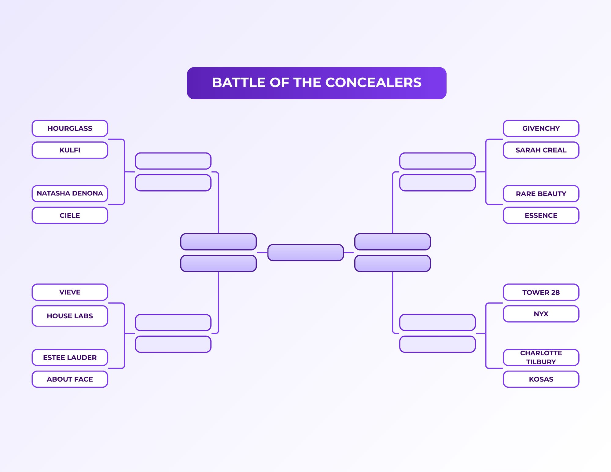
The way I put this bracket together was that I had everyone in my Substack chat vote for their favorites, and the concealers that got the most votes were paired against the ones that got the least (or none). For the actual tests, I wore one concealer on each side of my face, both under my eyes, to spot conceal, and as foundation on different days. I kept the rest of my makeup the same. I also switched sides for each match just in case. I’ve been posting (way too) close up pictures in my Substack chat and having everyone vote on which side looks better without telling them what they’re looking at.

In this post, all links are affiliate links (thank you for your support!), but all opinions are my own and I bought all these products myself. Swatches are under a ring light to show true to color (photo #1) and then standard lighting to show the formula a little better (#2) for all the products.

And finally, introducing the concealer bracket:

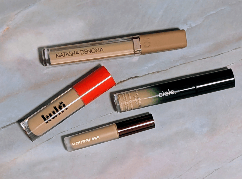
Round 1, Match 1: Hourglass Vanish Airbrush Concealer in Oat 3 vs. Kulfi Main Match Concealer in Mitai Soul – Hourglass was the concealer with the most votes, but Kulfi is one of my personal favorites, so I was super excited to see what happened with this first match up.

Shade wise, Hourglass Oat 3 is one of the very few lighter concealer shades I’ve found that’s actually labeled olive which I was super excited about, but I did get the mini because I bought so many concealers for this. On the Kulfi side, I actually have two shades of the Kulfi concealer because I do really love the formula, but Mitai Soul is the same depth as Oat 3 so I decided to have them go head to head. Hourglass is every so slightly more yellow/olive while Kulfi Mitai Soul is peachier on me but they both still definitely work.

By itself, Hourglass had great coverage and looked really nice, but in comparison to the Kulfi, it just didn’t look as good. The Kulfi also stretched way more, so if you’re someone looking to use a concealer as foundation, it works way better for that. The Hourglass also looked and felt a little drier and less skinlike than the Kulfi.

Every time I showed this pairing in my Substack chat, Kulfi won unanimously. They said it looked smoother and less textured, especially around my nose. I also made my husband vote in person without telling him which was which, as is tradition, and he picked Kulfi every time too. The Hourlgass didn’t look bad by any means (and like all concealers in this tournament, if it’s your favorite, keep on using it!), but the Kulfi definitely looked better and will be moving on!

Round 1, Match 2: Natasha Denona Hy-Glam Brightening & Hydrating Crease Proof Serum Concealer in Y2 vs. ciele conceal & PROTECT SPF 50+ in 04N – Natasha Denona was another one that got a ton of votes from my chat and faced off against one of my personal favorites, the Ciele conceal and protect. Shade wise, Natasha Denona Y2 is lighter, brighter, and more yellow on me. Ciele 04N is a little deeper and peachier in the arm swatches, but looks closer to my actual skin tone (on my face, not my arm) than the Natasha Denona once they dry down.

Similar to what happened in the first match, the first time I wore them side by side, Ciele just looked better. My chat was actually super surprised, and I ended up testing these two together so many times just in case. I switched sides, used different skincare and primers, whatever I could think of.

Every single time the Ciele side looked much smoother and less textured. Natasha Denona looked a little heavier and drier, and the Ciele sat much better on my skin and stayed looking really nice throughout the day. Despite how much my chat loves the Natasha Denona concealer, they picked the Ciele every time I shared this match up.

I still like the Natasha Denona concealer, and if I were wearing it by itself I don’t think I would say there was anything wrong with it. But I tested these so many times and got the same result every time, so I’m confident that Ciele moves on!

Next up is Vieve vs. Haus Labs and Estee Lauder vs About Face!

My Chat Wanted Reviews on Blue things, a bunch of blush, and an eyeshadow from YesStyle 

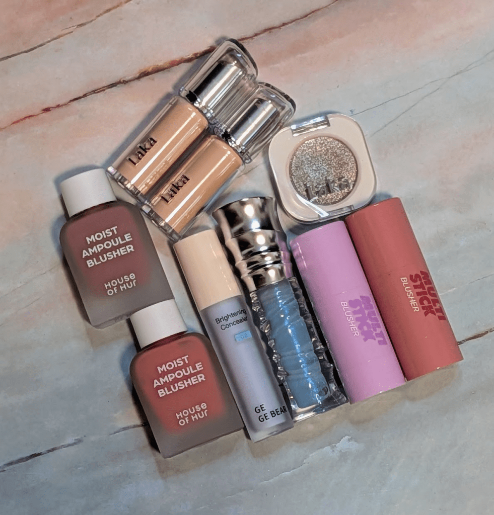
I’ve been aksing my chat for requests for what to get in my fairly frequent YesStyle review orders, and this order was 100% picked by chat. I posted my order when it got here, and folks voted on what they wanted me to review first so I’m doing that for my “things you asked me to test post” for August. I normally try to spend at least a few weeks, if not a few months, testing things before I write about them. This post is a little late because I wanted to test each of these products at least a few times, and it’s still technically August! If you’d like me to review anything else from YesStyle (or anywhere else), leave a comment or join the chat – we’d be happy to have you!

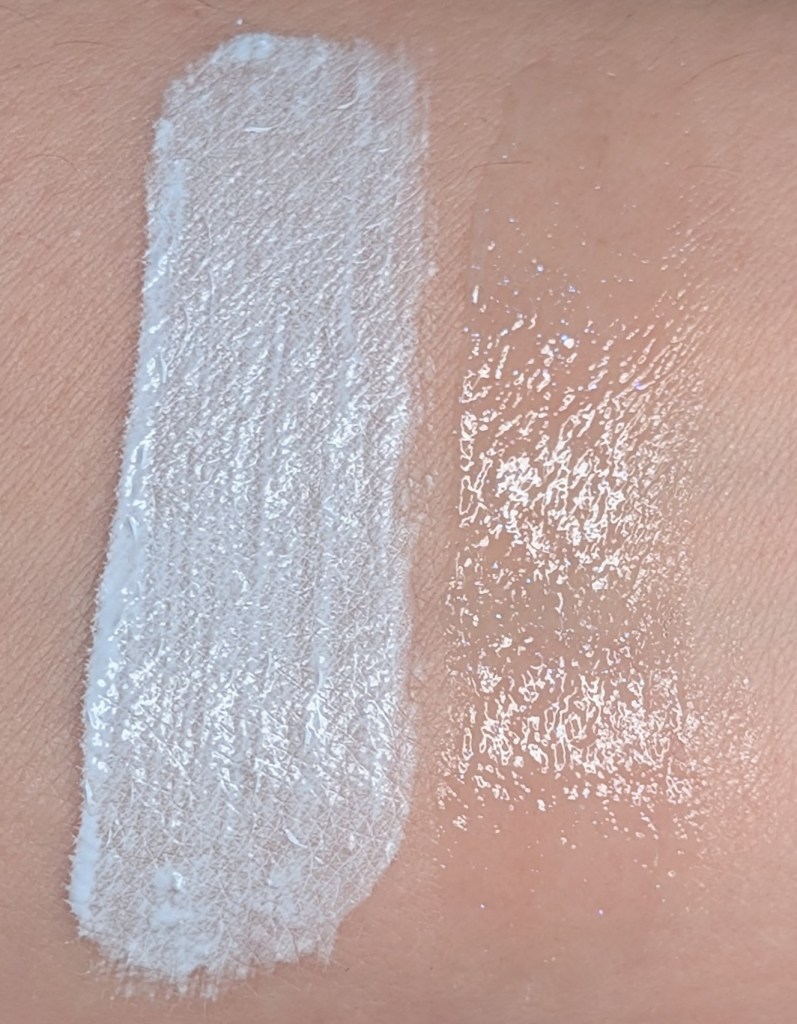
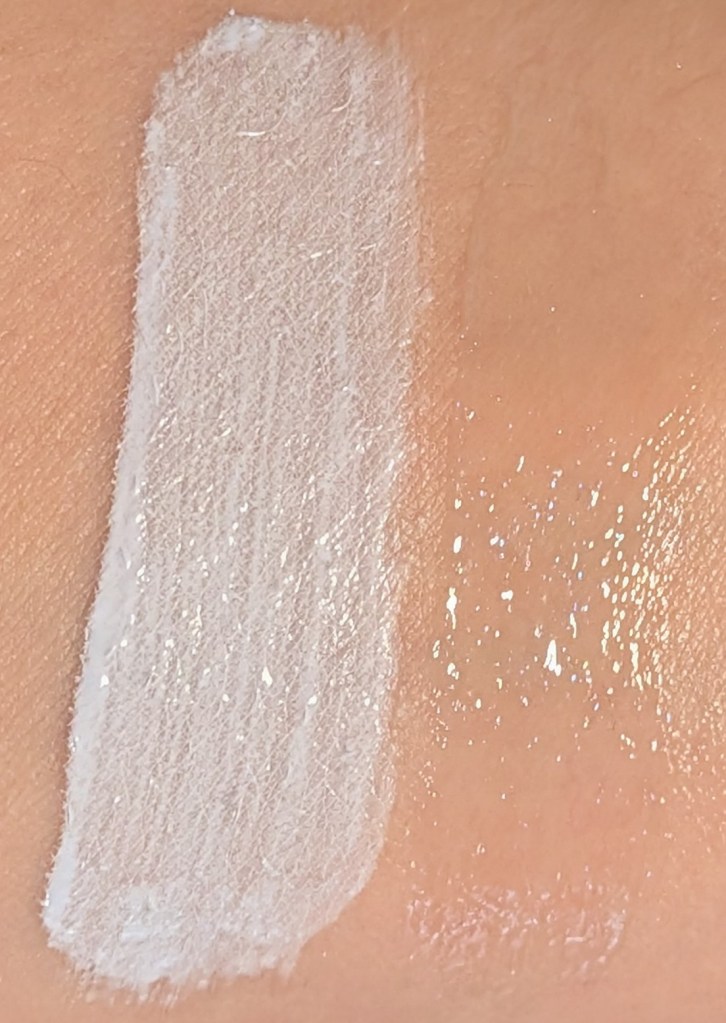
In this post, all links are affiliate links (thank you for your support!), but all opinions are my own and I bought all these products myself. I also have a YesStyle and Stylevana favorites shelf on my ShopMy if you want to see more of the products I’ve tried and would recommend. Swatches are under a ring light to show true to color (photo #1) and then standard lighting to show the formula a little better (#2) for all the products.

Gege Bear Brightening Concealer in 02 Frost Blue – I’m not sure I’ve ever actually talked about this before, even though the one in this order is actually a backup because I’m almost through my first tube. This is one of my favorite and most used products for fixing foundation that’s a little too dark and/or too orange on me. I usually put my foundation on first, add a few tiny dots of this directly on top, and blend it in with a brush. It cancels out the orange just enough, adds a little brightness, and makes everything just a little more green. Perfect match every time from a not so perfect match. I’ve never noticed it changing the texture or finish of my foundation at all. I have other blue correctors I like, but this is so cheap and works so well that I will absolutely keep buying it again and again. I also do use the green version of this as an actual color corrector where I have redness before I put on foundation.

Gege Bear Water Light Mirror Lip Gloss in 01 – This gloss does have enough blue pigment to actually cool down a lipstick that’s pulling too orange on me, but it’s still sheer enough that I can wear it by itself without looking like I’m wearing a BLUE lip gloss. It also has a ton of really pretty sparkle that doesn’t feel gritty or chunky that makes my lips look really nice. The formula and packaging are very clearly inspired by the Risky Be Bold Lip Glosses I’ve reviewed before (or at least it seems that way looking at them side by side; maybe it’s not inspired by Risky at all). I do still think the Risky gloss is ultimately a better formula. It’s more moisturizing and smoothing, and the Gege Bear feels thinner and less nourishing. Gege Bear is around $5 though compared to $19 for Risky, and I really do love the color, so I’m not mad about the formula difference. 

I’M MEME I’m Multi Stick Blusher in 005 Bliss Mauve and 006 Blooming Lilac – The formula of these blushes feels exactly the same to me as the shading stick that I reviewed in my last post. It’s super easy to blend with a brush or fingers, I can swipe them directly onto my face without it getting patchy, and the formula has a slightly blurring finish that I really love. My face also doesn’t eat this formula super quickly like it does with some other cream products. 

Bliss Mauve is not mauve at all on me – it’s just pink. Importantly, it stays pink on my face instead of going orange or coral, and it has enough saturation to actually show up on me as someone who is high contrast. It brightens up my face really well is a really good base layer for when I want to do a pink blush look and don’t want to have to worry about powder fading as fast. Blooming Lilac is a bright, pale lilac with a lot of white in it. I honestly have only been able to use this as a mixer to make another blush lighter and cooler. This is one of the few non-shimmery formulas in this color I’ve found because it does feel more like a highlighter. I think it’s really unique for that reason. I also do think there are people who will love this as an actual blush, especially if you’ve been looking for something this color and have never been able to find it. 

House of Hur Moist Ampoule Blusher in Lavender Flush and Cherry Blossom – I already had Rose Brown and Berry Purple, and then someone in chat asked what some of the other shades looked like as I was putting this order together, so I picked up Lavender Flush and Cherry Blossom. This formula is super sheer and watercolory, so I was actually a little worried about Lavender Flush when I swatched it because it looked like it might do basically nothing on my face. Once I put it on, I loved it. It’s very much a barely there blush on me, but somehow I just look prettier and more put together with it on.

Cherry Blossom is a little more pigmented and way warmer on me. It definitely goes pinky coral, but luckily it doesn’t go full Cheeto orange. I really like it when I’m intentionally doing a bronzy/warm look because it brightens up my face and is warm without going too much in that direction. This formula also blends out super easily with a brush, and it’s basically impossible to put too much on, which is perfect with a brighter color like this one.

Laka Bonding Glow Lipstick in 202 Boy and 217 Babe – Boy is honestly so special, and everyone in my chat who’s gotten it so far would agree. It’s a little brown, a little gray, a little purple, and stays cool toned on me. Boy also has that same kind of muted, slightly grungy feeling as MAC Alone Time (original shade!) while being even cooler toned. I swatched them next to each other and Boy actually makes the original Alone Time look warm. Babe is a really good pink, and I’m happy I bought it. I’ve been wearing it with mauve and lavender looks when I want something a little brighter on my lips, and it stays pink on me instead of going orange. It’s just really easy to wear, and I’m glad y’all asked me to test it.

I honestly forgot how much I love this lipstick formula until I started testing these again for this post. Both shades are now sitting at the front of my makeup station because my lips just look so good with them on. It’s moisturizing and glossy enough to make my lips look much smoother without being too shiny or sticky. The color also lasts pretty well considering this isn’t a matte lipstick or a stain, and it’s pretty easy to build up the level of pigment without it getting weird. My lips just look better when I wear this lipstick. There’s a little bit of a fruity scent, but it doesn’t last very long, and I can’t taste it at all.

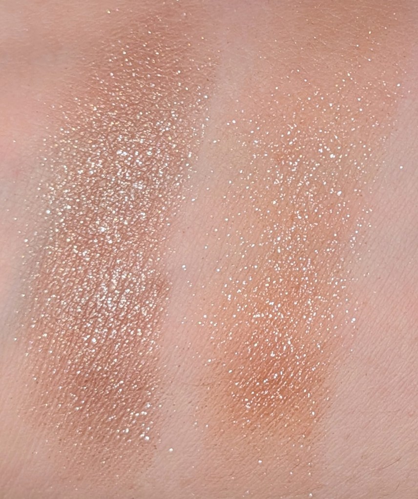
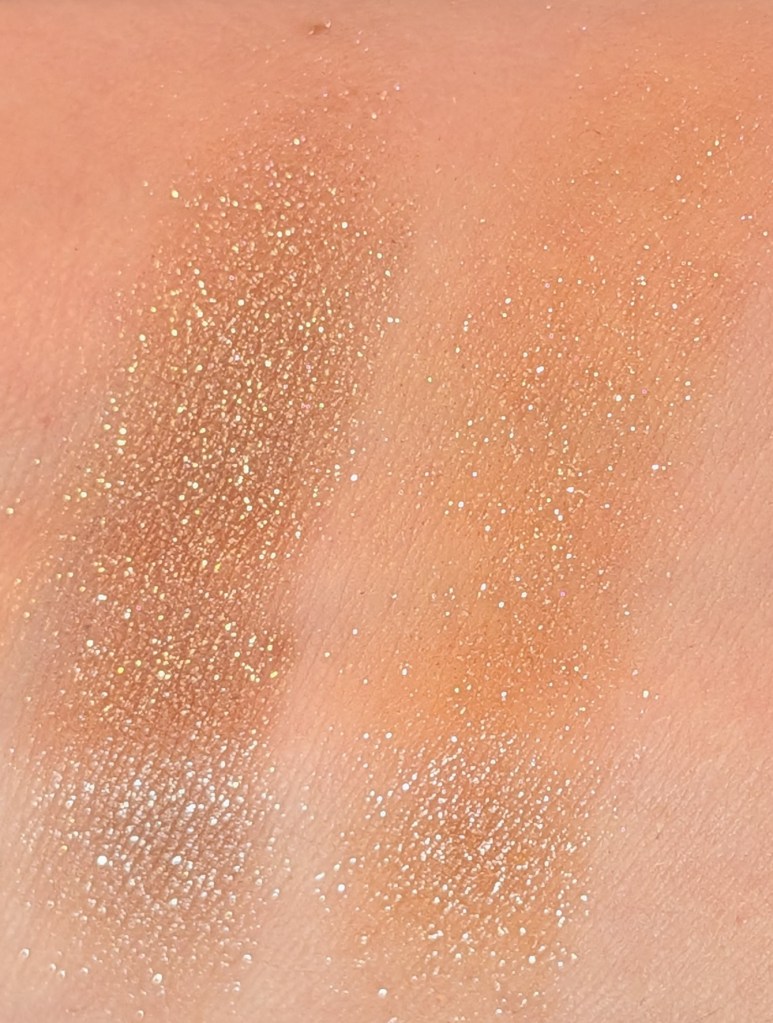
Laka Mono Eyeshadow in 926 Liberty – I was super excited about this one because it seemed like it could be Urban Decay Space Cowboy, but not orange. And I was right! This shadow is so sparkly and pretty. It has a neutral brown base with a ton of silver sparkle, but the thing I like most about it is that the brown actually stays neutral. I swatched it next to Urban Decay Space Cowboy so you can see how not orange Liberty is. On my eyes, it actually pulls a little cooler than it does in the swatch which almost never happens. With a lighter layer, you can see more of the brown base, and if you build it up, it gets much more silvery. It’s sheer enough that it works well as a topper, and I’ve used both a brush and a finger to apply this shadow without any problems.

Laka Mono Eyeshadow in 926 Liberty, Urban Decay Space Cowboy

That all said, I would absolutely use a primer with this eyeshadow. I tested it with primer on one eye and nothing on the other, and the side without primer had a ton of fallout. The primer side was almost entirely fallout free so it definitely made a big difference. 

What should I test for the next round?

The Makeup I Packed for a Week Away, and How I (Try To) Avoid Overpacking my Makeup 

I recently went away for about a week to visit family, and since it was super hot and humid and I knew I was mostly going to be doing pretty casual makeup, I tried to pack things that were easy, reliable, and all worked together. I only ended up wearing makeup about half the days, and when I did, it was the same 15-minute look every time.

This is honestly a pretty normal amount of travel makeup for me. I really don’t like to overpack makeup (especially now that I have to bring all of my toddler’s stuff). I don’t like bringing anything huge that would make it difficult to stuff back in a bag or so expensive that I’m going to be upset if something happens to it. I always pick my blushes first and then everything else has to work with them. For this trip I started with Lilybyred 14 and NAMING Taro, so that immediately ruled out anything too warm or orange. Everything else ended up being some version of mauve, beige, pink, or neutral brown. 

In this post, all links are affiliate links (thank you for your support!), but all opinions are my own and I bought all these products myself. Swatches are under a ring light to show true to color (photo #1) and then standard lighting to show the formula a little better (#2) for all the products. 

Afform Medium Traveller – I bought this a couple of years ago and I’ve taken it on basically every trip since. I love this bag so much. It has a ton of pockets in different sizes, including stretchy mesh ones that you can really fit a lot in. Some of the compartments are adjustable with Velcro in case you want to create more (or less) space. The rigid bottom is probably my favorite part because everything stays standing up in the bag. The sides also fold down, so I can open this on the counter and use my makeup straight out of it. I don’t have to create a giant makeup explosion in whatever room I’m in and can just zip it all back up.  

All of the makeup in this post fit super easily with lots of room, so I could also add in my BK Beauty travel brush bag with all my brushes too. I’ve never had anything break or leak all over it, and it’s held up really well after years of travel. It’s absolutely very expensive for a makeup bag but I would also immediately buy another one if I lost it, no questions asked. 

Glow Recipe Watermelon Glow Niacinamide Dew Drops – I use this as my usual primer at home and have the jumbo bottle because it’s such a standby for me. I happened to have a couple minis on hand already that were either gifts with purchase or came with sets. These are perfect for travel, and not surprisingly, it worked just as well away as it does at home. 

Erborian CC Red Correct – This was a super easy choice to bring as my foundation because I didn’t want to have to worry about something that perfectly matched me. Most all my foundations need a little something to look just right, and I don’t want to have to bring things to fix a foundation when I’m travelling. I had also just been using this a ton as a base layer anyway before I got my current foundation favorite (the new Westman Atelier – I seriously can’t stop wearing it). 

This mostly just gets rid of redness and evens everything out, and I am honestly green enough that using a green color corrector as foundation works completely fine. It’s not very high coverage (you can barely see it in the swatches), but I didn’t really want high coverage when it was approximately one million degrees outside anyway. It held up really well, it has SPF, and the tube takes up barely any space. 

Kulfi Main Match Concealer in Paan Party – I’m currently using so many different concealers because I’m putting together a concealer tournament. I just picked one from the pile I knew was easy and hoped for the best. Paan Party works well for me as a brightening concealer, the formula is really blendable, and it works well under my eyes. It wasn’t necessarily the concealer I would have picked if I were trying to find my absolute perfect shade match, and this doesn’t mean it won anything. It did work perfectly well and is still one I’d recommend though. 

Canmake Marshmallow Finish Powder Abloom in 03 Plumeria Wreath – I always pack this powder. It’s my much less expensive version of the Givenchy pressed powder and one I can bring without worrying about. On my face, they do almost the same thing, and many of you who have bought this powder have told me you love it too. It smooths and brightens without making my dry skin look super powdery and helps blend everything together.

MAC Fix+ Stay Over – I had a mini of this literally in my bag already from my last trip, so I brought it as my setting spray. It didn’t win my setting spray tournament, but it still works really well and definitely didn’t disappoint during the trip. 

I’m Meme I’m Multi Stick Shading in 005 Neutral Brown – I love this as a brontour type product. It’s actually neutral and not warm or cool on me like most of these products are (I tend to find things that are ORANGE or GRAY). I love how travel friendly the stick is, and I can apply directly from the stick or with a brush. It blends out really easily, and I like it so much I already have the blush version on the way to try out.

Soshe Blurring Pillow Bronzer in Olive Bronze Drift – I know I just talked about this last week but I really do love the formula enough that it was the bronzer I brought with me. Olive Bronze Drift isn’t my perfect bronzer color of all time, but it’s a really nice option for olive skin and I don’t have to worry about something like the Marc Jacobs bronzer getting broken on a trip. 

Judydoll Highlight & Contour Palette in #02 – This is such an underrated palette. I used the beigey yellow powder to blend and set anywhere where I needed a little more coverage than the Canmake, the highlighter as my highlighter, and the powders when I wanted to blur and mattify my bronzer even more. You can see the bronzer shade is super similar to Olive Bronze Drift but a little less orange, so next time, I’d probably just bring this palette. 

Lilybyred Luv Beam Cheek Balm in 14 Rosy Beam – I also just talked about this last week, but it’s really such a perfect cream blush for the vibe I’m going for. It’s a cool pinky purple that’s just so extremely easy to use and doesn’t turn into anything close to orange on me. I almost always put powder blush over cream blush anyway, and this works really well as the first layer because it gives me the color I want without getting too intense. Those of you who have managed to already get this from last week’s post have told me it’s one of the best blushes you’ve found for olive skin, and that makes me so happy! 

Naming Fluffy Powder Blush in Taro – This is one of my favorite powder blushes of all time. It looks like a very desaturated mauve in the pan but is a perfect beigey rosy blush on my face. I know this blush is always going to look good, so this was the starting point for the rest of the look. The formula is also really easy to throw on and build up and looks so pretty on the cheeks. 

Makeup by Mario Master Mattes Long-Wear Cream Eyeshadow in Mauve – This is the eyeshadow I’ve brought with me on every trip since I bought it. It’s just so easy to throw on with a finger, blend it out, and then be done. It makes a complete makeup look without being “too much” and looks super natural while covering up the discoloration on my eyelid, so I don’t need a primer. It’s more of a neutral brown with a touch of rosy tones than a true mauve, but that still works really well as a “I put something on but didn’t try too hard” kind of shadow, especially with these blushes. It also stayed on all day in the heat and humidity without creasing. I also intended to use this as an eyeshadow primer for the Moira shadow, but it looked so nice I just stopped here every time. 

Moira Chroma Light Shadow in 02 Tempting – I brought this because I thought I would want sparkle, and I just didn’t end up using it. I would probably still pack it again because it’s tiny and I really do love the formula and the color. 

ColourPop Creme Gel Liner in Sunnyvale – This is my favorite affordable brown eyeliner. I have much more expensive eyeliners I love, but this works great and it’s not a huge deal if I have to replace it. It’s a really good dark brown liner that isn’t too warm or too cool, and it has amazing staying power. It held up incredibly well on my eyes in the heat and humidity. 

Maybelline Lash Sensational Sky Tubes Tubing Mascara in Black – I’m actually in the middle of testing so I figured East Coast summer was a perfect time to continue testing. I’m always trying to find an even better tubing mascara, and this one is actually really great. No smudging, no flaking, my lashes looked incredible, and it’s really easy to remove. It’s everything I want from a tubing mascara, and it’s affordable. I think this probably knocks Finding Ferdinand out of my top three tubing mascaras, even though I still really love that one.

rephr Eyelash Curler – My favorite eyelash curler. It works with my eye shape, doesn’t pinch me, and actually gets my corner lashes. 10/10 no notes. 

Benefit Precisely, My Brow Pencil in 5 – This is the brow pencil I’ve been using for years and always have with me. It’s  the best one I’ve found for actually sticking to the skin where I need to fill in my brows and have it stay all day. If you have recommendations for amazing brow pencils, please let me know in the comments because I will test it (I have a lot of brow space to fill in because I have a big chunk of missing brow from a childhood accident). 

Rare Beauty Brow Harmony Flexible Lifting Gel in Clear – Still the best clear brow gel. It keeps my eyebrows where I put them and doesn’t get weird and crunchy. I’m currently resting the deep brown version and couldn’t be happier with it. 

ColourPop HydraPop Glossy Lip Stain in 90s Babe – All of these products have been sitting in a pile on my floor while I’ve been working on this post, and I have gone back specifically to pull this out of the pile and wear it. It’s a super pretty reddish rose that just looks like my lips but better. I have more on why I love this and swatches here. Mostly, it’s super easy to throw on and the stain lasts really well. 

Revlon Super Lustrous Shine Lipstick in 014 Glistening Purple – This is the lip product I ended up wearing the most. It’s a sheerish wash of lavender that really pulls this look together and makes my lips look just a little less red and a little more muted. I’m currently testing the Chantecaille Lip Chics, and those are honestly way more nourishing and last better than the Revlon formula. I’m not trying to imply that this is secretly the same experience as a $50 lipstick, but I really, really love this Revlon color so much that I would absolutely buy it again. The formula is still really nice and nourishing even though it isn’t luxury. 

OleHenriksen Pout Preserve Chillers Peptide Lip Treatment in Maldives Melon – This is one of my favorite lip treatments of all time (and it’s on sale!). I own almost every color/scent/glitter ones even, and I keep them all over my house. I actually had more Pout Preserves in my backpack for this trip. I used this for lip prep and whenever my lips were dry. Maldives Melon Chiller also just smells really nice, and I like the color. I think I like the color of Bora Bora Blackberry Chiller more but they’re not opaque enough that it makes a huge difference. 

And the lip products I love but didn’t use: 

Etude Fixing Tint in 15 Woody Pink – I didn’t use it, but I would still pack it again. If I were only bringing one matte option next time, this would be it. I love this formula too much not to have one with me just in case.

Mac Powder Kiss Lip + Cheek Mousse in Velvet Teddy – I love this product so much. I didn’t even remember I brought it.  

NYX Lip Lingerie Lip Liner Stain in 06 Up To No Good – I really love this. I also didn’t use it at all and didn’t even consider wearing lip liner.  If I packed again, I would pack almost entirely the same products, except for the MAC mousse and NYX stain. 

What’s your makeup packing routine like?

The Makeup I’m Using (Almost) Every Day That I Haven’t Had a Chance To Talk About Yet

I wanted to do a post about the products I’ve actually been reaching for over and over when I’m not testing something else. These are the things I’ve been using almost every day, even if they aren’t perfect. They’re super reliable and easy to use, and they also just make me feel pretty and put together with very little work.

In this post, all links are affiliate links (thank you for your support!), but all opinions are my own and I bought all these products myself. Swatches are under a ring light to show true to color (photo #1) and then standard lighting to show the formula a little better (#2) for all the products. 

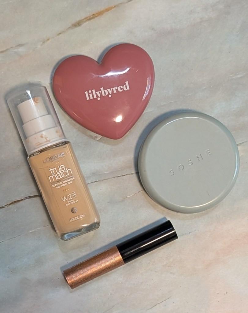
L’Oréal True Match Super-Blendable Foundation in W2.5 – My arm swatches were not doing this shade justice so I decided to show a photo of half my face with and without the foundation instead. Hopefully it’s easier to see how it actually looks on me. I did a side by side of the photo and then the same photo with this very professional green line so you can see exactly where the foundation starts – it’s on the bottom half of my face. W2.5 is described as a warm light-medium, and it’s a touch too yellow and a touch too deep for me, but it blends into my neck really well. If I weren’t nitpicking the match because I test so many base products, I probably wouldn’t notice. That said, it also definitely doesn’t turn Cheeto orange on me like a lot of foundations described as warm do and so I don’t have to color correct which is awesome. I would skip this particular shade if you’re a cool olive, but if you’re a more saturated warm olive, I think it’s a really good option.

The formula is also just really nice. It self-sets, smooths out my skin, and gives me enough coverage to make a difference without looking like a lot of foundation. You can hopefully see in the photo it color corrects the redness on my face and makes everything match my neck while being pretty imperceptible. It’s basically what I want out of a skin tint, except with more coverage, and it happens to also be affordable.

Lilybyred Luv Beam Cheek Balm in 14 – I was using the Leemember Cheek and Lip Cream in Y03 a bunch before I got this and thought that was a pretty perfect blush color for me. Until I tried the Lilybyred, which is actually the perfect blush color for me. The Lilybyred is a much cooler pinky purple and just works so much better with my skin. The formula is also really easy to use with a brush or fingers and lasts pretty well for a cheek balm. It also works by itself or as a base for another blush without having issues layering. I’ve been so pleasantly surprised by how much use I’ve been getting out of this one. 

Soshe Blurring Pillow Bronzers in Bronze Linen, Olive Bronze Drift, Bronze Speakeasy, and Bronze Dusk – I already love the Soshe blushes so much, and these are that same really lightweight cream to powder formula that is my personal favorite. They’re really easy to blend, super blurring, and set down nicely without looking too dry. I’ve mostly been wearing Olive Bronze Drift and Bronze Dusk as bronzers and Bronze Speakeasy as a blush. Bronze Linen isn’t quite right for me because it’s too peachy orange, and I can confirm it also goes orange on some of my green, blue, and purple friends. Most shades are sold out on Soshe’s site but Ulta has almost all of them right now!

Soshe Bronze Linen, Olive Bronze Drift, Bronze Speakeasy, and Bronze Dusk

I also swatched Giorgio Armani Luminous Silk Bronzing Powder in 90, Olive Bronze Drift, Bronze Dusk, and Marc Jacobs Legally Bronze Powder Bronzer in 20 next to each other since they’re all pretty similar. Marc Jacobs in 20 is actually the most traditionally bronzey on me and this helped me see why I still love that one so much. It has enough brown warmth so that it looks like what I expect bronzer to look like on my skin without going too orange (Armani), green (Olive Bronze Drift), or rosy (Bronze Dusk). If I could have Marc Jacobs 20 in the Soshe formula, I’d be so happy. That said, these are all great on me and blended out, it’s really hard to tell the nuanced differences between them.

I also swatched Gucci Bronzing Powder in 02 and 01, Fara Homidi Essential Bronzer in Bois, Bronze Linen, and Bronze Speakeasy so you can see how the rosier shades look against a couple popular rosier bronzers. Honestly right now in the summer, none of these is a good bronzer shade for me. Gucci 02 and Linen are definitely too orange or peachy, and the other three can all be used as blushes or transition type powders.  

Bobbi Brown Crystal Eyes Shadow Stick in Pink – I wouldn’t necessarily recommend this one if you want to wear it by itself because it can get a little patchy, but I really like it as a topper. This is one of the sparkliest eyeshadows I own, and I’ve been throwing it on constantly. It’s definitely a super chunky glitter formula rather than a smooth shimmer so I would skip this if you’re not into a chunky glitter. I personally am very into this level of sparkle right now.  

It has pretty good staying power, but honestly it’s so sparkly that I don’t really care if it moves around or creases a little. These swatches are absolutely not doing it justice. I have one of the darker shades as well and find that one even patchier and harder to apply, so I’m still not sure I would recommend every shade in the formula. Pink specifically is really easy to use and stays a really pretty pink instead of going orange or peach on me. Did I mention it’s just really sparkly and glittery? 

What have you been reaching for lately?