Natasha Denona I Need a Cool Is the Neutral Palette I’ve Been Looking For

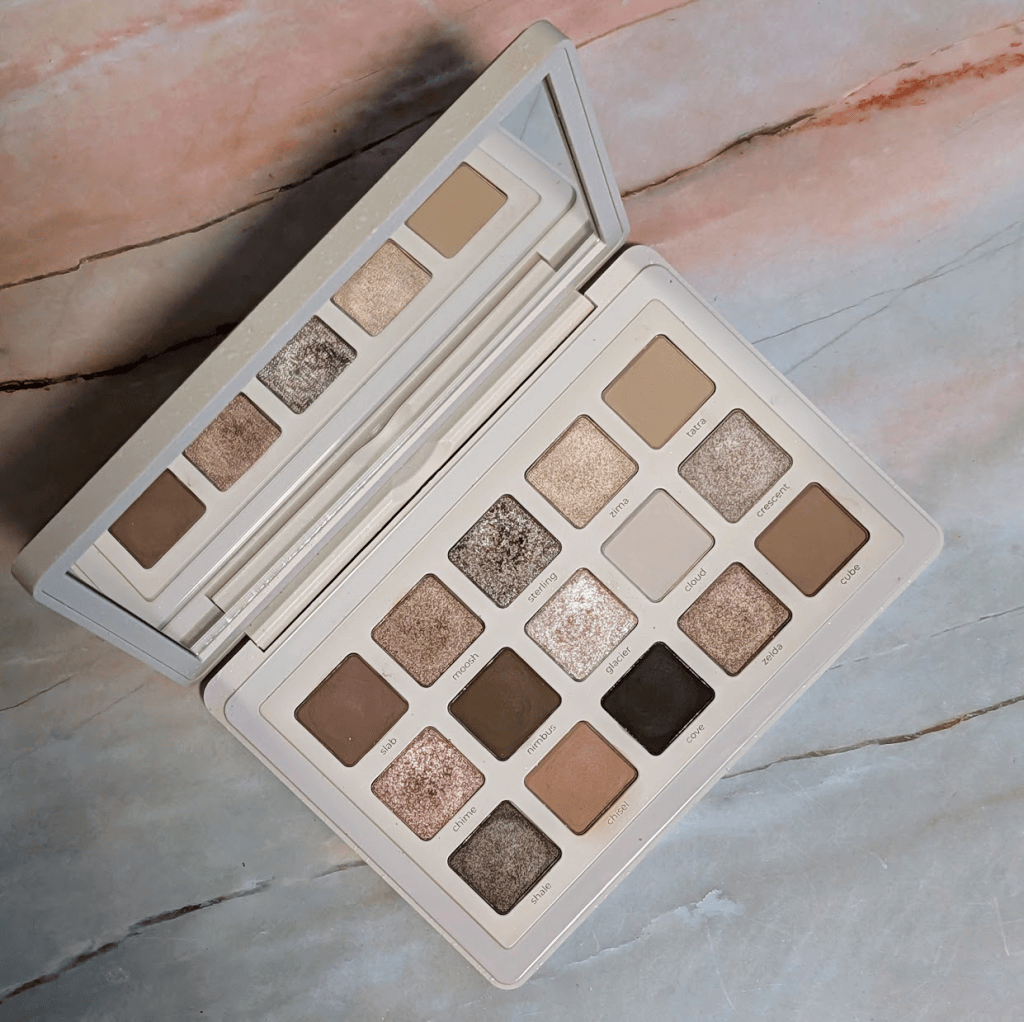
I have a problem with neutral eyeshadow palettes where I look at them and think “oh look, a normal brown”, and then I put them on my face and everything is orange. As an example, I Need a Nude is much peachier on me than I thought it was going to be and I Need a Tan is extremely warm (as expected, I know, I shouldn’t have bought it). Unsurprisingly, I Need a Gold also has plenty of shades that go orange. I was really hoping I Need A Cool would be the neutral palette for me from Natasha Denona, and it turns out that it is. Since I won’t come back around to this, saying upfront that the Xenon palette is my all time favorite cool-toned Natasha palette, but it’s a very different kind of palette than I Need a Cool. 
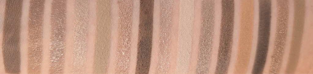
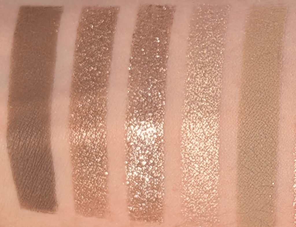
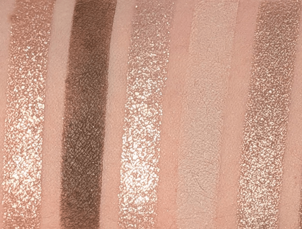
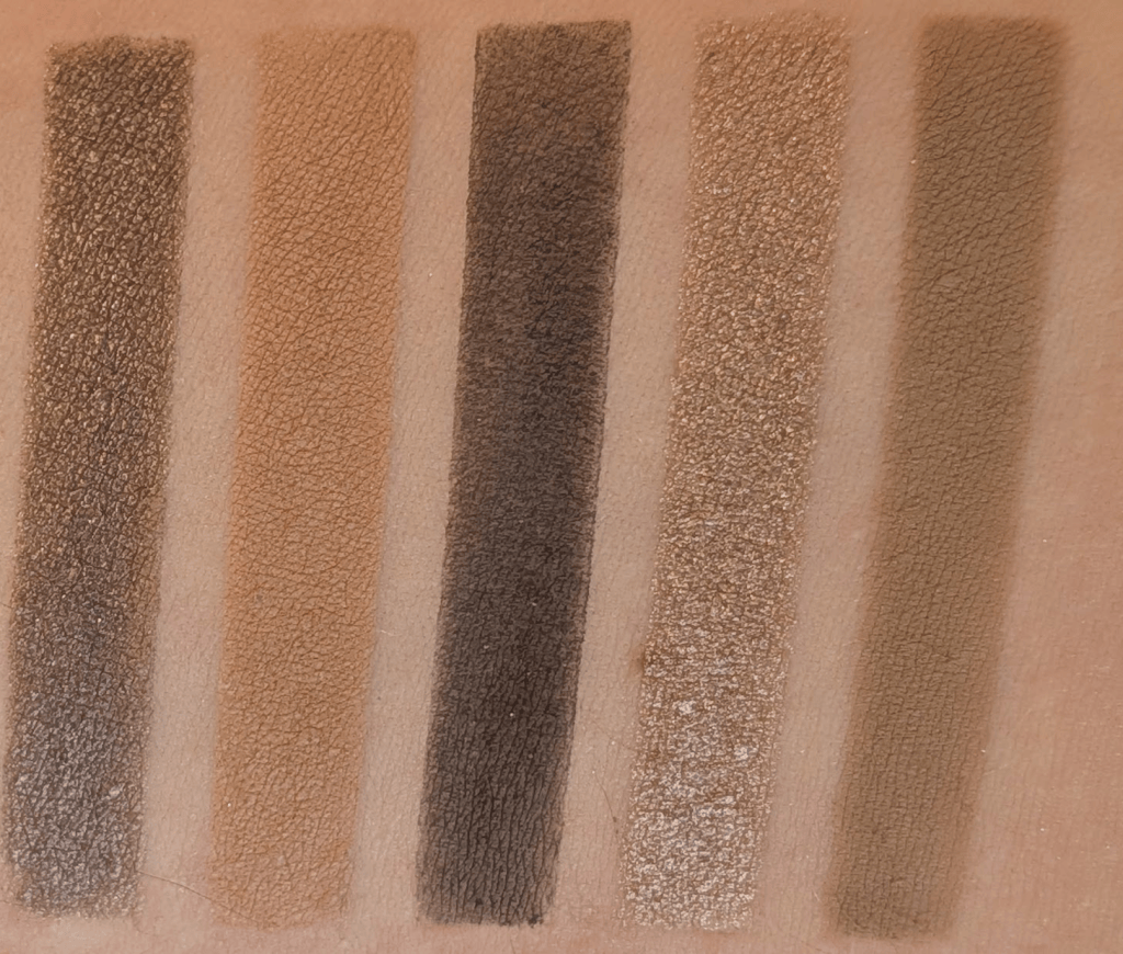
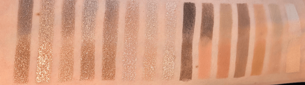
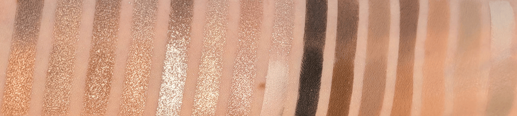
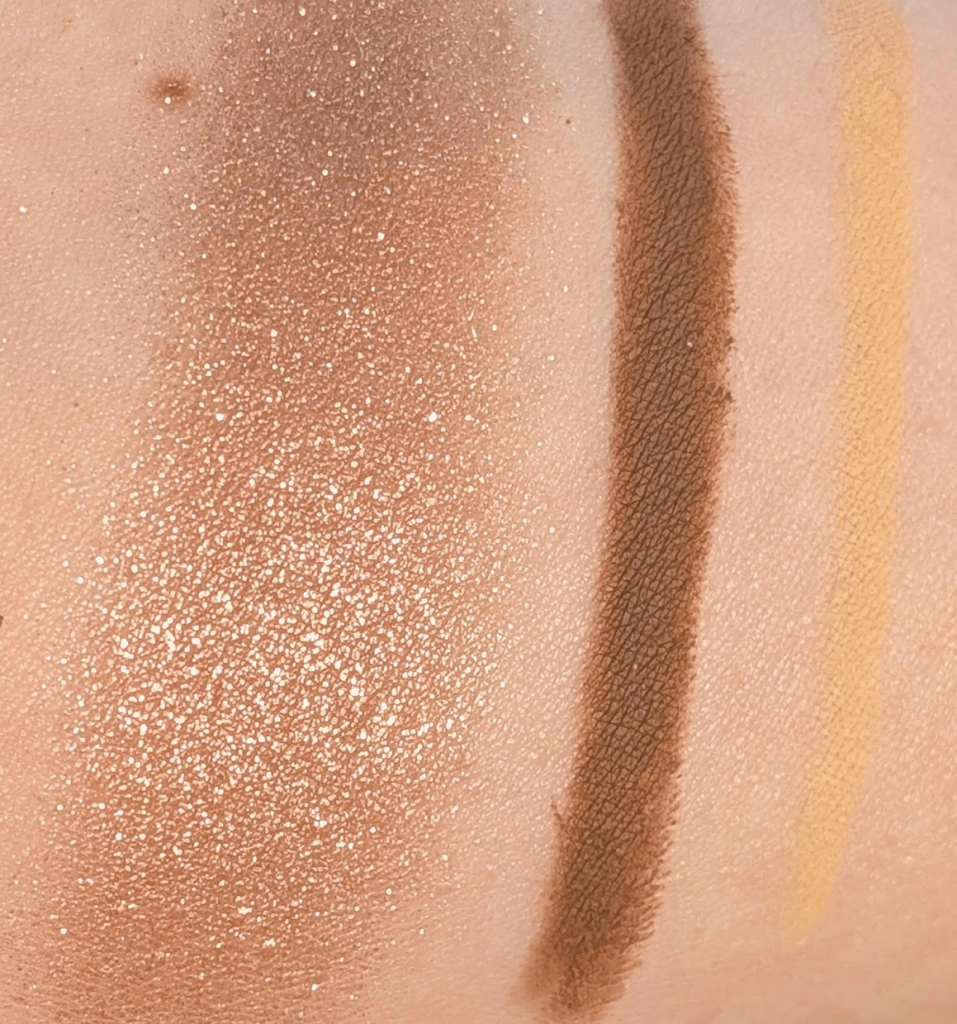
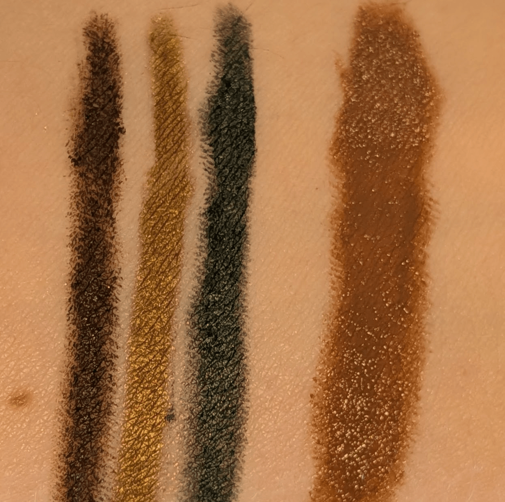
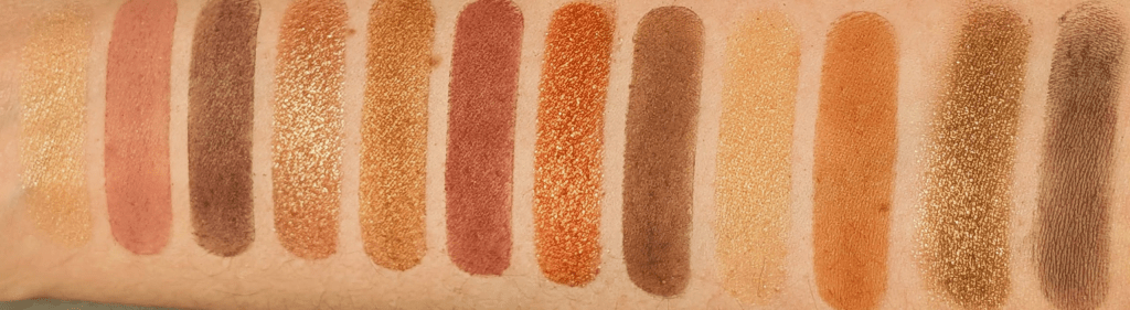
In this post, all links are affiliate links (thank you for your support!), but all opinions are my own and I bought all these products myself. Swatches are under a ring light to show true to color (photo #1) and then standard lighting to show the formula a little better (#2) for all the products.
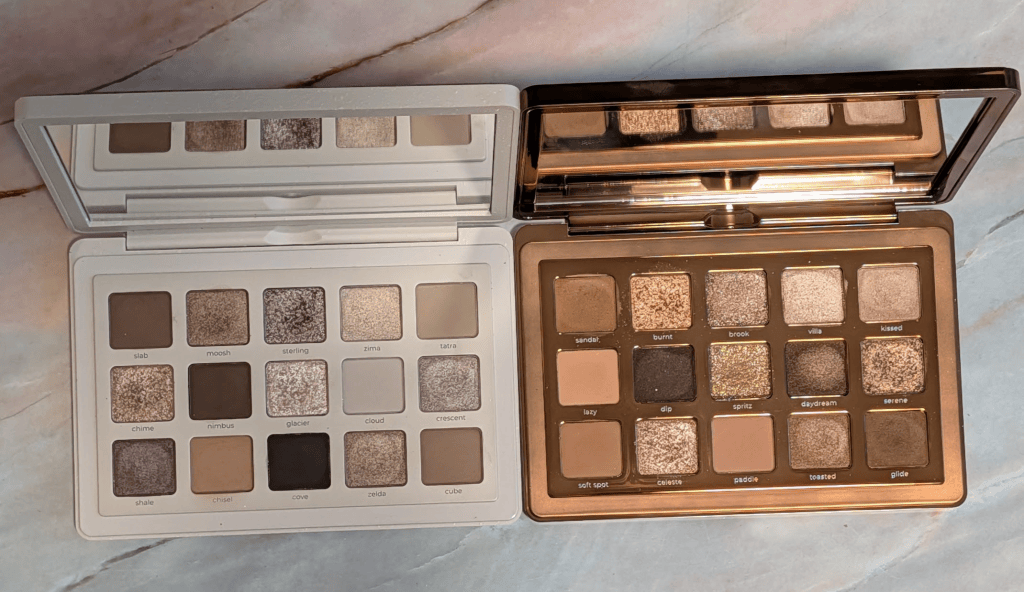
I Need a Cool vs I Need a Tan

I’ve seen other people say this palette is too gray or ashy, and after actually wearing it, I completely understand what they mean. I think I’m pulling basically every ounce of warmth out of these shades and they’re still landing somewhere around neutral-to-cool on me. If you don’t normally make everything turn orange, I can absolutely see this looking much grayer on you than it does in my swatches so I wanted to warn everyone up front that this is, in fact, a (mostly) cool palette. 

I personally tend to veer towards pink, purple, berry, and navy types of shades when I go for a cool toned look. This palette is very specifically a gray, mushroom, silver, taupe version of cool, and I honestly  don’t own that many palettes that have these kinds of shades. I’ve really liked the looks I’ve been wearing with this palette even though it’s weirdly a bit out of my comfort zone. I’m already excited to wear this with berry blush when it gets colder, and it turns out these shades look great with a bright pink blush just like warmer shades do. 
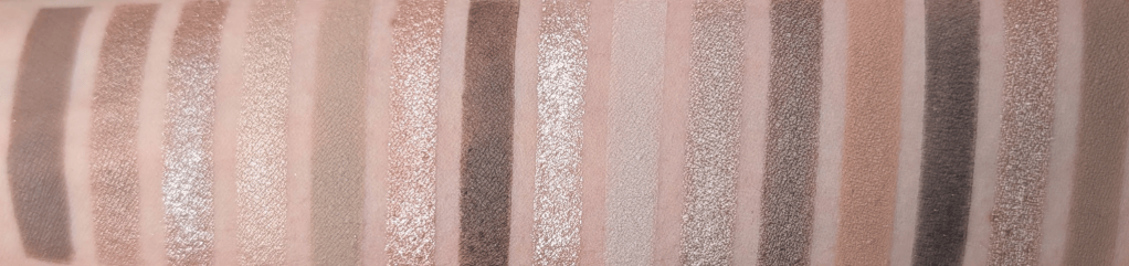
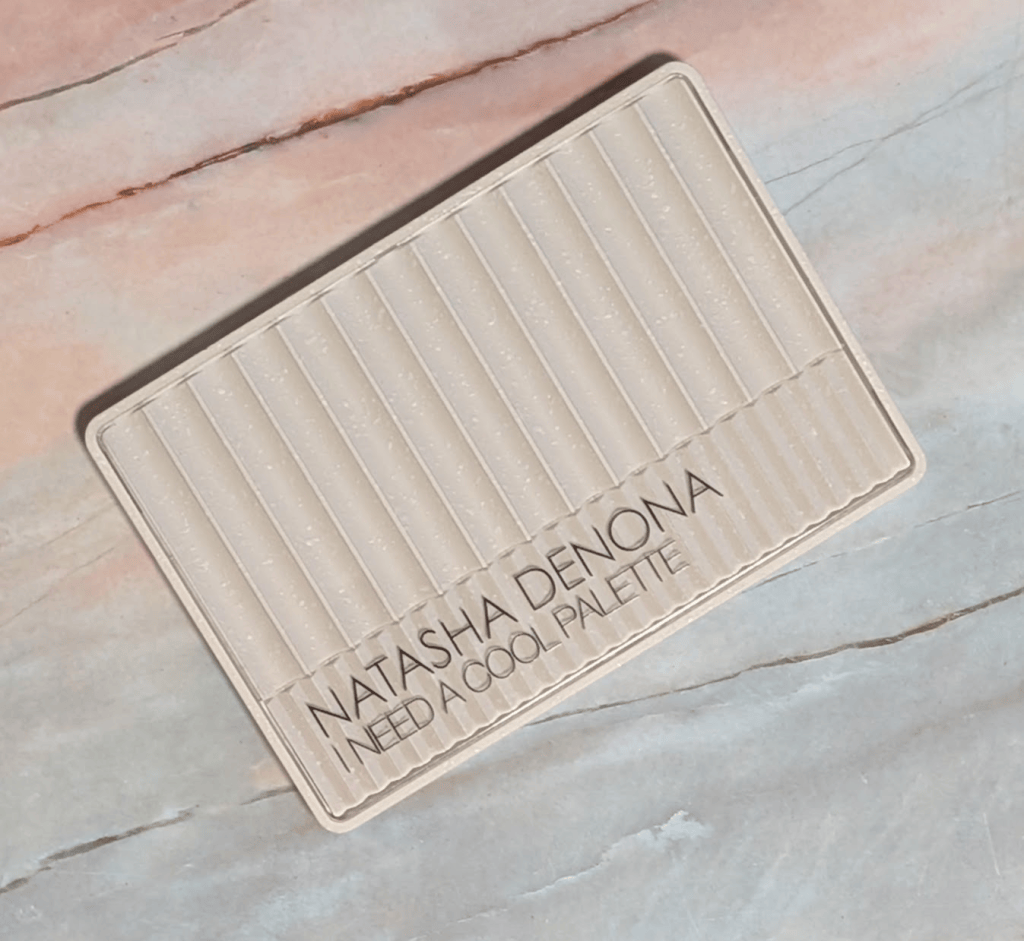
Natasha Denona I Need A Cool

Formula-wise, I’m still not the biggest Natasha Denona matte person. I know people LOVE these mattes, but they have a stick-to-it-ness that isn’t really my preference. Once I put them down, they want to stay exactly where I put them, and I prefer a silkier matte that I can move around more easily, like the mattes in the YSL quads. They’re still good mattes, but I think they really benefit from a natural hair brush and being used to working with this type of formula. 

The super sparkly shimmers and metallics, as usual, are stunning. They have a lot of dimension and just look blingy, for lack of a better word. They’re easy to use with a finger or a brush, and they wear really well on me. The smoother shimmers are exactly what you want for a sophisticated (meaning I had 30 seconds to get ready for this 7am meeting, and I don’t want it to look like I’m covered in glitter) type of look. 

A short detour to look at each of the shades individually:
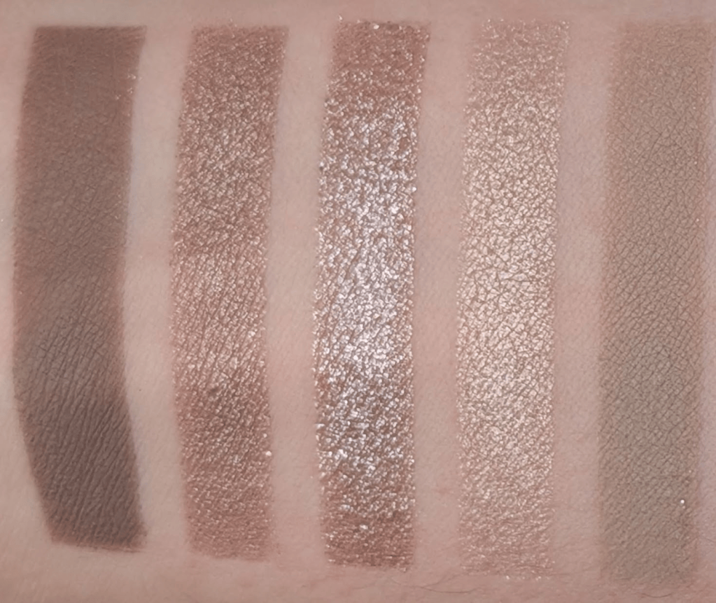
Slab, Moosh, Sterling, Zima, Tatra

Slab – This is my perfect midtone brown matte that doesn’t go even a little orange. It has a little gray-green thing going on if you look really closely, and it just works so well with my skin. I can wear this as a one and done matte look so easily. I wouldn’t say buy this palette for this shade, but I wouldn’t be mad if I could buy this as a single. 

Moosh – This is a smooth taupe shimmer that’s less sparkly, but easy to wear alone. It’s one of those neutral browns that always turns orange on me, except this one doesn’t.

Sterling – This is one of my favorites in the palette. It’s a taupey brown with a chunky silvery metallic reflect that I just want to pile on my eyes (and I have many times). Another one that I’d totally buy as a single. 

Zima – This is somehow the least special shade in here even though it’s not a matte. It’s a champagne shimmer that pulls a little gold on me, and I feel like I already own this shade 400 times. Spoilers – it’s also the only shade I found an actual dupe for in the Stone Cold Fox palette. 

Tatra – This is one of my favorite mattes in the palette. It’s a muted stone/khaki/beige transition shade that does what I always want a camel brown to do because Tatra doesn’t turn orange.  
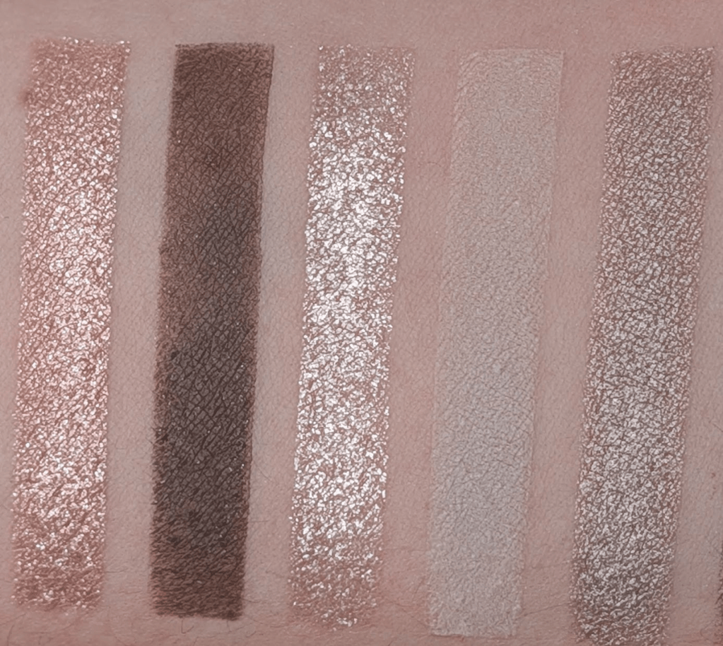
Chime, Nimbus, Glacier, Cloud, Crescent

Chime – I love this one. There’s a little pink in it, but it’s almost silver when I get it on my eyes. It’s mostly just really shiny and sparkly, and the silver reflect keeps it from going too peachy. 

Nimbus – This is the darkest brown matte in the palette, and it honestly swatches pretty badly. It works much better when I’m actually working with it, and I really like using this as a subtle liner because it doesn’t show up too strongly and I have room to build it up. 

Glacier – This is a very pale and icy sparkly shade. I like this much more as a topper or brightening shade than using it alone. This is also the shade that I get the most fallout with, so I have to be a little more careful. 

Cloud – This is a super pale mushroomy off-white matte. I thought I would use this a lot to blend things out, especially because it’s almost a little green, but I just really haven’t. This is also one of the shades that can make a look go from neutral to “wait why is this so gray?” pretty quickly.

Crescent – This is a really nice taupe brown metallic that doesn’t go orange. It’s pretty and the formula is very nice. 
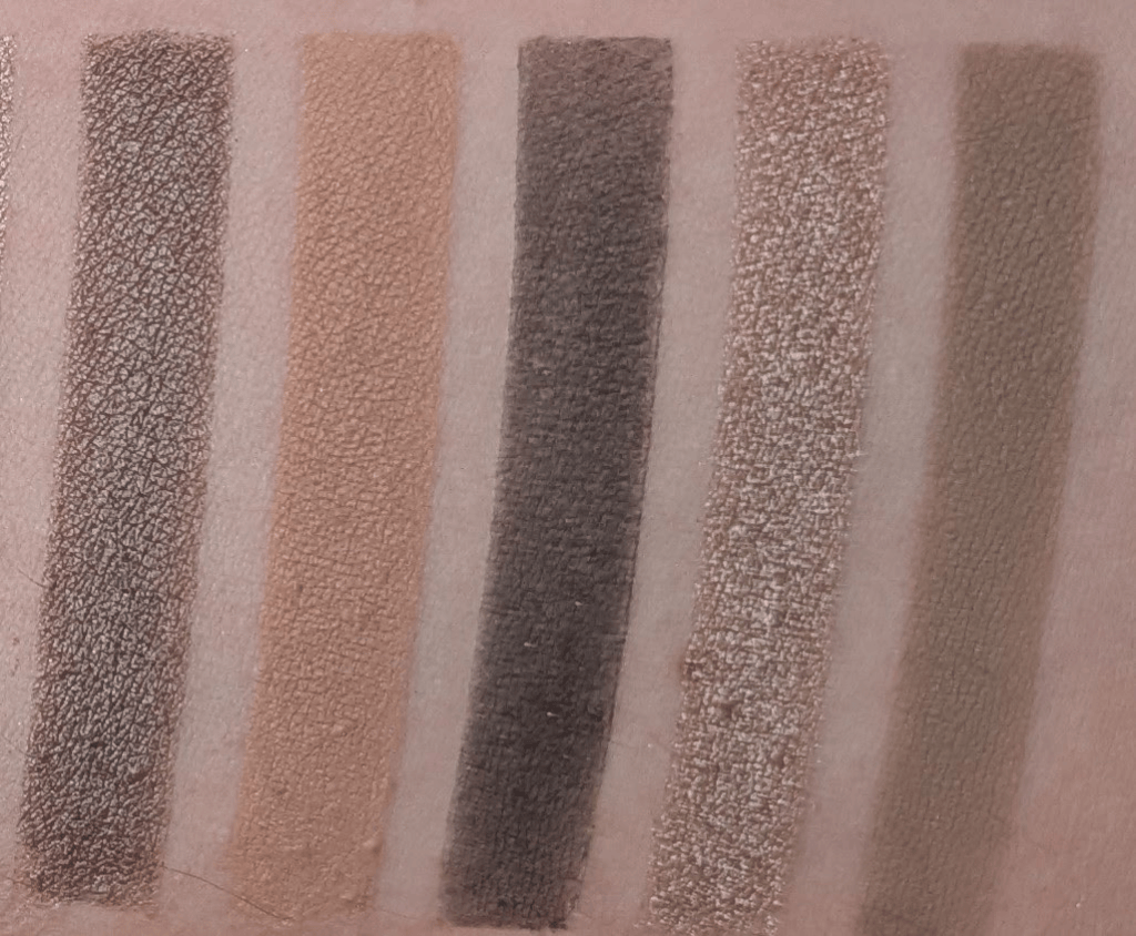
Shale, Chisel, Cove, Zelda, Cube

Shale – Similar general territory to Crescent but much deeper and browner, and I like Shale so much better, I really haven’t used Crescent. 

Chisel – This is the actually warm shade in the palette especially relative to everything else. I don’t even know that I would call it particularly warm if it were sitting somewhere else, but next to everything here it definitely is. I like having it for when I’ve accidentally gone too gray and want to pull things back a little without going too orange, but it still feels a little out of place. 

Cove – This is the deepest shade. It’s more of an almost black than an actual inky black, which is nice if you’re afraid of using a super pigmented black shadow. If you’re used to that though, this might be a little disappointing.

Zelda – A smooth taupe-brown shimmer (yes, another one!). It’s pretty, and I would happily wear by itself.

Cube – Another mid-tone taupe/brown. It’s deeper and browner than Tatra, but they’re close enough in what they do for me that if I were making this palette, I probably would have put something else here.

Most of the looks I’ve made are some variation of taupey brown with sparkle. Sometimes they’re more pink, sometimes more gray, sometimes a little khaki, sometimes very silver, but they’re all the same vibe. That doesn’t bother me when it’s so obvious that’s what you’re getting with this kind of palette. If you want to wear that kind of look every day, you’re gonna love this palette. 

And now, the real reason you’re here, comparison swatches! 

The Natasha comparison that makes the most sense to me is I Need a Nude, because I Need a Cool is basically what I wanted I Need a Nude to look like on me. I Need a Nude is really pretty, but so much of it ends up being really peachy on my skin. When I swatched all 15 shades next to each other, I Need a Nude was noticeably rosier and peachier vs the gray/taupe/mushroom tones in I Need a Cool.  
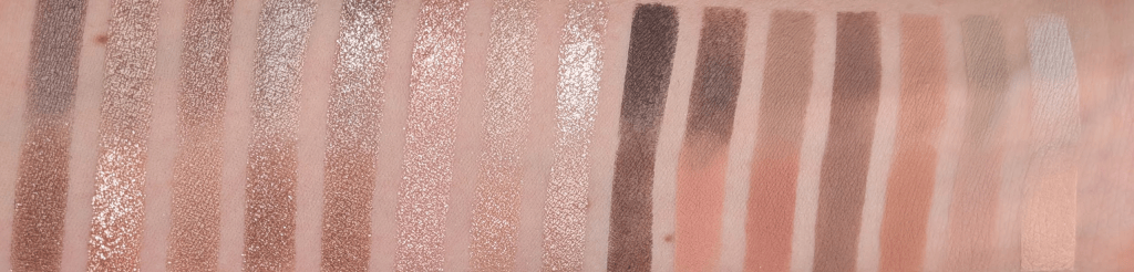
I Need a Cool on the top and I Need A Nude on the Bottom

If I Need a Nude already looks beautifully neutral on you, then I can absolutely see I Need A Cool being too grey for you. If I Need a Nude is orange on you, then I think I Need a Cool might be exactly what you’re looking for. 

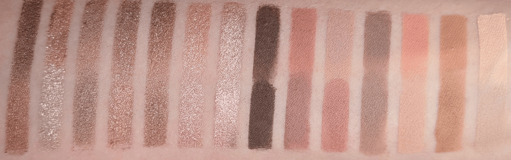
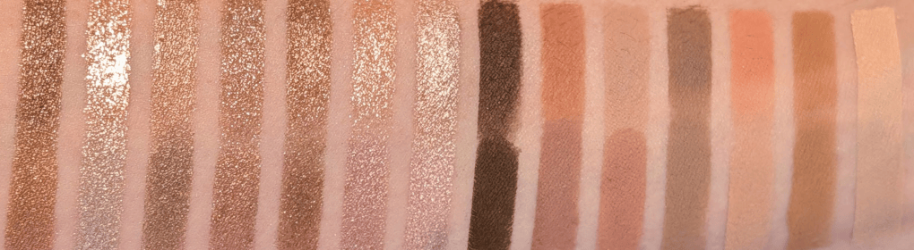
And then obviously there is Colourpop Stone Cold Fox. I matched 15 shades from the two palettes and when I swatched them all together, the overall color stories looked much closer than I expected. There aren’t 15 actual dupes, but I truly think you can get pretty close to both I Need a Nude and I Need a Cool with the shades in Stone Cold Fox. Even though they’re not exactly the same, they’re very very similar. And by they’re, I do really mean both I Need a Cool + I Need a Nude = Stone Cold Fox. 
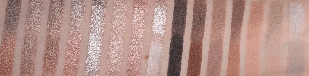
I Need a Cool on the top and Stone Cold Fox on the bottom
I Need a Nude on the Top and Stone Cold Fox on the bottom

I personally reach for I Need a Cool more than I Need a Nude and Stone Cold Fox, especially because I like the Natasha shimmers more and the I Need a Cool tones more. If I already had Stone Cold Fox and liked it, I definitely wouldn’t feel like I had to immediately buy I Need a Cool too. And if you’re looking at all of these gray-taupe-brown shades and have no idea whether this is something that could work for you, Stone Cold Fox is a much cheaper way to experiment. Especially because Stone Cold Fox is under $30 right now, and each Natasha Denona Palette is $72.

I used Ulta points to get I Need a Cool and I would happily use my points on it again. Actually, if I could go back in time, I just wouldn’t buy I Need a Tan and buy this instead. I knew I Need a Tan was probably going to be too warm when I bought it, but I wanted to review it anyway, and now I feel guilty every time I see it because I just don’t want to use it enough to even finish the review (I did post swatches in my Substack chat, please comment if you want me to find them!). With I Need a Cool, I keep wanting to use it and have to force myself to use other things I’m also testing. But of course, if you already have your perfect silvery taupes, mushroom browns and neutral mattes that never go orange, you may truly not need this. 

Ultimately, I do think this one is worth getting if you have also spent years wondering why every “neutral” brown palette looks orange on you. If my toddler hid this somewhere in my house and I couldn’t find it again (he would never, but hypothetically), I would buy another one. A lot of my other palettes, I wouldn’t miss. 
The Products Under $10 at Ulta I Actually Use, Even If I Was Just Trying to Hit Free Shipping

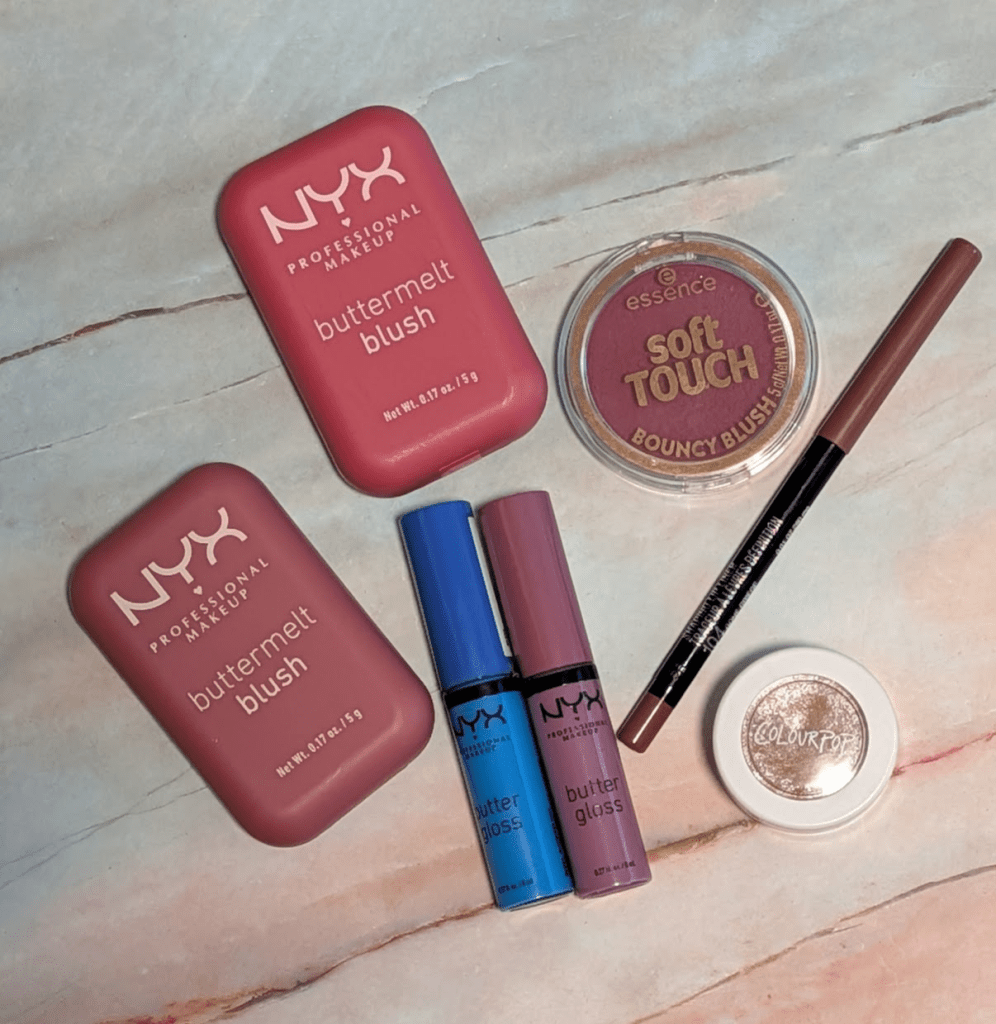
A lot of affordable makeup is pretty fantastic, and I don’t spend enough time talking about it. So for May, I’m dedicating the entire month to posts about products under $20. I wanted to start with the under $10 products at Ulta that you might throw in your cart just to hit free shipping, but that I would happily buy anyway because they’re really that good. I also did a quick affordable bronzer check at the end because I tried three from Ulta (and don’t use them very often). In this post, all links are affiliate links (thank you for your support!), but all opinions are my own. 

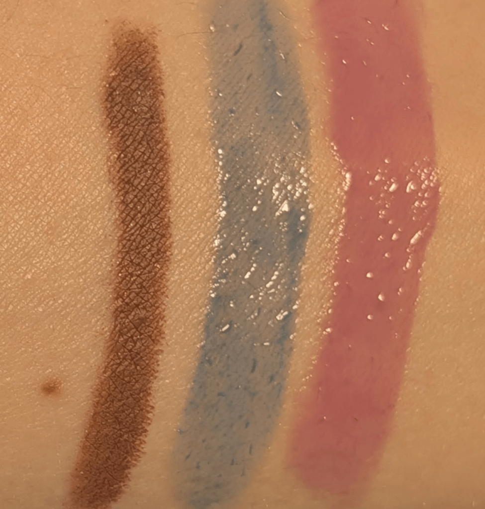
Maybelline Color Sensational Shaping Lip Liner in Gone Greige ($8.49) – This color is really special. On me, it reads like a cool brown with a purple-gray undertone, which is exactly the kind of lip liner color I am always looking for and almost never find. It gives definition without looking out of place and goes so well with the lip products I tend to reach for. The formula has a little time to blend, and then it really stays put. I also love using it with lip products that run a little too warm because it helps cool everything down. 

NYX Butter Gloss in Blueberry Tart and Marshmallow ($6) – The NYX Butter Gloss is one of my favorite gloss formulas and has been for years, but these two shades I’m especially excited about. They’ve been so useful for cooling down lip products that pull orange or yellow. If something is really orange, I use Blueberry Tart, and I always get the most perfect shade no matter what I’ve mixed it with. If it just needs a little help or is weirdly yellow, I use Marshmallow. Marshmallow is also so pretty with my olive skin on its own. It’s a really special cool milky muted lilac I don’t see very often. The formula isn’t sticky, feels nice on the lips, and wears better than a lot of glosses that are way more expensive. I think they actually moisturize and nourish my lips too, unlike a lot of lip glosses/oils. 

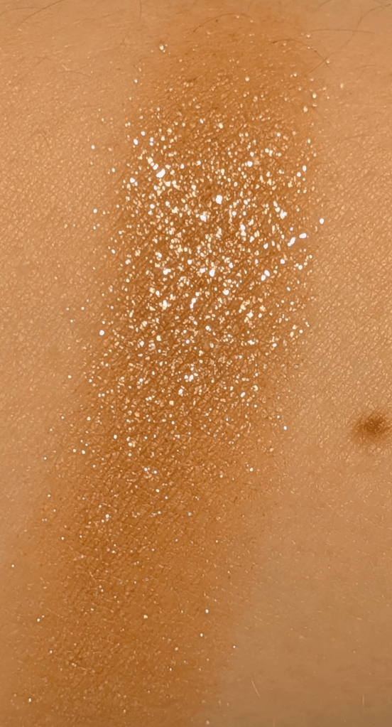
ColourPop Super Shock Shadow in Ritz ($7) – This is one of my all time favorite one and done eyeshadows. The sparkle, wear time, and overall effect are right in line with my more expensive shadows; I wouldn’t be able to tell that this was as inexpensive as it is. It reminds me a lot of Urban Decay Space Cowboy, just with a sheerer base color. Even with that, it has such a beautiful wet-look sparkle that I can get away with wearing this alone or layered over matte shadows as a topper. The formula is super easy to use with a finger or a brush, and I find I get less fallout than with other similar glittery shadows. I keep thinking of buying other shades since I love the formula so much, but I know I’ll reach for Ritz every time. 

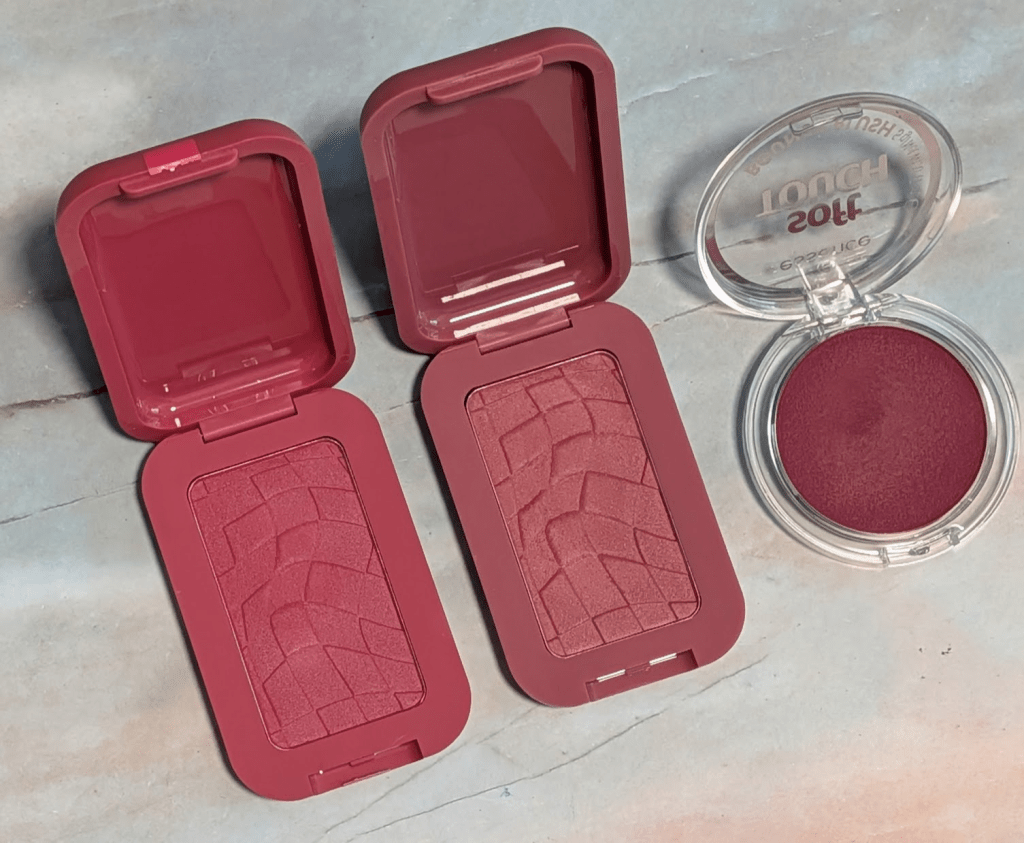
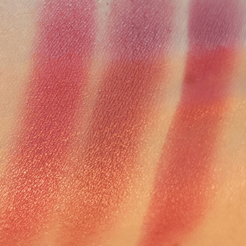
NYX Buttermelt Pressed Powder Blush in Butta With Time and For The Butta ($11) – I really like this formula. These are super pigmented, but they blend easily and don’t feel as difficult to work with as some other super pigmented powder blushes. That said, if you want a super subtle flush of color, I don’t think you’ll appreciate these because they really are pigmented. Butta With Time is a bright, warm (but not too warm) pink, and For The Butta is more of a rosy mauve. Now that I’ve gone back and tested them side by side again, I actually think I like Butter With Time more right now because it wakes up my face and fits with the warmer weather. For The Butter feels softer and moodier, and I can already tell it will be perfect for the fall and winter. *I know these are actually $11, but I can almost always find them on sale, so I decided to include them anyway. 

Essence Soft Touch Bouncy Blush in Roses in Berry ($5.99) – This has that blurred, soft matte-satin, bouncy cushion blush formula that is my absolute favorite blush formula. If I didn’t know this was affordable, I would totally think it cost way more than it did. I do think some of my more expensive blushes have more nuanced shades, but this formula is definitely just as good. On me, this berry shade is almost a little too red, but if I use a light hand, it gives a really pretty fresh pop of color that doesn’t go orange. This is especially pretty for spring and summer, and I think I would also have loved Electric Peony. Like with the NYX blushes, these are pretty pigmented and a little goes a long way. 

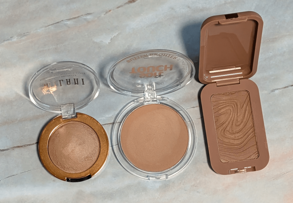
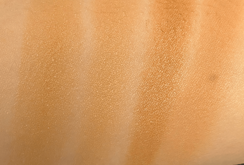
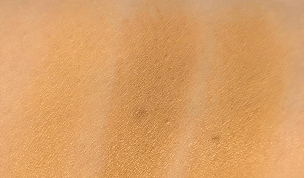
Trying affordable bronzers: Milani Baked Bronzer in Amalfi Glow ($12.99), Essence Soft Touch Butter Bronzer in 10 Whipped Buttercup ($5.99), and NYX Buttermelt Bronzer in Deserve Butta ($11)  – I actually like something about all three of these. Milani Baked Bronzer in Amalfi Glow and Essence Soft Touch Butter Bronzer in 10 Whipped Buttercup are both super easy to blend and build up, with Milani being glowier and more believable as a bronzer on me and Essence looking softer and more matte. The NYX Buttermelt Bronzer in Deserve Butta gives the prettiest sunkissed effect but is also the most pigmented and the closest to going too orange. All three still run warmer or just more yellow than my ideal bronzer tone, so this is one of those categories where the formulas are improving faster than the shades for my undertones. I might try NYX Buttermelt Bronzer in All Butta’d Up, though, because I like the formula and that shade looks rosier. Based on the swatches, the Milani and Essence shades I got are the coolest options in their ranges. I also included the Gucci Bronzing Powder in 01 for reference in the swatches.

What other products would you like me to review? Let me know if there’s anything else you’d like to see here, and thanks for reading! As always, some links may be affiliate links that support the blog and some products may have been gifted, but all reviews/opinions are completely my own and unsponsored. 

5 Products I’m Decluttering And What I’m Keeping Instead

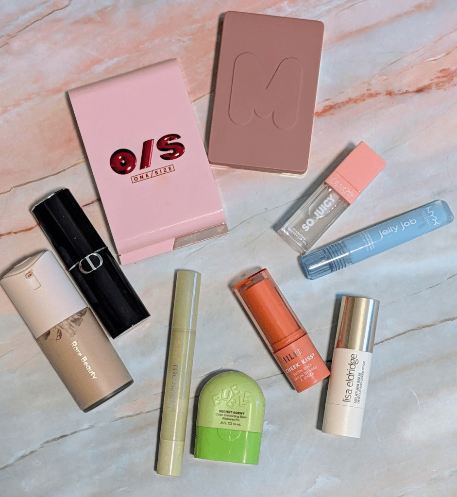
I was originally going to do something else this week, but I realized I had so many products sitting in my declutter drawer that I just don’t really want in my collection anymore. Most of these products are perfectly fine (and you might love them) but they got replaced by something that works much better for my skin and preferences. I never end up reaching for them, and they would be much better off with a friend. In this post, all links are affiliate links (thank you for your support!), but all opinions are my own.

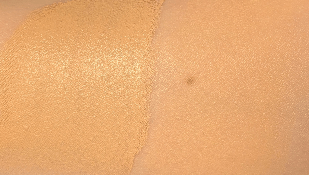
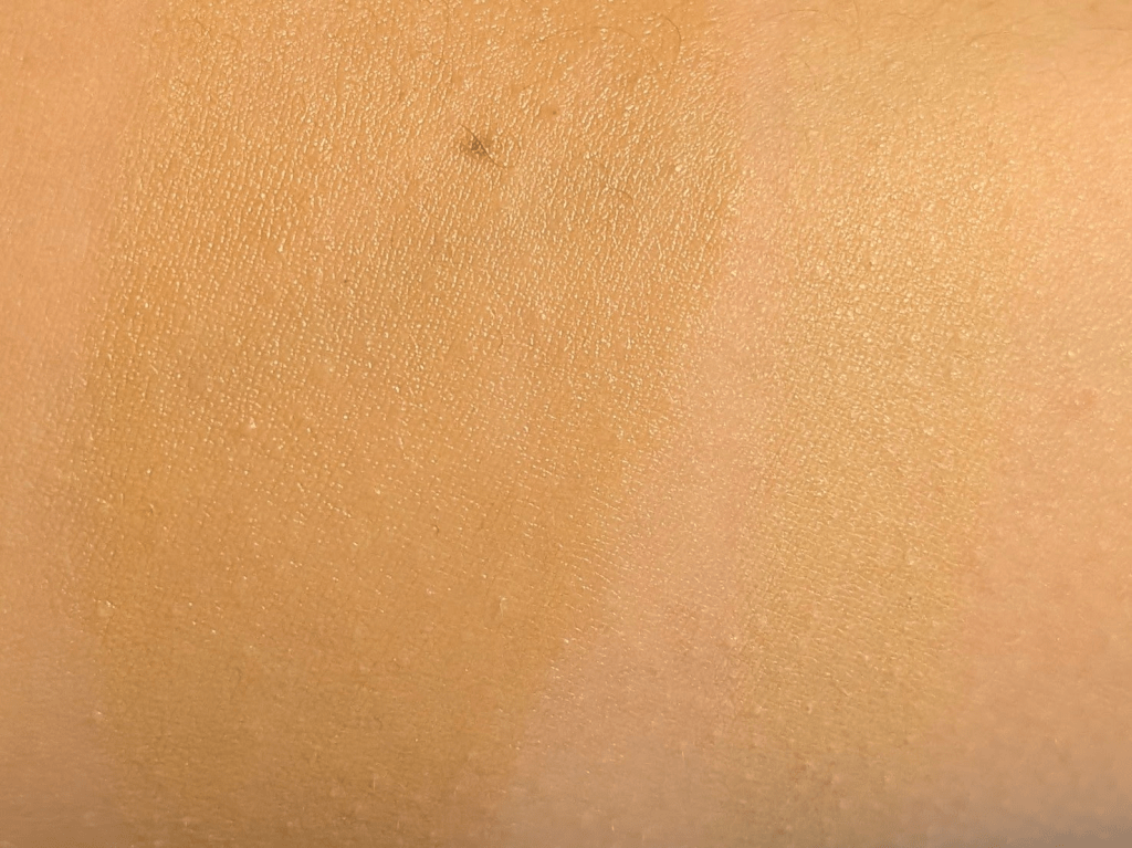
Instead of the Dior Forever Skin Perfect Stick in 1.5N, I’m keeping the Rare Beauty Soft Matte Foundation in 10 – The Dior stick foundation formula is totally fine, but the shade is just a bit too warm and orange on me. I can get away with a complexion product that’s a little too warm if the formula is nice enough, but this one doesn’t play super well with any of my blue color correctors, which is normally what I do if something is too orange. The Rare Beauty Soft Matte Foundation is what I’ve been reaching for instead. Since it’s a liquid foundation, it’s not technically a one-to-one replacement for a stick foundation, but it fills the same role for me when I want that more matte satin, perfected skin kind of base. I have only had it for a little while (I got it in my Sephora sale order) and have only worn it a couple times, so this isn’t a long term review. The shade match is so much better, and it blends in without needing any color corrector. I also just like the formula better. This is one of my favorite matte foundation finishes I’ve tried in a long time because while it is matte and blurring, it’s not too drying. It really looks nice all day. I even tried it without primer or anything hydrating underneath  just to see what it would do, and even on my very dry skin, it only broke up a tiny bit. I also really like the packaging, which is a pump that locks. This makes it really easy to travel with or throw in a bag. I could not get the swatches to show up true to color no matter what lighting (indoor, outdoor, any room) I tried but I can confirm that my husband literally couldn’t even tell the Rare beauty swatch was on my arm.

Instead of the Bubble Secret Agent Color Correcting Balm Redness Fix, I’m keeping The Saem Cover Perfection Pen Concealer in Green Beige – The Bubble corrector is one I might not recommend for anyone, but if you love it, let me know in the comments. It has this weird watery texture, and when I blend it out it turns into this beigey orange that’s also green, it doesn’t do a good job of cancelling redness. I end up with a weird orangey red blotchy situation that is not what I’m looking for at all. The Saem one is so much better. It’s a perfect beigey green that actually neutralizes redness while still blending into my skin instead of sitting on top looking obvious. I also like the texture so much more. It just makes a lot more sense on my skin, and I would never use the Bubble over the Saem. 

Instead of the ColourPop So Juicy Plumping Glossy Lip Oil, I’m keeping the NYX Jelly Job Lip Gloss in Jelly Frost – I know the ColourPop gloss/oil  is supposed to be plumping, but for me, it’s just really uncomfortable without doing any plumping. If a lip product is going to sting, it needs to also look good enough for me to work through the pain. This one doesn’t make my lips look better or nourish them, and it hurts. It doesn’t last especially well (probably because it’s more on the oil side than gloss or balm), so overall it’s just not a product I enjoy using. The NYX Jelly Job gloss is such a better drugstore option for me. It feels nourishing, lasts well for a gloss, and I really like shade Jelly Frost specifically because it has a slight blue tone to it. It’s not a pH adjusting gloss that turns bright pink, and that tiny bit of coolness is really helpful since I can use this on top of lip products that lean too warm for me. 

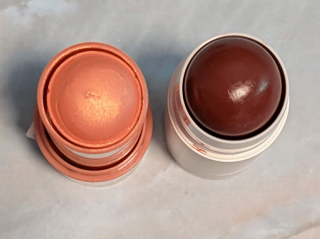
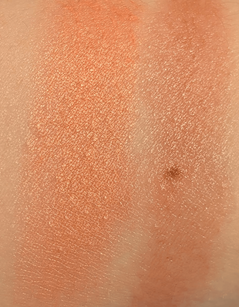
Instead of the Milani Cheek Kiss Blush Stick in Luminouso, I’m keeping the Lisa Eldridge Blush Balm in Cinnamon Bun – This one is an easy declutter for me. Obviously the shade is not right for me, but honestly the texture is just as much of a problem. It looks patchy and splotchy on my skin and never really in the way I want it to. The Lisa Eldridge Blush Balm in Cinnamon Bun is so much better on me. Caveat that I understand this is much more expensive but it’s so worth it to me. Cinnamon Bun is this perfect sunburned rusty reddish brown that looks so natural and so at home on me. It gives me that healthy, warm, I’ve been in the sun look without going Cheeto. I also love the formula. It goes on so quickly and easily and blends seamlessly with my skin. You can hopefully see how much smoother it is than the Milani. I actually love the formula so much that I now have four of the Lisa Eldridge blush balms, and I’ve been using them almost daily. 

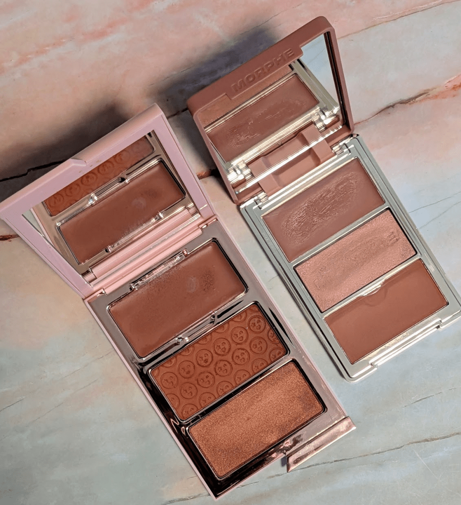
Instead of the One/Size Cheek Clapper 3D Blush Trio in Rich Betch, I’m keeping the Morphe Cheek Thrills Multi-Finish Face Trio in Honeymoon Suite –  Since I bought the Morphe blush trio, I haven’t reached for the One/Size one once. Both of these are trios with a cream blush, a matte powder blush, and a sparkly blush, and the packaging is basically the same. There is nothing really wrong with the One/Size one, but the Morphe one definitely kicked it out of my rotation. The Morphe formula works better for me, is easier to apply and blend, and feels less high stakes. The color story of the Honeymoon Suite trio is a set of cool toned mauve blushes, which looks very at home on my skin. I think the One/Size one might be better in the summer since I do tend to like a red/brown blush (like Cinamon Bun!), but it just always looks a little off on me. The Morphe trio also happens to be half the price, so you could get a warmer and a cooler version if you wanted the option and have spent the same amount of money. 

What other products would you like me to review? Let me know if there’s anything else you’d like to see here, and thanks for reading! As always, some links may be affiliate links that support the blog and some products may have been gifted, but all reviews/opinions are completely my own and unsponsored.

Victoria Beckham Brand Review: What’s Worth It and What I’d Skip

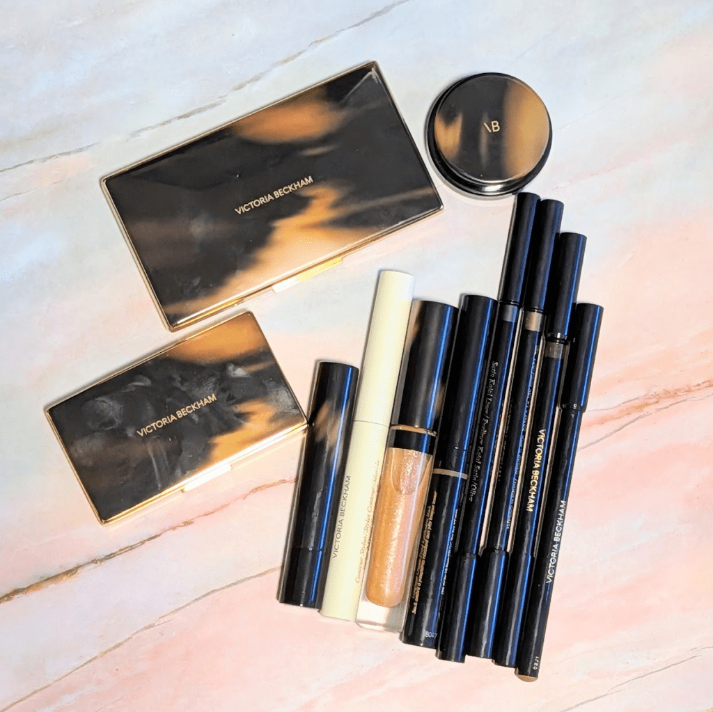
This has been a very highly requested brand review (thank you so much for the requests – please keep them coming here or on Instagram). I’m so excited to share so many amazing products and a couple I personally would not recommend. In this post, all links are affiliate links (thank you for your support!), but all opinions are my own. As always, I’ve prioritized getting product swatches true to color so don’t pay too much attention to whatever is going on with my skin.

Posh Lipstick in Pose – This is my favorite Victoria Beckham product and the first thing I’d rebuy if I had to start over. It stays actually cool toned on me, which is absurdly hard for me to find. It’s a mid-toned mauve that never turns even a little bit orange. It’s that perfect pinky purple mauve I’m always looking for and can basically never find. The formula is lightweight and a little nourishing and dewy without being too glossy. It’s just such an easy everyday lipstick that I would buy again and again.

Lip Definer in 02 – This is one of the VB products that has stayed in my rotation the longest. I just checked and I got mine in 2021 so it’s probably time for a new one, but honestly, it still works and smells perfectly fine. It’s a firmer formula that is long-wearing, and it gives me the clean definition I need to make my lips look more polished. This shade does go a bit go too orange on me so if I grab a new one, I’ll get a different shade, probably 03. This also is definitely a drier formula so I usually need to start with a little lip prep that has time sink in first.

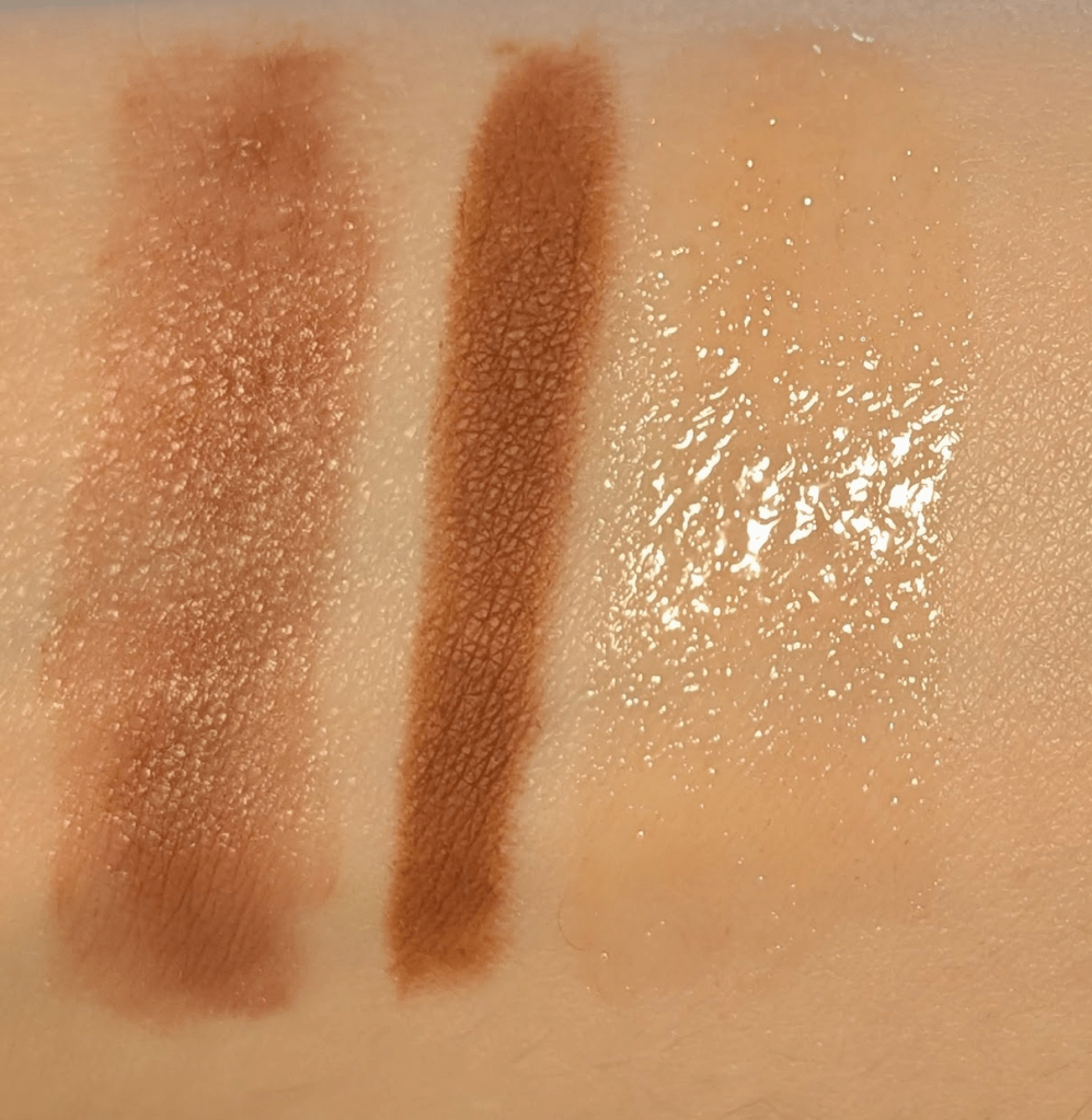
Posh Gloss in Poolside and Martini – I love this formula so much. It makes my lips look smoother and more hydrated, and it’s shiny without being sticky. Poolside is the one I’d rebuy next because it’s the perfect everyday shade on me and plays so nicely with my olive undertones (I actually used it up, so I don’t have it right now and cannot swatch it). Martini is a very, very sheer glittery peach topper that’s won’t change the color of whatever you’re wearing underneath, but also looks really good on bare lips. I have a bunch of shimmery glosses and balms now and this one isn’t my favorite of the bunch, but I’m glad I tried it and the formula is still fantastic.

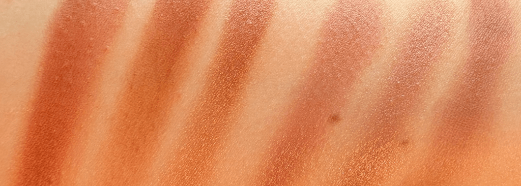
Matte Bronzing Brick in 01 (lighter shade, darker, shade, mixed together)

Matte Bronzing Brick in 01 – I use this constantly, which is very rare for a bronzer. The packaging is beautiful, and I love that it’s refillable, so you can keep the compact and just swap in a refill if you ever finish it. The matte finish is extra blurring on the skin without being overly dry or powdery. The undertone is ever so slightly cooler and more neutral than a lot of bronzers that end up going very orange so both tones work well for my olive undertones. It’s still warm but not too much. I use the lighter shade to blend out anything that needs blending, soften harsh edges, and bridge the gap between my cheek products and concealer, or to softly fill in hollows. Then I’ll use the deeper shade as my actual bronzer, or I’ll just mix the two together depending on the season. I also use both shades as eyeshadow all the time. It’s a great year-round bronzer because you can adjust it lighter or deeper without needing a second product, and I think it would work for a wide range of complexions too.

Lid Lustre in Tea Rose – This is the sparkly Victoria Beckham eye product I’d recommend of all the different shimmery eye products (more on the palettes later). The formula is gorgeous and really easy to apply with a finger or a brush, and you can do a light layer or build it up. Tea Rose is a perfect neutral taupe brown base with a soft plummy/pinky sheen that also has sophisticated glitters that flash pink-lilac and a little champagne/gold in different lighting. It doesn’t go orange or even all that warm, and I love it pared with the Pose lipstick. It’s a more fancy sparkle when the light hits than something like a Pat McGrath special shade, so it actually works really well for everyday. One warning though – mine isn’t super hard-pressed, and I tilted it too far once and got eyeshadow everywhere. So, just be careful!

Crease-Proof Eyeshadow Stick in Pecan – This is one of my favorite eyeshadow sticks, and I’m actually not a huge eyeshadow stick person. The formula is truly great. I can throw it on, blend it out quickly, and it stays all day. Pecan is a really great color that actually stays brown on me, and there’s a tiny hint of green that makes it work so well with my olive undertones. It does have a hint of warmth in it, but not in a Cheeto way. This is also one of my favorite car makeup eye products because it’s so easy to throw on without a brush, and I can wear it alone or tap on a shimmer on top with my finger.

Instant Brightening Waterline Pencil – This is so good that I got rid of my other beige/white waterline pencils. The color is so good. It’s a yellow beige that brightens without looking stark or obvious, so it reads way more natural on me. I know it’s very yellow in the swatch, but it works really well actually on my waterline. The formula is also super easy to use, comfortable on the waterline, and actually stays put. When I’m tired and want to look more awake fast (which is always), this is one of my go-tos.

Satin Kajal Liner in Cocoa, Bronze, and Olive – This is a great eyeliner formula if you want creamy application with really great staying power. You have enough time to smudge or soften it, and I actually do use the little smudger on the other side of the pencil because it works great with this formula. The liner does sets down and doesn’t migrate or turn into a mess on me. It’s easy, it layers well, and it works for tightlining. The Ravie liner is still my pick for someone who’s really bad at eyeliner (it’s me, I’m very bad at eyeliner) but if you’re a little more confident and can handle a more pigment, this is next on my list. Cocoa (dark matte brown) and Bronze (antique green/gold/bronze shimmer) are my everyday favorite easy natural shades on me. Olive is a shimmery deep black based green that’s clearly green but also is a great choice if you want to start playing around with green since it’s not a bright lime green.

Contour Stylus in Marble – This one works, but it’s too expensive for what it is and way too warm to be a good contour for olive undertones. On the positive side, the packaging is super nice, like all Victoria Beckham products. Even though it looks like it might be a little dark at first, it blends out really well and can look natural on my high contrast complexion as a bronzer. That said, I don’t really love the super skinny precise contour stick format. The formula also feels a little dry and a little sticky on me. If you love a precise contour stick and you love the brand, you might enjoy it but this is not the one I would tell you to run out and buy. I will be doing a contour update super soon with your recommendations!

Eye Wardrobe Multi-Finish Eyeshadow Palette in Orchid, Bordeaux, and Cocoa – These are my regret purchases, which I’m very sorry to report. The compact is super luxurious, the refill system is easy (I got one compact and 3 refills), and the formulas are genuinely fantastic. The mattes are silky, easy to blend, and not overly pigmented. The satins and shimmers are beautiful too, and I have no complaints about performance. My problem is the colors do not work for me. Orchid (supposed to be purple) goes brown-orange on me. Bordeaux is straight up orange, including the shade that should read more burgundy. Cocoa went gray-green on me, which I normally wouldn’t mind, except it’s gray-green that still goes orange, and it just doesn’t look right. The light matte in this one is also just Cheeto on me. Every time I use one of these, I have to grab another product to fix it or I end up wiping it off and trying again. If you struggle with shadows not looking like the pan on your skin, I wouldn’t recommend these. For the price, I’d personally grab a YSL Quad every time.

What other products would you like me to review? Let me know if there’s anything else you’d like to see here, and thanks for reading! As always, some links may be affiliate links that support the blog and some products may have been gifted, but all reviews/opinions are completely my own and unsponsored.