Natasha Denona I Need a Cool Is the Neutral Palette I’ve Been Looking For

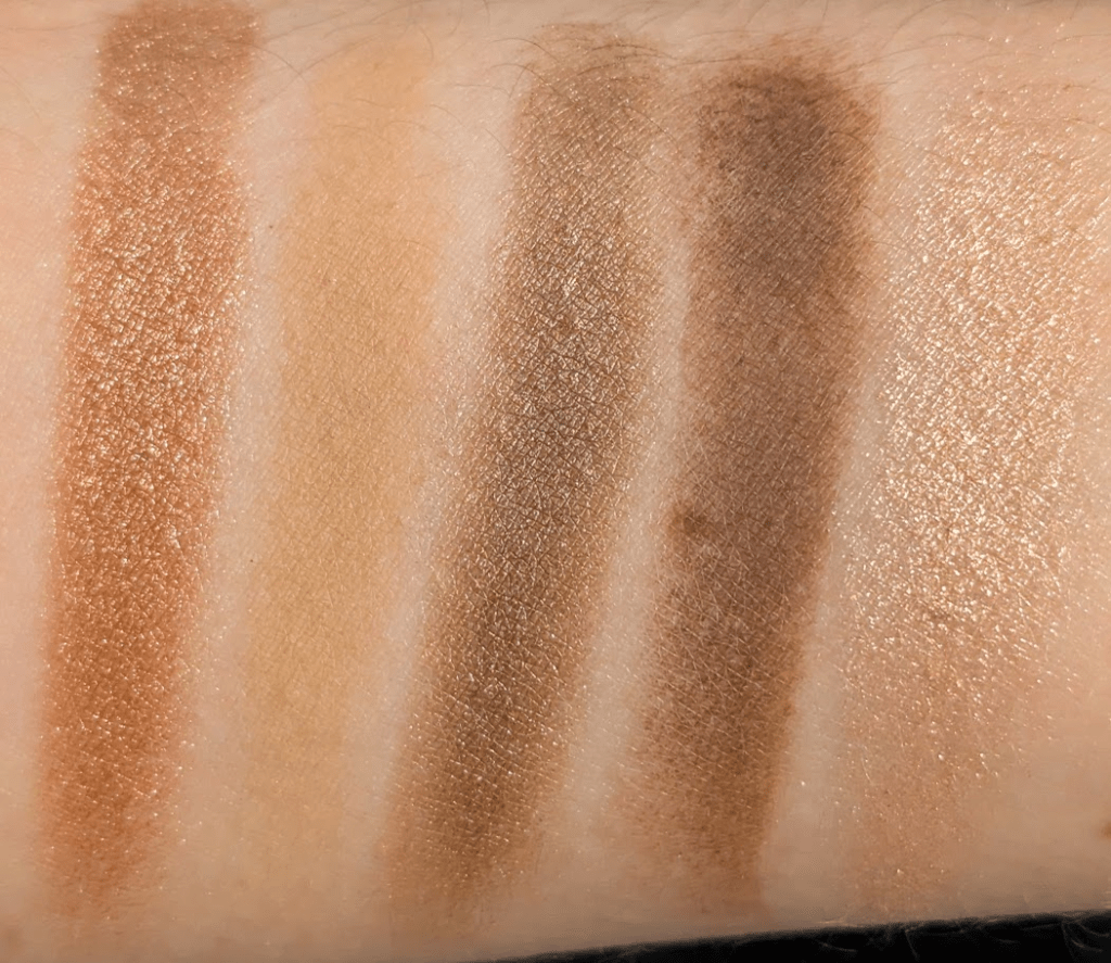
I have a problem with neutral eyeshadow palettes where I look at them and think “oh look, a normal brown”, and then I put them on my face and everything is orange. As an example, I Need a Nude is much peachier on me than I thought it was going to be and I Need a Tan is extremely warm (as expected, I know, I shouldn’t have bought it). Unsurprisingly, I Need a Gold also has plenty of shades that go orange. I was really hoping I Need A Cool would be the neutral palette for me from Natasha Denona, and it turns out that it is. Since I won’t come back around to this, saying upfront that the Xenon palette is my all time favorite cool-toned Natasha palette, but it’s a very different kind of palette than I Need a Cool. 
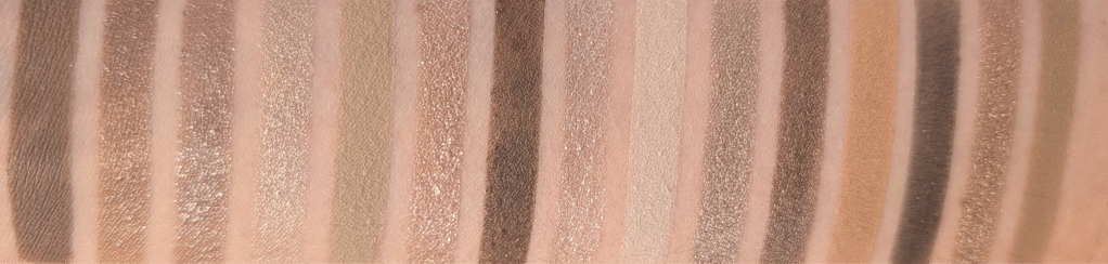
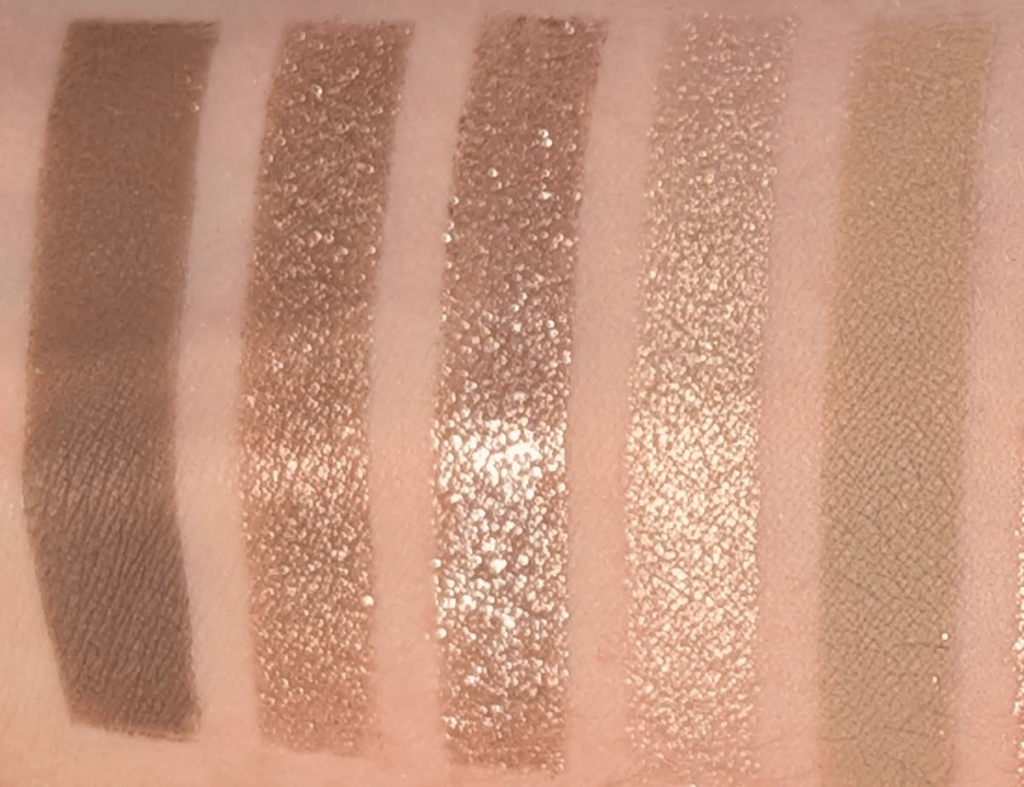
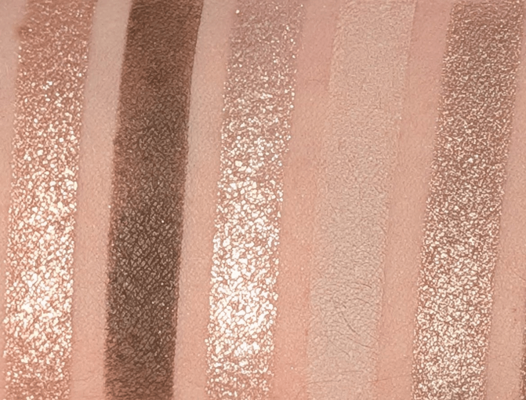
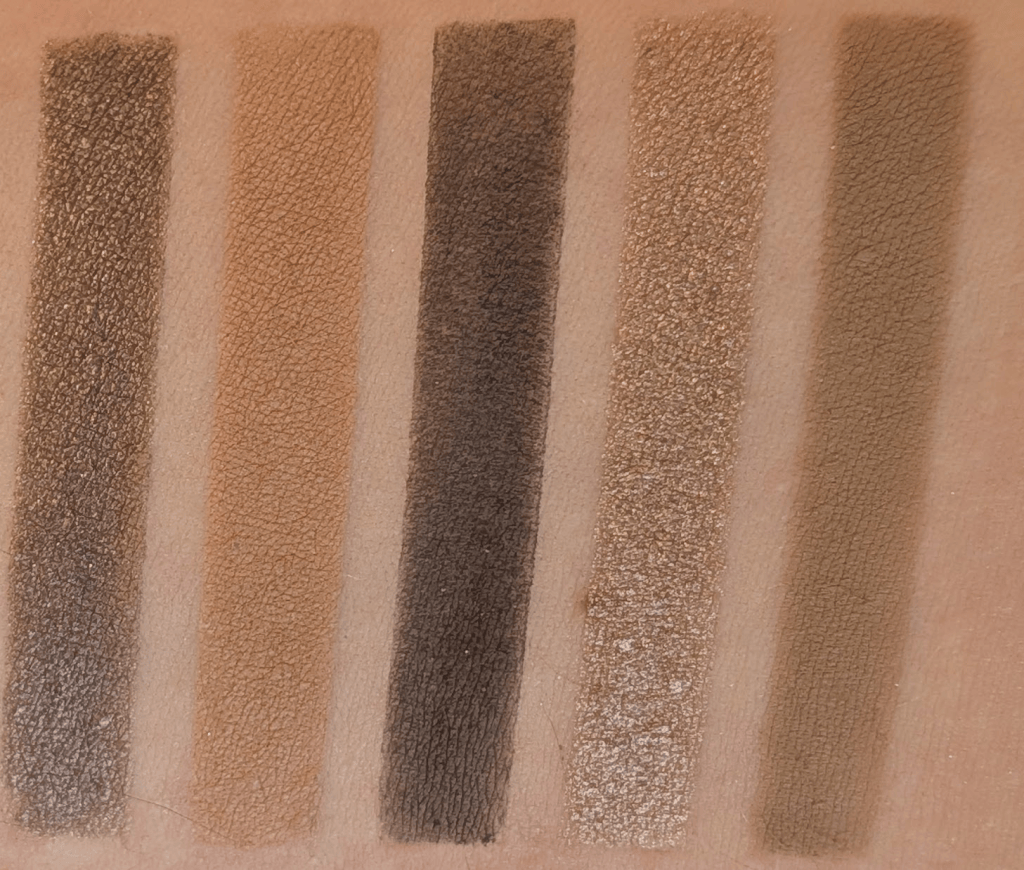
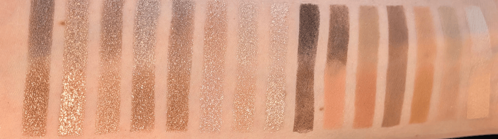
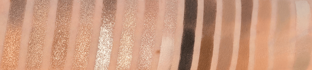
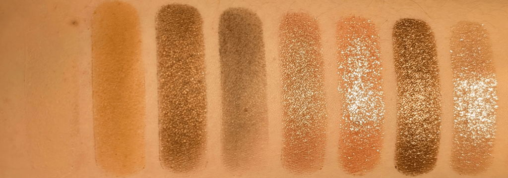
In this post, all links are affiliate links (thank you for your support!), but all opinions are my own and I bought all these products myself. Swatches are under a ring light to show true to color (photo #1) and then standard lighting to show the formula a little better (#2) for all the products.
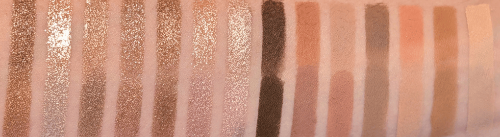
I Need a Cool vs I Need a Tan

I’ve seen other people say this palette is too gray or ashy, and after actually wearing it, I completely understand what they mean. I think I’m pulling basically every ounce of warmth out of these shades and they’re still landing somewhere around neutral-to-cool on me. If you don’t normally make everything turn orange, I can absolutely see this looking much grayer on you than it does in my swatches so I wanted to warn everyone up front that this is, in fact, a (mostly) cool palette. 

I personally tend to veer towards pink, purple, berry, and navy types of shades when I go for a cool toned look. This palette is very specifically a gray, mushroom, silver, taupe version of cool, and I honestly  don’t own that many palettes that have these kinds of shades. I’ve really liked the looks I’ve been wearing with this palette even though it’s weirdly a bit out of my comfort zone. I’m already excited to wear this with berry blush when it gets colder, and it turns out these shades look great with a bright pink blush just like warmer shades do. 
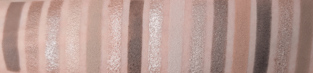
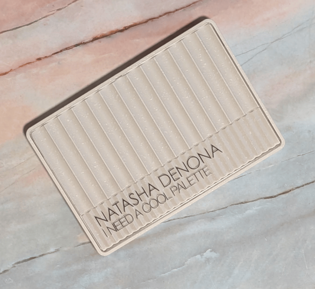
Natasha Denona I Need A Cool

Formula-wise, I’m still not the biggest Natasha Denona matte person. I know people LOVE these mattes, but they have a stick-to-it-ness that isn’t really my preference. Once I put them down, they want to stay exactly where I put them, and I prefer a silkier matte that I can move around more easily, like the mattes in the YSL quads. They’re still good mattes, but I think they really benefit from a natural hair brush and being used to working with this type of formula. 

The super sparkly shimmers and metallics, as usual, are stunning. They have a lot of dimension and just look blingy, for lack of a better word. They’re easy to use with a finger or a brush, and they wear really well on me. The smoother shimmers are exactly what you want for a sophisticated (meaning I had 30 seconds to get ready for this 7am meeting, and I don’t want it to look like I’m covered in glitter) type of look. 

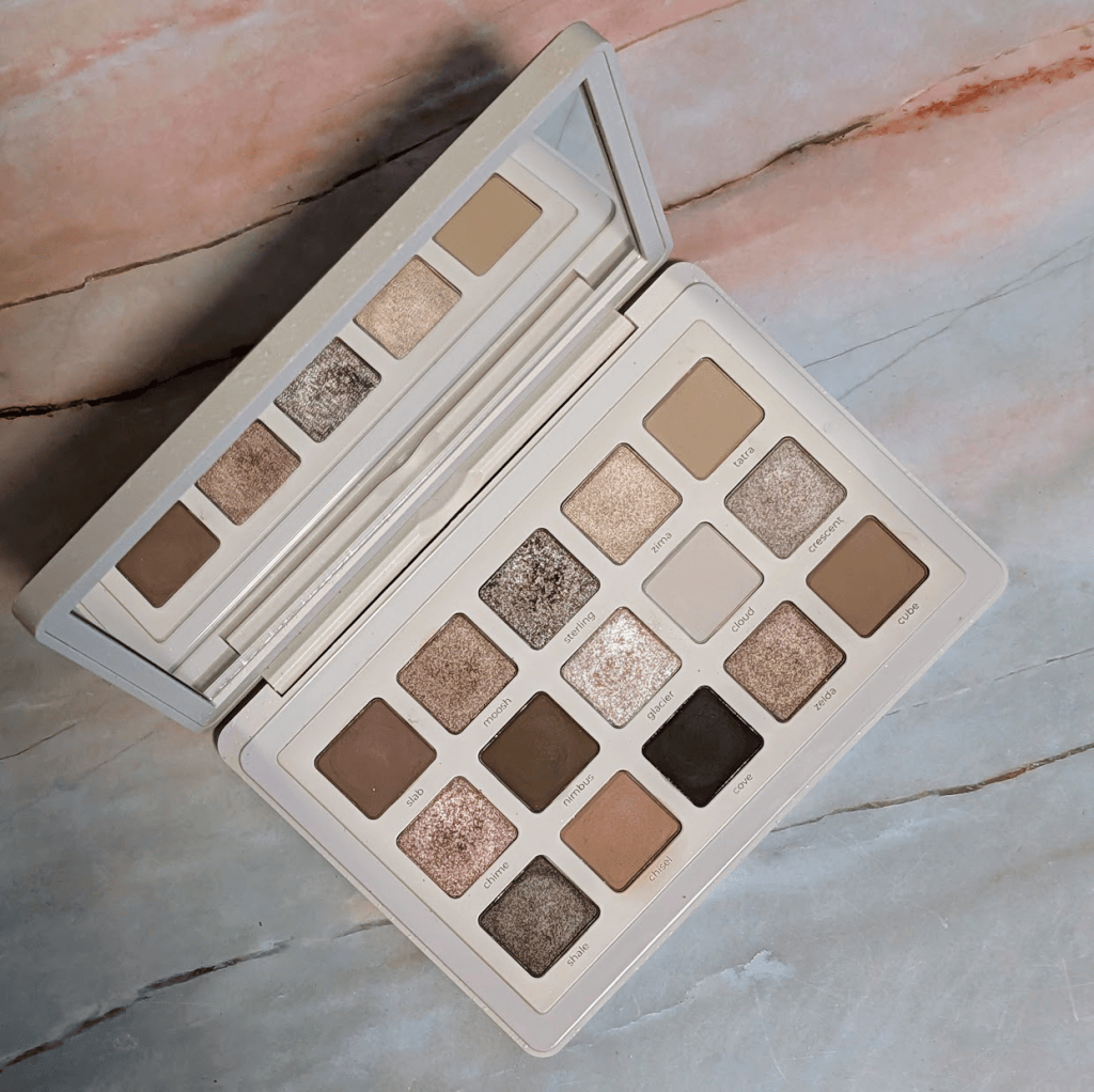
A short detour to look at each of the shades individually:
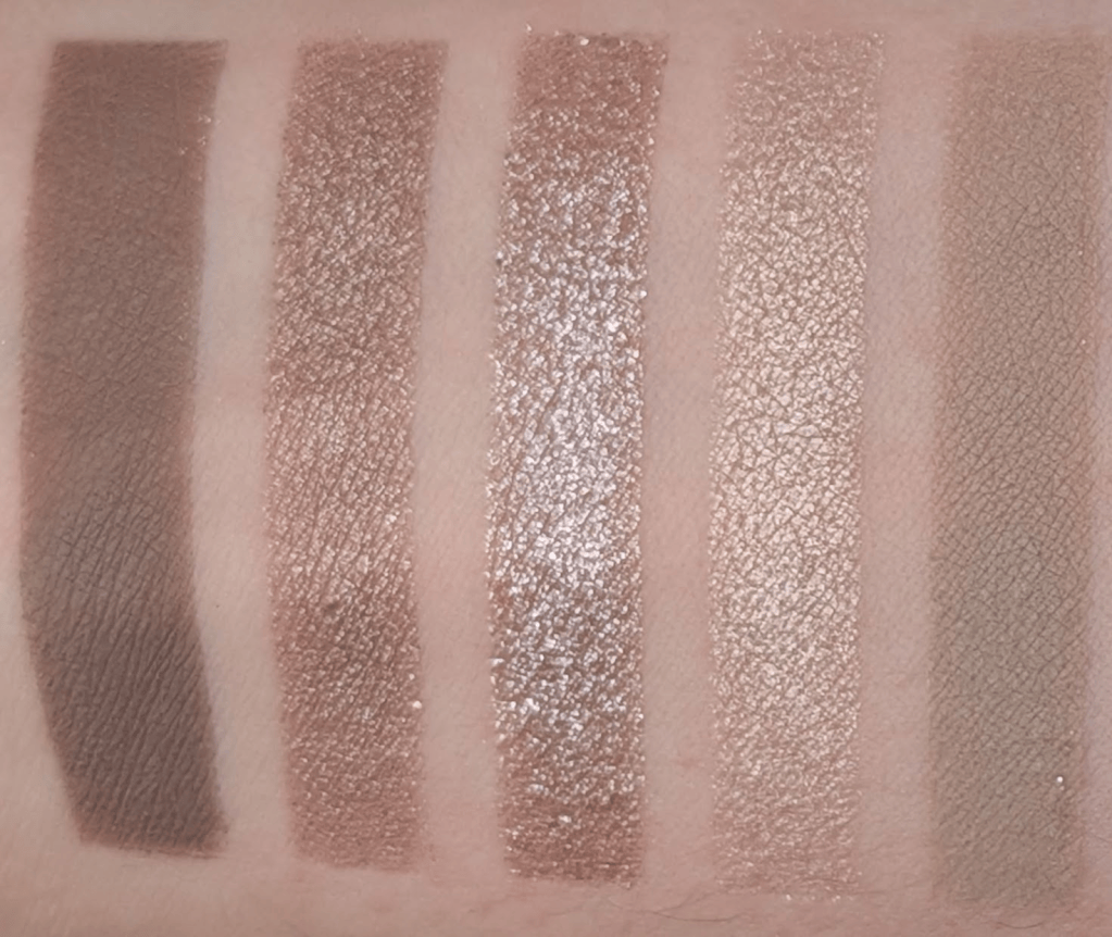
Slab, Moosh, Sterling, Zima, Tatra

Slab – This is my perfect midtone brown matte that doesn’t go even a little orange. It has a little gray-green thing going on if you look really closely, and it just works so well with my skin. I can wear this as a one and done matte look so easily. I wouldn’t say buy this palette for this shade, but I wouldn’t be mad if I could buy this as a single. 

Moosh – This is a smooth taupe shimmer that’s less sparkly, but easy to wear alone. It’s one of those neutral browns that always turns orange on me, except this one doesn’t.

Sterling – This is one of my favorites in the palette. It’s a taupey brown with a chunky silvery metallic reflect that I just want to pile on my eyes (and I have many times). Another one that I’d totally buy as a single. 

Zima – This is somehow the least special shade in here even though it’s not a matte. It’s a champagne shimmer that pulls a little gold on me, and I feel like I already own this shade 400 times. Spoilers – it’s also the only shade I found an actual dupe for in the Stone Cold Fox palette. 

Tatra – This is one of my favorite mattes in the palette. It’s a muted stone/khaki/beige transition shade that does what I always want a camel brown to do because Tatra doesn’t turn orange.  
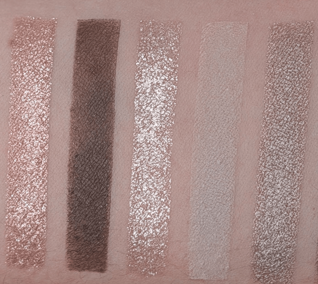
Chime, Nimbus, Glacier, Cloud, Crescent

Chime – I love this one. There’s a little pink in it, but it’s almost silver when I get it on my eyes. It’s mostly just really shiny and sparkly, and the silver reflect keeps it from going too peachy. 

Nimbus – This is the darkest brown matte in the palette, and it honestly swatches pretty badly. It works much better when I’m actually working with it, and I really like using this as a subtle liner because it doesn’t show up too strongly and I have room to build it up. 

Glacier – This is a very pale and icy sparkly shade. I like this much more as a topper or brightening shade than using it alone. This is also the shade that I get the most fallout with, so I have to be a little more careful. 

Cloud – This is a super pale mushroomy off-white matte. I thought I would use this a lot to blend things out, especially because it’s almost a little green, but I just really haven’t. This is also one of the shades that can make a look go from neutral to “wait why is this so gray?” pretty quickly.

Crescent – This is a really nice taupe brown metallic that doesn’t go orange. It’s pretty and the formula is very nice. 
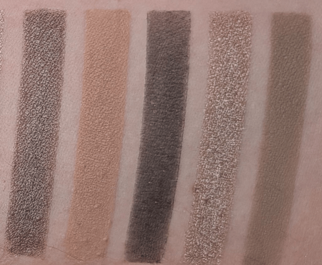
Shale, Chisel, Cove, Zelda, Cube

Shale – Similar general territory to Crescent but much deeper and browner, and I like Shale so much better, I really haven’t used Crescent. 

Chisel – This is the actually warm shade in the palette especially relative to everything else. I don’t even know that I would call it particularly warm if it were sitting somewhere else, but next to everything here it definitely is. I like having it for when I’ve accidentally gone too gray and want to pull things back a little without going too orange, but it still feels a little out of place. 

Cove – This is the deepest shade. It’s more of an almost black than an actual inky black, which is nice if you’re afraid of using a super pigmented black shadow. If you’re used to that though, this might be a little disappointing.

Zelda – A smooth taupe-brown shimmer (yes, another one!). It’s pretty, and I would happily wear by itself.

Cube – Another mid-tone taupe/brown. It’s deeper and browner than Tatra, but they’re close enough in what they do for me that if I were making this palette, I probably would have put something else here.

Most of the looks I’ve made are some variation of taupey brown with sparkle. Sometimes they’re more pink, sometimes more gray, sometimes a little khaki, sometimes very silver, but they’re all the same vibe. That doesn’t bother me when it’s so obvious that’s what you’re getting with this kind of palette. If you want to wear that kind of look every day, you’re gonna love this palette. 

And now, the real reason you’re here, comparison swatches! 

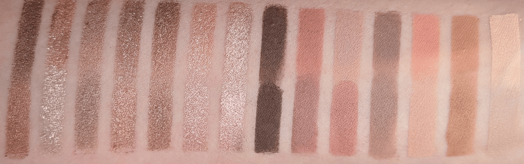
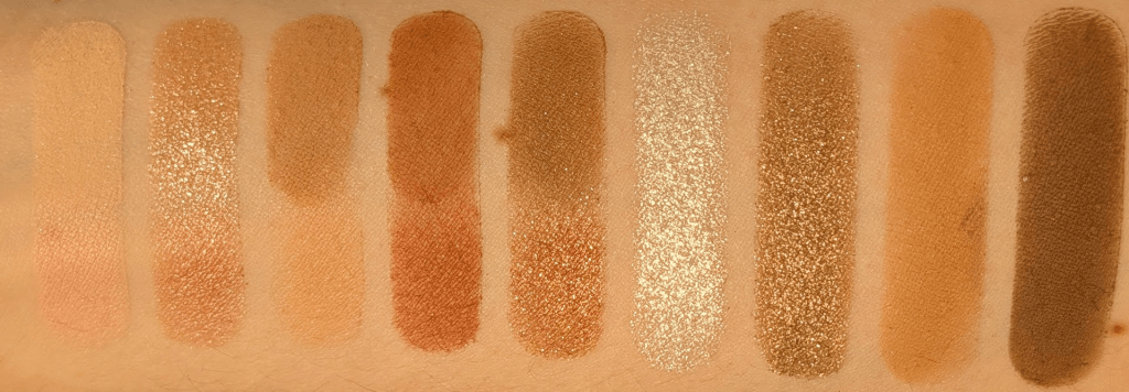
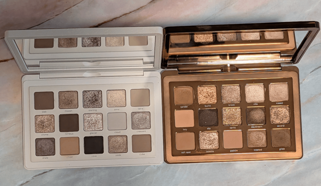
The Natasha comparison that makes the most sense to me is I Need a Nude, because I Need a Cool is basically what I wanted I Need a Nude to look like on me. I Need a Nude is really pretty, but so much of it ends up being really peachy on my skin. When I swatched all 15 shades next to each other, I Need a Nude was noticeably rosier and peachier vs the gray/taupe/mushroom tones in I Need a Cool.  
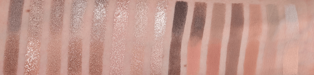
I Need a Cool on the top and I Need A Nude on the Bottom

If I Need a Nude already looks beautifully neutral on you, then I can absolutely see I Need A Cool being too grey for you. If I Need a Nude is orange on you, then I think I Need a Cool might be exactly what you’re looking for. 

And then obviously there is Colourpop Stone Cold Fox. I matched 15 shades from the two palettes and when I swatched them all together, the overall color stories looked much closer than I expected. There aren’t 15 actual dupes, but I truly think you can get pretty close to both I Need a Nude and I Need a Cool with the shades in Stone Cold Fox. Even though they’re not exactly the same, they’re very very similar. And by they’re, I do really mean both I Need a Cool + I Need a Nude = Stone Cold Fox. 
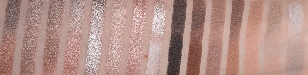
I Need a Cool on the top and Stone Cold Fox on the bottom
I Need a Nude on the Top and Stone Cold Fox on the bottom

I personally reach for I Need a Cool more than I Need a Nude and Stone Cold Fox, especially because I like the Natasha shimmers more and the I Need a Cool tones more. If I already had Stone Cold Fox and liked it, I definitely wouldn’t feel like I had to immediately buy I Need a Cool too. And if you’re looking at all of these gray-taupe-brown shades and have no idea whether this is something that could work for you, Stone Cold Fox is a much cheaper way to experiment. Especially because Stone Cold Fox is under $30 right now, and each Natasha Denona Palette is $72.

I used Ulta points to get I Need a Cool and I would happily use my points on it again. Actually, if I could go back in time, I just wouldn’t buy I Need a Tan and buy this instead. I knew I Need a Tan was probably going to be too warm when I bought it, but I wanted to review it anyway, and now I feel guilty every time I see it because I just don’t want to use it enough to even finish the review (I did post swatches in my Substack chat, please comment if you want me to find them!). With I Need a Cool, I keep wanting to use it and have to force myself to use other things I’m also testing. But of course, if you already have your perfect silvery taupes, mushroom browns and neutral mattes that never go orange, you may truly not need this. 

Ultimately, I do think this one is worth getting if you have also spent years wondering why every “neutral” brown palette looks orange on you. If my toddler hid this somewhere in my house and I couldn’t find it again (he would never, but hypothetically), I would buy another one. A lot of my other palettes, I wouldn’t miss. 
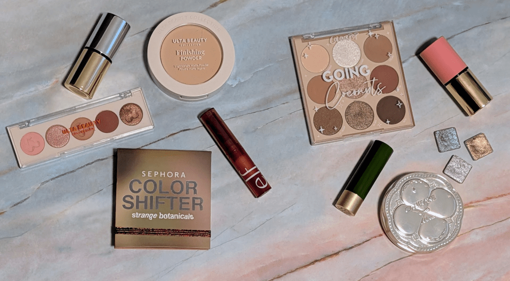
2025 Product Fails And What I’d Buy Instead

I was going to do a full “worst products of 2025” post, but honestly I didn’t have enough fails to do one. It was an amazing makeup year, and I’ve had way more great products than bad ones. That said, I’ve been collecting the products that really didn’t work for me in a bin all year, and these are the five that really stood out as not working for me (and what I’d recommend instead). In this post, all links are affiliate links (thank you for your support!), but all opinions are my own.

Instead of the Sephora Collection Color Shifter Strange Botanicals Palette, Try the Half Magic Eyeshadow Singles – This palette is such a cool concept. I bought it on sale because it was really inexpensive, and I thought it would be a fun way to try Sephora Collection palettes. But all of the mattes are patchy, hard to blend, and super uneven. The shimmer shade is fine, but pretty flat. It’s the kind of palette that makes you feel like you’re really bad at doing your makeup, and then you remember you own other shadows that basically apply themselves (like my beloved Byredo Bibilophilia palette).

Sephora Collection Strange Botanicals, Half Magic Blushing Lizard, Wet Pebble, and Sparkle Puff

The one topper shifter shade in the palette is actually really pretty (it’s the fifth shade in). It’s smooth, shifty, and performs well. But I think it’s better to just find your perfect shifty topper and buy that because you probably already own a bunch of mattes you love that perform way better. Specifically, I would recommend the Half Magic single shadows, especially since they have way more shades to choose from. I have Blushing Lizard, Wet Pebble, and Sparkle Puff. Look how much prettier and sparklier and smooth they are than the Sephora Collection Shades. I’d rather buy one amazing topper that can also be a gorgeous single shadow than buy a whole palette where I only reach for one pan.

Instead of the Make Beauty Heat Stroke Blush, Try the the Make Beauty Cream Stroke Blush – I wanted to love the dewy Make Beauty Heat Stroke Blush stick especially since I have dry skin. The formula ended up being more work than I want to do with a blush stick. The formula can get patchy and a little sticky, and even though the finish is nicely dewy, I don’t love how it sits on my skin. It also was really hard for me to find a shade that I thought would work well with my olive undertones, and even with Swelter being the best option I could find, it still doesn’t feel quite right on me.

Displaying PXL_20251121_164736235~2.jpg
Heat Stroke Blush in Swelter, Cream Stroke Blush in Major Mauve and Hypernude

The Cream Stroke Blush sticks, though, I’m so happy with. I have Major Mauve and Hypernude, and I love this formula so much more. It’s easy to swipe on, easy to blend, and the finish is blurring without being too matte. It’s not sticky at all and lasts much longer than the Heat Stroke blush. The shades also actually look great with my olive undertones. Major Mauve is a terracotta leaning mauve (they describe it as an “Earthy Mauve”) that works perfectly with my olive undertones. Hypernude is peachy beige that definitely leans orange/warm on me but is perfect for when I want to do a warm look on purpose because it doesn’t go all the way to Cheeto orange like a lot of blushes do. I’m so glad they came out with this new blush stick formula, and I’m planning on grabbing Chroma for the summer. If you’re looking for something dewier that has a great formula, I’d recommend the Glow Recipe Watermelon Glow Niacinamide Dewy Flush.

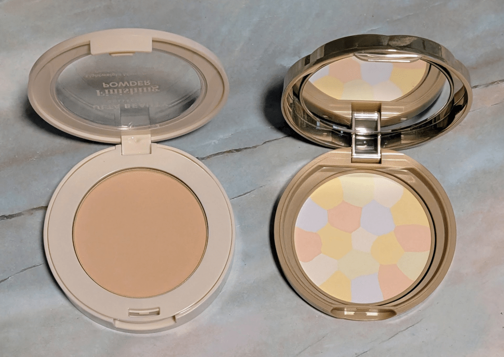
Instead of the Ulta Beauty Collection Pressed Finishing Powder, Try the Canmake Abloom Face Powder – I was really excited about this one because I am always hunting for great affordable powders, and powders are my most read category on here. On my skin, the Ulta Beauty Collection finishing powder looked textured and drying without actually doing anything blurring, smoothing, or setting. It also feels a little too pigmented to work as a soft-focus finishing powder. If you’re looking for an Hourglass or Givenchy style powder, this is not the one. If you want to something similarly affordable that is actually a great finishing powder, I’ve been loving the Canmake Abloom Face Powder in shade 3. I’ve been using it just as much as my favorite luxury pressed powder from Givenchy, and it’s been working the exact same. Related, I’ll be doing a bunch of KBeauty reviews soon – let me know if there’s any products or brands you’re interested in reading about!

Ulta Beauty Collection Pressed Finishing Powder and the Canmake Abloom Face Powder

Instead of the e.l.f. Black Cherry Sheer Slick Lipstick, Try the Finding Ferdinand Delicious Balms – This one is supposedly a dupe for Clinique Black Honey, and I have worn variations of this shade family for years. Now that I understand my undertones and color theory better, I can see why it has always felt slightly off on me. I also know that it turns weirdly orange on some of you, and generally just isn’t a universal shade. Beyond the shade, I really do not like this formula. It feels a little drying, it does not apply as smoothly as I want a “sheer easy balm lipstick” to apply, it can look patchy, and it’s just not comfortable. And honestly, I didn’t love the original Clinique Black Honey formula either for the same reasons.

Displaying PXL_20251121_165132239~2.jpg
e.l.f. Black Cherry, Finding Ferdinand the Black Balm and Lucky Cat

The Finding Ferdinand Delicious Balms are absolutely what I’d recommend instead (and you can use my affiliate code liftbakelove10 for a discount.)I showed the Black Balm and Lucky Cat in the swatches, but there are more shades if you’re looking for something warmer, cooler, more berry, more lavender, etc. The formula is so much better. They go on smoothly, feel comfortable, actually nourish the lips, and they smell amazing. The shades feel more dialed-in and nuanced than all the Black Honey dupes, and it’s much easier to find something that works for your undertones. I also like mixing the Black Balm and Lucky Cat to get a deeper black cherry tone that works for me.

Instead of the Ulta Beauty Collection 5-Pan Eyeshadow Palettes, Try the Colourpop 9-Pan Palettes – Ulta’s small 5-pan palettes are absolutely fine for an affordable eyeshadow palette. There’s nothing terribly wrong with the one I have, but it’s also just not amazing. And since they’re $14, and ColourPop’s 9-pan palettes are also $14, I would go with a ColourPop 9 pan every time. Not only because the formula is better, but you also get more shades. The eyeshadows are easier to use, have more consistent pigmentation, and overall just more fun to work with. Hopefully you can see how the mattes in the ColourPop shades are smoother and more pigmented and the shimmers are sparklier. Both brands go on sale often, but even at full price, I would choose ColourPop every time for the formula. If you’re willing to spend a little more for a mini palette that feels truly high quality, I love the Natasha Denona minis. I absolutely love the Mini Retro and Mini Glam palettes, and I would happily spend the extra $10 for any of those.

ColourPop Going Coconuts on the top (plus the four on the right) and Ulta Beauty on the bottom of the first five

What other products would you like me to review? Let me know if there’s anything else you’d like to see here, and thanks for reading! As always, some links may be affiliate links that support the blog and some products may have been gifted, but all reviews/opinions are completely my own and unsponsored.

Natasha Denona Mini Glam Palette: The Best Everyday Neutral Eyeshadow Palette for Olive Undertones

I’ve tried countless neutral eyeshadow palettes, but the Natasha Denona Mini Glam Palette really stands out to me. It’s become my staple every day palette, especially because it works so well with my olive undertones without going too warm or too cool. I wanted to do a full rundown of each shade and why I love this palette so much. As always, thank you so much for being here, and it would mean so much to me if you subscribe here for new posts. All links in this post are affiliate links, and if you choose to shop through them, thanks for supporting the blog!

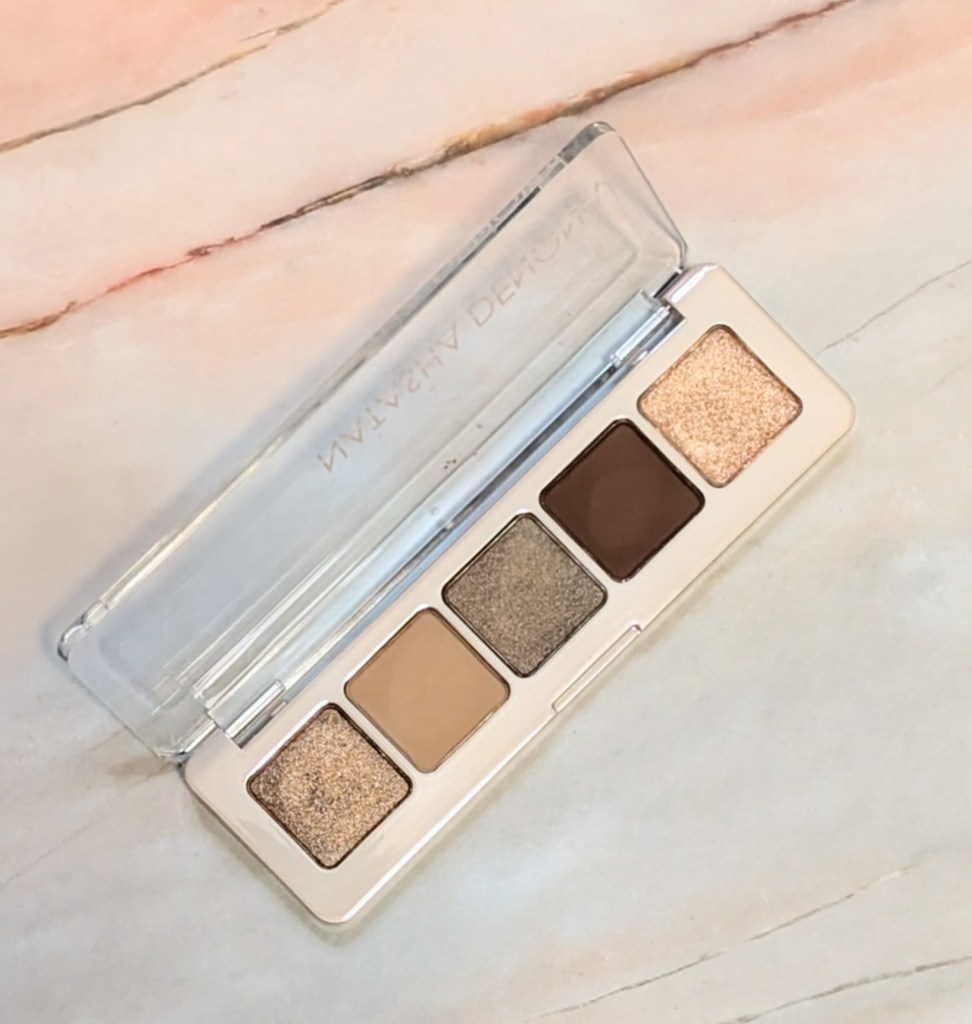
The Mini Glam palette has five shades that all work well individually as one-and-done looks or together to create various looks. Unlike other palettes that can pull too warm and orange on me, the browns actually stay brown, and the shimmers don’t end up looking like I accidentally added cheeto dust to my eye look. Because of this, the Mini Glam palette is super easy for me to throw on even when I’m running low on time. I can put together a polished look with minimal effort and without really having to think about it. I also love that I can do anything from a subtle wash of color to a cool-toned smoky eye with just this palette.

Of course, the palette is great for travel because it’s so small, and I even threw it even my backpack to take to the office one day with no issues. Some of the shades remind me of the Biba palette (I’m pretty sure Seed is actually in both), so this is a great way to get Biba palette vibes for only $27. Here are some swatches of all of the shades:

The shimmers, Golden Flesh (a gold-bronze metallic), Anjo (a gray-brown metallic), and Faye (a cool metallic champagne), all apply well with a finger or brush, though I recommend using natural fiber brushes if you can with Natasha Denona shadows in general. There’s no chunky glitter or fallout with these shades, which is another reason they’re super easy to throw on in the morning.

Seed is a creamy dark brown matte and Harlow is a creamy matte taupe that both blend easily without any patchiness. Seed is a perfect outer corner and liner color for me while Harlow is a great base and blending shade or easy one and done matte look.

Golden Flesh and Anjo both work really well for one and done looks depending on if you want to go more bronze or more taupe. They also layer beautifully together. Faye is a fantastic inner corner highlight, and I’ve also used it all over the lid for a subtle daytime look.

If you have olive skin and struggle to find truly flattering neutral tones, I highly recommend giving the Natasha Denona Mini Glam Palette a try. It has become an absolute essential in my collection and is worth every penny especially since it’s fairly affordable given the cost of other quands and quints (looking at you, new Hourglass quads).

Let me know if there’s anything else you’d like to see here on LiftBakeLove, and thanks for reading! As always, some links may be affiliate links that support the blog, but all reviews/opinions are completely my own and unsponsored.